Transform lackluster photos into vibrant masterpieces through precise color correction techniques that professional photographers rely on daily. Master white balance adjustments to eliminate unwanted color casts, calibrate your monitor for consistent results across devices, and develop a professional editing workflow that ensures accurate colors every time. Whether shooting landscapes bathed in golden hour light or portraits in challenging mixed lighting conditions, proper color correction elevates ordinary images into compelling visual stories that capture exactly what your eye witnessed. Understanding color theory and mastering digital tools like curves, selective color adjustments, and HSL panels puts complete creative control at your fingertips, allowing you to craft images that resonate with viewers while maintaining natural, true-to-life colors.
Understanding Color Management Fundamentals
Color Spaces and Profiles
Understanding color spaces is crucial for accurate color reproduction in your photography workflow. Think of them as different languages that your camera, monitor, and printer use to communicate color information.
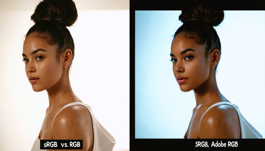
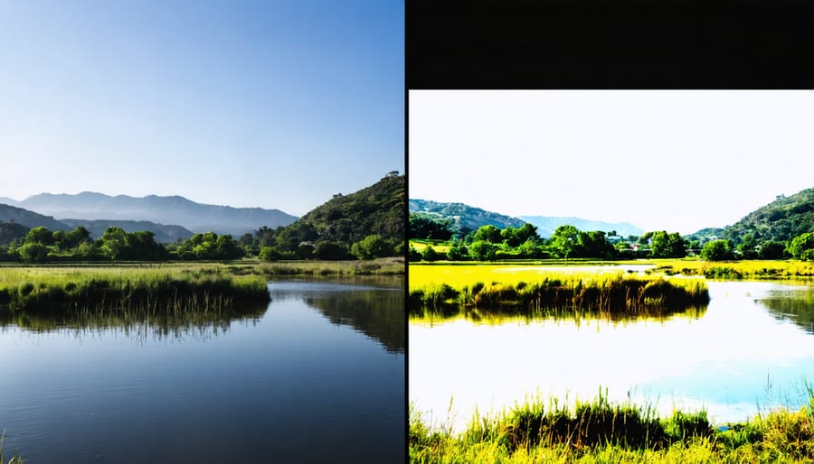
The most common color space is sRGB, which serves as the universal standard for web display and many consumer devices. While it offers a smaller color gamut, it ensures consistency across various platforms and is ideal for images primarily viewed online.
Adobe RGB provides a wider color gamut, especially in the green-cyan regions, making it popular for color management for printing. If you’re planning to print your work professionally or want to retain more color information for post-processing, shooting in Adobe RGB can be advantageous.
ProPhoto RGB offers the largest color gamut of the three, capable of representing colors beyond what the human eye can see. While this might seem excessive, it provides maximum flexibility for future editing and helps prevent color clipping during intensive processing.
When choosing a color space, consider your end-use: sRGB for web display and social media, Adobe RGB for print and professional work, or ProPhoto RGB for maximum editing flexibility. Remember to maintain color space consistency throughout your workflow to avoid unexpected color shifts in your final images.
Monitor Calibration Essentials
Monitor calibration is the cornerstone of accurate color correction in photography. Think of it as tuning a musical instrument – without proper calibration, your edits will be off-key, no matter how skilled you are. When your monitor isn’t calibrated, you might be making adjustments to colors that don’t actually need fixing, leading to prints that look nothing like what you see on screen.
To properly calibrate your monitor, you’ll need a hardware calibration device (colorimeter or spectrophotometer) and calibration software. While built-in operating system tools can help, they rely on your eyes, which aren’t precise enough for professional work. The calibration process typically takes about 15-20 minutes and should be repeated monthly, as monitors drift over time.
Before calibrating, ensure your monitor has been running for at least 30 minutes to warm up. Set your room lighting to match your typical editing conditions, and clean your screen. During calibration, you’ll set key parameters including white point (typically D65/6500K), brightness (120cd/m² for most work), and gamma (usually 2.2).
Pay special attention to your working environment. Avoid bright lights directly hitting your screen, and consider using a monitor hood to prevent glare. If possible, paint your walls a neutral gray to minimize color cast from reflected light. These environmental factors can significantly impact how you perceive colors during editing.
Remember, even the most expensive monitor won’t perform at its best without proper calibration. It’s an investment in accuracy that pays dividends in the quality of your final images.
Professional Color Correction Workflow
White Balance Mastery
White balance is your secret weapon for achieving natural, true-to-life colors in your photographs. Think of it as teaching your camera’s brain to recognize what “white” should look like under different lighting conditions. When your white balance is spot-on, everything else in your image falls perfectly into place.
Start by understanding your camera’s preset white balance options. While Auto White Balance (AWB) works well in many situations, it’s not infallible. For more precise control, match your setting to your lighting environment: Daylight for sunny conditions, Cloudy for overcast skies, Tungsten for indoor lighting, and Fluorescent for office environments.
For ultimate accuracy, use a gray card or white balance target. Simply photograph your target under your shooting conditions, then use it as a reference to set a custom white balance. This method is particularly valuable when shooting in mixed lighting situations or when color accuracy is crucial, such as in product photography.
If you’re shooting in RAW format (highly recommended for color correction), you have the flexibility to adjust white balance during post-processing without quality loss. Many editing software packages offer temperature and tint sliders – temperature controls the warm-cool balance, while tint handles the green-magenta spectrum.
Remember, white balance isn’t just about technical accuracy; it’s also a creative tool. Sometimes, a deliberately “incorrect” white balance can create mood or enhance the emotional impact of your image. Don’t be afraid to experiment while keeping your intended result in mind.
Tone Curve Adjustments
The tone curve is one of the most powerful tools in color correction, offering precise control over your image’s contrast, brightness, and color balance. Think of it as a visual map where you can fine-tune specific brightness levels while maintaining perfect exposure settings across your photograph.
At its core, the tone curve represents the relationship between input (original) and output (adjusted) values. The curve’s default state is a straight diagonal line, where any adjustments create bends that affect different tonal regions. The horizontal axis represents the input values from shadows (left) to highlights (right), while the vertical axis shows the output values.
To use tone curves effectively, start by creating subtle S-curves to enhance overall contrast. This involves slightly lifting the highlights and lowering the shadows while maintaining a smooth transition through the midtones. For more targeted adjustments, you can work with individual color channels – Red, Green, and Blue – to correct specific color casts or create artistic effects.
A common technique is to adjust the RGB curve for overall contrast and then fine-tune individual channels to balance color temperature. For instance, lifting the Blue channel’s shadows while lowering its highlights can add warmth to shadows while cooling down bright areas, creating a more dynamic image.
Remember that subtle adjustments often yield the most natural-looking results. Pay special attention to the curve’s smoothness to avoid introducing unwanted posterization or color artifacts in your images.
HSL/Color Panel Techniques
The HSL (Hue, Saturation, Lightness) panel is your precision tool for targeted color adjustments, offering far more control than basic color correction tools. Think of it as a surgical instrument that allows you to isolate and modify specific color ranges without affecting the rest of your image.
To use the HSL panel effectively, start by identifying the specific color you want to adjust. For instance, if you’re working on a landscape photo, you might want to enhance the blue of the sky without affecting the greens in the vegetation. Simply select the targeted color range and adjust the hue slider to shift the color temperature, the saturation to control its intensity, and the lightness to fine-tune its brightness.
A particularly useful technique is the targeted adjustment tool, which lets you click and drag directly on your image to make changes. This intuitive approach helps you visualize the adjustments in real-time. When working with skin tones, use subtle adjustments in the orange and red channels to maintain natural-looking results.
Remember to work with adjustment layers when possible, allowing for non-destructive editing. This gives you the flexibility to refine your adjustments later or create multiple versions with different color treatments. For challenging images with mixed lighting conditions, try using multiple HSL adjustments with layer masks to target specific areas independently.
Common Color Problems and Solutions
Mixed Lighting Challenges
One of the most challenging scenarios photographers face is dealing with multiple light sources in a single frame. Whether you’re shooting at golden hour with both natural sunlight and artificial lighting, or capturing an indoor event with fluorescent overhead lights and window light, mixed lighting can create complex color correction needs.
Understanding lighting management techniques is crucial when dealing with these situations. Each light source typically has its own color temperature, creating different color casts across your image. For example, tungsten bulbs cast warm orange tones, while fluorescent lights often produce greenish tints.
To tackle mixed lighting challenges, start by identifying your dominant light source and white balancing for it. Then, use selective adjustments to correct specific areas affected by secondary light sources. Tools like graduated filters, adjustment brushes, and luminosity masks can help you target specific regions without affecting the entire image.
Consider using gels on your artificial lights to match the ambient lighting, or alternatively, embrace the creative possibilities of contrasting color temperatures. Some photographers intentionally use mixed lighting to create mood and depth in their images, turning what could be a technical challenge into an artistic advantage.
Remember to shoot in RAW format when dealing with mixed lighting scenarios, as this gives you maximum flexibility during post-processing to address different color temperatures effectively.
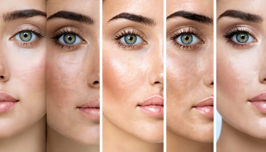
Skin Tone Correction
Getting skin tones right is often considered the holy grail of color correction, as our eyes are incredibly sensitive to unnatural skin colors. The key to achieving natural-looking skin tones lies in understanding that human skin, regardless of ethnicity, follows certain color patterns within the RGB and HSL color spaces.
Start by evaluating your image’s white balance, as this forms the foundation for accurate skin tones. A properly white-balanced image will show neutral whites and grays, which helps ensure skin colors appear natural. Pay particular attention to the highlights and midtones in facial areas, as these are where color casts become most noticeable.
When correcting skin tones, focus on maintaining a healthy balance between red and yellow undertones. Most natural skin tones fall along what’s called the “skin tone line” – a diagonal line between orange and yellow hues. Avoid pushing skin tones too far into greens or magentas, as these colors rarely occur naturally in human skin.
Use reference points like lips, the whites of eyes, and natural shadows to gauge the overall accuracy of your corrections. A helpful technique is to check your image in black and white – if the skin tones appear too dark or light in grayscale, they likely need adjustment in color too.
Remember that skin tone correction isn’t about achieving a single “perfect” color – it’s about preserving the natural variation and character of different skin types while ensuring they look healthy and true to life.
Color Cast Removal
Color casts are unwanted tints that can affect your entire image, often resulting from incorrect white balance settings or challenging lighting conditions. These tints can make your photos appear unnaturally warm (orange/yellow) or cool (blue), diminishing their impact and authenticity.
To identify a color cast, look at areas that should be neutral gray or pure white in your image. If these areas show a noticeable tint, you’re dealing with a color cast. Common causes include shooting under fluorescent lights, mixed lighting conditions, or using incorrect camera settings.
Removing color casts in post-processing is straightforward once you know the right techniques. In most editing software, start by using the White Balance tool to click on an area that should be neutral gray. This automatically adjusts the overall color temperature and tint to compensate for the cast. For more precise control, use the Temperature and Tint sliders to fine-tune the correction.
Advanced photographers might prefer using Curves adjustments, targeting specific color channels to remove stubborn casts. The key is making subtle adjustments – overcorrection can lead to new color problems. Remember to periodically toggle your adjustments on and off to ensure you’re maintaining a natural look.
Prevention is often better than cure. Using custom white balance settings while shooting and keeping an eye on your histogram can help avoid color casts in the first place.
Advanced Color Grading Techniques
Split Toning
Split toning is a powerful color correction technique that allows photographers to create distinct moods by separately adjusting the colors in the highlights and shadows of an image. This method has its roots in darkroom photography but has evolved into a versatile digital tool for creative expression.
When applying split toning, you can add warmth to your highlights while keeping shadows cool, or vice versa, creating a sophisticated color balance that enhances the emotional impact of your photographs. For instance, adding subtle golden tones to highlights while maintaining blue-tinted shadows can evoke a cinematic feel in landscape photography.
Common split toning combinations include:
– Orange highlights with blue shadows for a classic sunset look
– Pink highlights with teal shadows for a modern editorial style
– Yellow highlights with purple shadows for a dreamy, ethereal effect
To achieve effective split toning, start with subtle adjustments. A saturation level of 10-20% often yields more natural-looking results than heavy-handed application. Pay attention to the balance slider in your editing software, which helps you control the relationship between highlight and shadow colors.
Remember that split toning works best when it enhances the existing mood of your image rather than completely transforming it. For portraits, warm highlights can create a flattering glow, while cool shadows can add depth and dimension to the subject’s features.
Color Harmony
Color harmony in photography goes beyond simply adjusting individual colors – it’s about creating a cohesive visual story through thoughtful color relationships. Understanding color harmony helps photographers create images that are not only technically correct but also emotionally resonant.
The foundation of color harmony lies in the color wheel and its classic combinations. Complementary colors (those opposite each other on the wheel) create dramatic contrast, while analogous colors (those adjacent) produce peaceful, harmonious scenes. Triadic color schemes, using three equidistant colors, can generate vibrant and balanced compositions.
When correcting colors in your photos, consider the overall mood you want to convey. Warm colors like reds and oranges typically evoke energy and passion, while cool blues and greens suggest calm and tranquility. By deliberately adjusting your color palette, you can create creative color effects that enhance your artistic vision.
A well-balanced color palette should have a clear hierarchy – typically one dominant color, supported by secondary and accent colors. When color correcting, start by identifying your main color and adjust other tones to complement it. This approach ensures your images maintain visual coherence while avoiding the chaos of competing colors.
Remember that cultural and contextual meanings of colors can impact how your images are perceived. Consider your audience and the intended message when fine-tuning your color harmony.
Color correction is a fundamental skill that can transform your photography from good to exceptional. As we’ve explored throughout this guide, understanding the principles of color theory, mastering your camera’s white balance settings, and becoming proficient with post-processing tools are all crucial elements in achieving accurate and appealing colors in your images.
Remember that color correction isn’t just about fixing mistakes – it’s about enhancing your creative vision and ensuring your photographs convey the mood and atmosphere you intended to capture. Whether you’re adjusting skin tones for portrait photography, enhancing the vibrant colors of a sunset, or creating a specific aesthetic for commercial work, the techniques we’ve discussed provide a solid foundation for your color correction journey.
Start by practicing with the basic adjustments we covered, such as white balance and exposure corrections. As you become more comfortable, gradually incorporate more advanced techniques like selective color adjustments and color grading. Don’t be afraid to experiment with different approaches and develop your own workflow that suits your style and needs.
Keep in mind that color correction is both a technical and artistic process. While there are objective measures for correct color balance, there’s also room for creative interpretation. Trust your eye, but also learn to use the tools and measurements available to ensure consistency in your work.
The key to mastering color correction is practice and patience. Start with simple adjustments on your next photo shoot, maintain a consistent workflow, and gradually build your skills. With time and dedication, color correction will become an intuitive part of your photographic process, helping you create images that truly stand out.