Color grading transforms ordinary footage into cinematic masterpieces by manipulating light, color, and emotion through precise technical adjustments. Much like visual storytelling techniques, professional color grading shapes viewer perception and emotional response through deliberate choices in contrast, saturation, and tonal balance.
Master colorists combine technical precision with artistic vision, using sophisticated tools like DaVinci Resolve and Adobe SpeedGrade to craft distinct visual atmospheres. From the cool, desaturated dystopia of “Blade Runner 2049” to the warm, nostalgic hues of “La La Land,” color grading decisions fundamentally impact narrative power and audience engagement.
Modern color grading transcends simple color correction, embracing advanced techniques like split-toning, selective adjustments, and LUT (Look-Up Table) applications to achieve specific moods and styles. Whether enhancing natural lighting conditions or creating surreal visual experiences, thoughtful color grading elevates cinematography from mere documentation to compelling artistic expression.
This technical-creative intersection demands both precise technical knowledge and refined artistic sensibility, transforming raw footage into polished, professional content that resonates with audiences and serves the story’s emotional core.
The Fundamentals of Cinematic Color Grading

Color Theory in Motion
While static color theory forms the foundation of visual design, its application in motion pictures adds fascinating layers of complexity. Unlike still photography, colors in cinematography interact with movement, time, and narrative progression, creating dynamic emotional resonance with viewers.
Consider how cinematic lighting techniques and color work together to guide the viewer’s attention and emotional journey. A gradual shift from warm to cool tones might mirror a character’s emotional descent, while sudden color contrasts can heighten dramatic tension in key scenes.
The psychology of color remains consistent, but cinematographers must consider how these effects evolve over time. For instance, complementary colors like orange and teal create visual tension that can build throughout a sequence, while analogous colors can maintain mood consistency across multiple shots.
Movement also influences how we perceive color relationships. Fast-paced scenes might benefit from high contrast color schemes to maintain visual clarity, while slower, contemplative moments allow for subtle tonal variations to shine through. This dynamic interplay between motion and color creates what we call “visual flow” – the smooth transition of color elements that guides viewers through the story.
Understanding these principles helps colorists make intentional choices that enhance narrative impact while maintaining visual coherence throughout the entire piece.
Technical vs. Creative Grading
Color grading in cinematography can be divided into two distinct yet complementary approaches: technical grading and creative grading. Technical grading, often called color correction, focuses on fixing issues and establishing a neutral baseline. This includes adjusting exposure, correcting white balance, and ensuring consistent color temperature across shots. Think of it as laying a solid foundation – much like a painter preparing their canvas before creating art.
Creative grading, on the other hand, is where the artistic vision comes to life. This phase involves making deliberate color choices to enhance the story’s mood and emotional impact. For instance, a romantic scene might benefit from warm, golden tones, while a thriller might employ cooler, desaturated colors to create tension.
Understanding the difference between these approaches is crucial for achieving professional results. Technical grading should always come first – you wouldn’t paint a masterpiece on a damaged canvas. Common technical corrections include balancing shadows and highlights, matching shots from different cameras, and ensuring skin tones look natural and consistent.
The creative phase is where your artistic signature emerges. This might involve creating specific looks through color schemes, emphasizing certain colors while muting others, or applying stylistic effects like color bleach bypass or split-toning. Remember that creative decisions should always serve the story rather than just looking visually impressive.
Most professional colorists work in layers, starting with technical corrections as the base layer before building up creative grades. This methodical approach ensures both technical excellence and artistic expression work hand in hand.
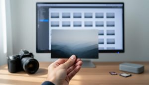
Essential Tools and Software
Professional vs. Consumer Solutions
Color grading solutions span a wide spectrum, from professional-grade software used in Hollywood productions to consumer-friendly apps that make basic grading accessible to everyone. At the professional end, DaVinci Resolve leads the industry with its comprehensive toolset and node-based workflow. While it offers a free version, the Studio edition provides advanced features like noise reduction and HDR grading tools that professionals depend on.
Adobe Premiere Pro and Final Cut Pro X occupy the middle ground, offering robust color grading capabilities that satisfy most professional needs while maintaining relatively intuitive interfaces. These programs integrate well with other post-production workflows and provide a good balance between functionality and ease of use.
For beginners and enthusiasts, LUTs (Look-Up Tables) and preset-based solutions like FilmConvert or Color Finale offer simplified approaches to achieving cinematic looks. Mobile apps such as VSCO and Snapseed have also democratized basic color grading, allowing creators to experiment with different looks on their phones.
When choosing between professional and consumer solutions, consider your project requirements, technical expertise, and budget. While professional software offers more precise control and advanced features, consumer solutions can still achieve impressive results, especially for social media content and smaller productions. Many creators start with consumer options and gradually transition to professional tools as their skills and needs evolve.
Must-Have Tools for Quality Grading
To achieve professional-quality color grading, you’ll need a robust set of tools in your arsenal. DaVinci Resolve stands out as the industry standard, offering both a free and studio version with comprehensive color grading capabilities. Its powerful node-based workflow and precise control over every aspect of your image make it a go-to choice for both beginners and professionals.
Adobe Premiere Pro, combined with Lumetri Color panel, provides an excellent alternative with its user-friendly interface and seamless integration with other Creative Cloud apps. For those seeking additional flexibility, plugins like FilmConvert and Magic Bullet Looks can add that extra layer of cinematic polish to your footage.
A color-accurate monitor is absolutely essential – without one, you’re essentially working blindfolded. Look for displays with at least 99% sRGB coverage and hardware calibration capabilities. A monitor calibration tool, such as the X-Rite i1Display Pro or Datacolor SpyderX, ensures your colors remain consistent across different devices.
For precision control, consider investing in a dedicated control surface like the Tangent Wave or BlackMagic Micro Panel. These hardware controllers make the grading process more intuitive and efficient compared to using just a mouse and keyboard.
Don’t forget about LUTs (Look-Up Tables) – they’re invaluable for quickly achieving specific looks or correcting log footage. Building a library of high-quality LUTs can significantly streamline your workflow and provide inspiration for different creative directions.
Popular Cinematic Color Grades
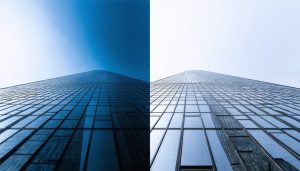
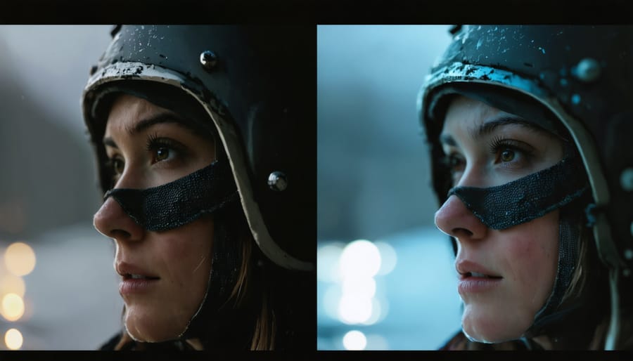
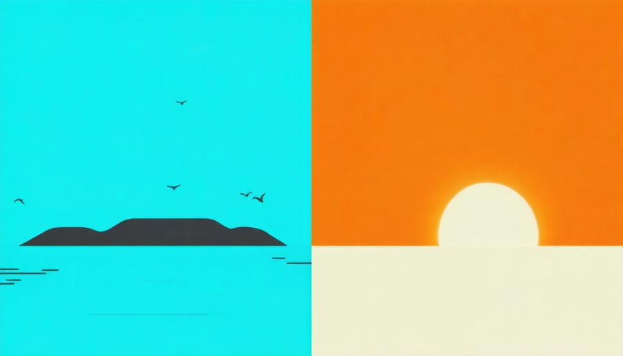
Teal and Orange Look
The teal and orange color scheme has become a defining aesthetic in modern cinema, particularly since the rise of digital color grading. This striking combination leverages the natural contrast between warm and cool tones, with orange representing skin tones and warm elements, while teal provides a complementary backdrop that makes subjects pop on screen.
Cinematographers and colorists achieve this look by pushing the shadows and midtones toward blue-green (teal) while enhancing highlights and skin tones toward orange. The technique gained prominence in Hollywood blockbusters like Transformers and Mad Max: Fury Road, where it creates a heightened sense of drama and visual impact.
To implement the teal and orange look effectively, colorists typically begin by adjusting the overall color temperature, warming up the highlights while cooling down the shadows. They then fine-tune the orange tones to maintain natural-looking skin tones while pushing the background elements toward teal. This is often accomplished through selective color adjustments in the shadows, midtones, and highlights.
However, it’s important to use this technique judiciously. While powerful, overuse of the teal and orange look has led to criticism of its prevalence in modern cinema. The key is finding the right balance – subtle implementation can add cinematic polish, while heavy-handed application can make footage look cliché or artificial. Many contemporary filmmakers now opt for a more nuanced approach, incorporating elements of the teal and orange aesthetic while maintaining their unique visual style.
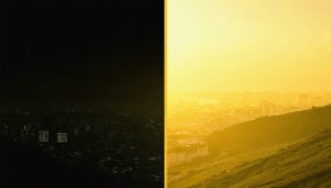
Vintage Film Emulation
The allure of vintage film aesthetics continues to captivate modern filmmakers, leading to a surge in digital techniques that recreate these timeless looks. By understanding the characteristics of classic film stocks like Kodak Vision3 or Fujifilm Eterna, cinematographers can craft authentic-looking vintage effects through careful color grading.
To achieve a classic film look, start by adjusting your footage’s color temperature to emulate specific film stocks. Kodak tends toward warmer tones with pronounced reds, while Fujifilm often features cooler, more subdued colors. Adding subtle grain patterns and slightly lifting the black levels can help recreate film’s characteristic response to shadow detail.
One effective approach combines traditional in-camera effects with digital grading techniques. Consider using classic techniques like split-toning, where you introduce specific colors into the highlights and shadows. For instance, adding subtle blue tones to shadows while maintaining warm highlights can create that coveted cinematic feel.
Pay attention to halation effects – the subtle glow around bright objects characteristic of film. This can be recreated by carefully adjusting highlight roll-off and adding minimal bloom effects. Remember that authentic film looks often feature slightly muted contrast and selective color saturation, rather than the overly processed appearance common in modern digital footage.
For the most authentic results, study reference footage from your target era and consider investing in film LUTs designed to emulate specific stocks. These provide excellent starting points for creating your own vintage looks while maintaining modern creative control.
Genre-Specific Grades
Different film genres require distinct color grading approaches to enhance their storytelling and emotional impact. Horror films often employ a desaturated palette with emphasis on cool tones, particularly deep blues and greens, to create an unsettling atmosphere. Shadows are typically crushed to increase tension, while highlights might have a slight green tint to add an eerie quality.
Action movies tend to favor high contrast and vibrant colors, with warm oranges and teals dominating the palette. This combination creates visual energy and excitement while maintaining a modern cinematic look. Fight scenes might feature slightly increased saturation to heighten intensity.
Romance and drama films usually opt for a softer, more natural approach. Skin tones are kept warm and pleasing, while overall contrast remains gentle. Period dramas often incorporate a subtle sepia tone or muted colors to evoke nostalgia and establish the historical setting.
Science fiction typically embraces distinct color schemes based on the story’s world. Dystopian futures might feature bleach bypass effects and desaturated colors, while advanced civilizations could showcase pristine whites with accent colors. Neon elements are frequently emphasized through selective color isolation.
Comedy films generally maintain bright, well-balanced colors with good contrast to keep the mood light and engaging. The grading usually aims to enhance visual clarity without drawing attention to itself, allowing the humor to take center stage.
Documentary-style productions often minimize heavy color manipulation to maintain authenticity, though they might adjust contrast and exposure to ensure consistent visual quality across different shooting conditions.
Practical Workflow Tips
Pre-Production Planning
Successful color grading begins long before you enter the editing suite. Planning your color palette and establishing your visual aesthetic during pre-production ensures a smoother post-production workflow and more cohesive final results.
Start by creating detailed mood boards that represent your project’s intended look and feel. These visual references help communicate your vision to the entire team and serve as guidance throughout the production process. Consider collecting stills from films with similar aesthetics or creating custom color palettes that align with your story’s emotional tone.
Your choice of camera settings plays a crucial role in achieving optimal results. Always shoot in log or raw format when possible, as these provide maximum flexibility during color grading. Additionally, incorporating cinematic lens filters during production can help establish your base look while maintaining natural contrast and color relationships.
Consider your location’s natural lighting and how it might affect your color palette. Schedule shoots during golden hour for warm, dramatic tones, or overcast days for softer, more controlled lighting. Document your camera settings, lighting setups, and filter choices for each scene to maintain consistency throughout production.
Remember to perform camera tests before principal photography begins. This allows you to experiment with different picture profiles, verify your exposure settings, and ensure your footage will grade well in post-production. These test shots can also serve as reference points when you begin the actual grading process.
Working with LUTs
LUTs (Look-Up Tables) are powerful tools that act like preset color recipes, transforming your footage’s colors and tones with a single click. Think of them as Instagram filters on steroids – but with precise, professional-grade control over your image’s final look.
Working with LUTs begins with understanding their two main types: technical and creative. Technical LUTs help convert between different color spaces or camera log formats to standard viewing formats, ensuring accurate color representation. Creative LUTs, on the other hand, apply specific stylistic looks, like the teal-and-orange palette popular in Hollywood blockbusters.
To effectively use LUTs in your workflow, start by applying technical LUTs first if needed, then layer creative LUTs on top. Many colorists recommend reducing the LUT’s intensity to around 50% and fine-tuning from there. This prevents the look from becoming too heavy-handed while maintaining the desired aesthetic.
Remember that LUTs aren’t magic fixes – they work best on properly exposed footage. Before applying any LUT, ensure your footage is balanced with basic corrections to exposure, contrast, and white balance. This gives you a clean foundation for the LUT to work its magic.
Pro tip: Create a collection of go-to LUTs that match your style, but don’t rely on them exclusively. Use them as starting points and adjust parameters to achieve your unique look.
Common Mistakes to Avoid
Even experienced colorists can fall into common traps when color grading their footage. Being aware of these pitfalls will help you achieve more professional and polished results. Here are the most frequent mistakes to watch out for:
Oversaturation is perhaps the most common error beginners make. While vibrant colors can be appealing, pushing saturation too far can make skin tones appear unnatural and create an amateur-looking result. Instead, focus on selective saturation adjustments for specific elements while maintaining natural-looking skin tones.
Another frequent mistake is inconsistent color temperature across scenes. When shots within the same sequence have mismatched white balance, it can break the viewer’s immersion. Always ensure continuity by matching your shots’ color temperature, particularly in scenes that are supposed to take place in the same location or time.
Many colorists fall into the trap of relying too heavily on pre-made LUTs without understanding their impact. While LUTs can be useful starting points, blindly applying them without adjustments can lead to crushed blacks, blown-out highlights, and inappropriate looks for your specific footage.
Neglecting to consider the viewing environment is another oversight. What looks good on your calibrated monitor might appear very different on various devices and screens. Always check your grade on multiple displays and consider your target viewing platform.
The “fix it in post” mentality can be dangerous. Poor exposure or white balance in the original footage can severely limit your grading options. Focus on getting the best possible image in-camera first, then use color grading to enhance rather than rescue your footage.
Finally, avoid over-processing your footage. Sometimes, subtle adjustments can be more effective than dramatic changes. Remember that color grading should serve the story and mood you’re trying to convey, not draw attention to itself through excessive stylization.
Always maintain backup versions of your work and perform regular reference checks against your original footage to ensure you haven’t strayed too far from your intended look.
Color grading is a powerful tool that can elevate your cinematography from good to extraordinary. Throughout this journey, we’ve explored the essential elements that make color grading such a vital component of cinematic production value. From understanding color theory and mastering the technical aspects of various grading tools to developing your unique style, each step brings you closer to achieving your creative vision.
Remember that successful color grading isn’t about following rigid rules but rather understanding the principles and then experimenting to find what works best for your project. Start with the basics we’ve covered, practice regularly with different footage types, and don’t be afraid to push boundaries. Save your favorite grades as presets, but always be ready to adapt them to suit each unique project.
The most important takeaway is that color grading is both a technical skill and an art form. As you continue to develop your expertise, focus on telling compelling visual stories through your color choices. Keep experimenting, stay curious, and remember that even the most experienced colorists are constantly learning and evolving their craft.