
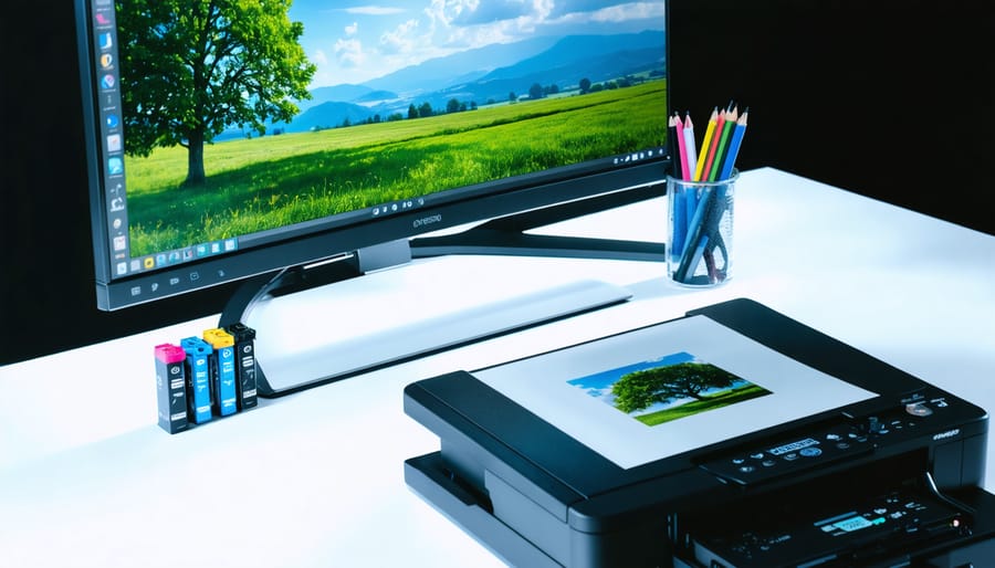
You’ve spent hours perfecting that landscape photograph on your calibrated monitor, sent it to the printer, and received back something that looks muddy, flat, or just wrong. The culprit isn’t a careless printer—it’s the fundamental difference between how screens and paper create color. Your monitor uses RGB (red, green, blue light), while professional printing relies on the 4 color print process using CMYK inks: cyan, magenta, yellow, and black.
This disconnect catches most photographers off-guard because the two systems work in opposite ways. Monitors add colored light together to create brightness, while printing subtracts light by layering translucent inks on paper. When you convert an RGB file to CMYK for printing, some of those vibrant blues and electric greens simply can’t be reproduced with physical inks—they fall outside the printable color gamut.
Understanding this process matters because it affects every decision from capture to final print. That electric sunset you captured might contain colors that physically cannot exist in ink form. Professional photographers learn to work within these limitations, soft-proofing their images before sending files to the printer and making strategic adjustments to preserve the photograph’s emotional impact even when exact color matches prove impossible.
This guide walks you through the technical foundations of CMYK printing, shows you how to identify problematic colors before printing, and provides a practical workflow for preparing your photography files to achieve consistent, predictable results every time.
What the 4 Color Print Process Actually Means
The Four Ink Colors and What They Do
Each of the four ink colors plays a specific role in recreating the full spectrum of colors you see in your photographs. Think of them as the building blocks of your printed image.
Cyan is your cool blue-green ink that handles the blue and aqua tones in your images. It’s particularly important for sky details, water scenes, and the cooler tones in shadows. When you look at a vibrant ocean photograph, cyan is doing much of the heavy lifting.
Magenta brings the purples, pinks, and warm reds to life. This ink is essential for sunset photographs, skin tones, and floral images. Without magenta, your prints would lack warmth and depth in the red spectrum.
Yellow handles the brightest, most luminous colors in your prints. It creates the golds, greens when combined with cyan, and adds brightness to oranges and reds. If you’re printing autumn landscapes or golden hour portraits, yellow ink is crucial for capturing that warm glow.
Now, here’s where things get interesting. Black is represented by the letter K, which stands for “key” because in traditional printing, the black plate was the key plate that aligned all other colors. You might wonder why we need black at all when combining cyan, magenta, and yellow theoretically creates black. In practice, mixing these three produces a muddy brown color. True black ink provides deep shadows, sharp text, and helps reduce ink consumption. It’s the foundation that gives your prints depth and contrast, particularly important for dramatic black and white conversions or images with rich, detailed shadows.

Subtractive vs Additive Color: The Screen-to-Print Gap
Here’s the frustrating scenario every photographer faces at least once: you’ve spent hours perfecting an image on your monitor, getting that sky to be the perfect vibrant blue, only to receive your prints and discover they look noticeably duller. What happened?
The culprit is the fundamental difference between how screens and printers create color. Your monitor uses RGB (Red, Green, Blue), which is an additive color system. Think of it like shining colored flashlights in a dark room. When you combine red, green, and blue light at full intensity, you get white. Your screen literally emits light to create colors, which is why images can appear so luminous and vibrant.
Printing, however, uses CMYK (Cyan, Magenta, Yellow, and Black), a subtractive color system. Instead of emitting light, inks absorb certain wavelengths and reflect others. When you layer all four inks together, you get a dark, muddy color approaching black. Each ink subtracts light from the white paper beneath it.
Here’s a practical example: that brilliant electric blue sky in your landscape photo might look stunning on screen, but RGB can display colors that simply don’t exist in the CMYK gamut. When your printer converts the file, it approximates that blue with the available cyan and magenta inks, often resulting in a slightly muted version.
This screen-to-print gap isn’t a flaw in either system. It’s physics. Understanding this difference is the first step toward predicting and controlling how your final prints will look.
How CMYK Affects Your Photography Workflow
When to Worry About CMYK (And When Not To)
Here’s the reality: most of the time, you don’t need to worry about CMYK at all. If you’re sharing images on Instagram, building a web portfolio, or sending files through client proofing systems, stick with RGB. Your screen works in RGB, web browsers display RGB, and converting unnecessarily just adds an extra step that can degrade your image quality.
So when should CMYK become part of your vocabulary? The answer is straightforward: when someone else is printing your work commercially. Magazine editors will typically request CMYK files because their printing presses can’t interpret RGB. Commercial printers producing brochures, advertisements, or corporate materials operate in the CMYK color space. Fine art printers may also prefer CMYK conversions, though many modern fine art printing services handle this conversion themselves using sophisticated color management systems.
Here’s a practical rule: if you’re sending files to a printer, ask them first. Professional print shops will provide specifications about their preferred color space, resolution, and file format. Many actually prefer receiving RGB files because their equipment performs optimized conversions based on their specific press and paper combinations.
The exception? Home printing. If you’re printing on your own inkjet printer, keep everything in RGB. Consumer printers have built-in conversion algorithms designed to work with RGB files, and you’ll get better results letting the printer driver handle the translation than doing it yourself in Photoshop.
The Colors That Won’t Translate
Some colors in your photographs simply can’t be reproduced accurately with CMYK inks, no matter how carefully you prepare your files. These out-of-gamut colors will shift to the nearest printable alternative, sometimes with disappointing results.
Vibrant electric blues are notorious troublemakers. That stunning azure sky you captured at midday or the brilliant cobalt in a sports car will likely print as a duller, slightly purple-tinged blue. Screen displays excel at pure blues using RGB light, but cyan and magenta inks can’t quite recreate that same intensity.
Neon-like greens present similar challenges. Think of fresh spring leaves backlit by morning sun or those eye-catching lime green athletic shoes in product photography. These vivid greens often contain colors that push beyond what CMYK can deliver, resulting in prints that appear more subdued or yellowish.
Bright, saturated oranges also fall victim to gamut limitations. Sunset photography is a common example where those glowing orange-red tones lose their punch in print. The same applies to vivid orange flowers like California poppies or construction safety equipment.
The good news? Understanding which colors will shift lets you adjust your expectations and potentially modify these areas during post-processing before sending files to print, maintaining the overall impact of your images even when perfect color matching isn’t possible.

Preparing Your Images for CMYK Printing
Setting Up Your Color Management System
Getting your color management right is like tuning a musical instrument before a performance—it makes everything that follows sound better. The frustration of receiving prints that don’t match your screen is almost universal among photographers, but the good news is that proper setup can eliminate most of these disappointments.
Start with monitor calibration, which is absolutely essential. Your display needs a hardware calibrator like the X-Rite i1Display Pro or Datacolor SpyderX. These devices measure your screen’s actual output and create a custom profile. Calibrate in the lighting conditions where you typically work, aiming for a brightness of around 120 cd/m² and a color temperature of 6500K (D65). This mimics standard viewing conditions for prints. Recalibrate monthly, as monitors drift over time. I learned this the hard way after wondering why my prints suddenly looked different—turns out my monitor had shifted significantly over six months.
In Photoshop, navigate to Edit > Color Settings and select “North America Prepress 2” as your starting point. This configures Adobe RGB (1998) as your working space, which captures more colors than sRGB and is ideal for print. For CMYK, choose the profile your printer provides—this is critical. If you’re working with a professional lab, request their specific ICC profile. Generic CMYK profiles create unpredictable results because different printers and paper stocks behave differently.
Enable “Convert to Working RGB” under Color Management Policies. This ensures imported images adopt your workflow. Check “Ask When Opening” for profile mismatches so you maintain control.
In Lightroom, set your soft proofing profile to your printer’s ICC profile under View > Soft Proofing > Profile. This simulates how your image will look when printed. When you review prints with clients, this preparation ensures everyone sees accurate expectations from the start.
Converting RGB to CMYK: The Right Way
Here’s the reality: converting RGB to CMYK isn’t a simple one-click process if you want prints that truly match your vision. The good news? With the right approach, you can maintain remarkable color fidelity and avoid unpleasant surprises when your prints arrive.
Start by understanding that conversion timing matters. Never convert to CMYK until your RGB editing is completely finished. Once you’re ready, the method you choose depends on your printing scenario. If you’re sending files to a professional lab, ask them for their preferred ICC profile. Most reputable printers provide these on their websites, and using the correct profile is like speaking the same language as their equipment.
In Photoshop, soft-proofing is your secret weapon for previewing how colors will translate before committing to conversion. Navigate to View, Proof Setup, and select Custom. Choose your printer’s ICC profile, set rendering intent to Relative Colorimetric (which preserves most relationships between colors), and enable Black Point Compensation. Now toggle View, Proof Colors on and off to see the difference. You’ll often notice vibrant blues and oranges shifting most dramatically.
The gamut warning feature reveals which colors fall outside CMYK’s printable range. Enable it through View, Gamut Warning, and out-of-gamut colors appear highlighted in gray. Don’t panic when you see these areas. Make targeted adjustments using Hue/Saturation or selective color tools to bring problematic colors closer to printable values while maintaining the overall look.
Many photographers find online proofing tools invaluable for collaboration with clients and printers, streamlining the approval process before final conversion.
When you’re satisfied with your soft proof, convert using Edit, Convert to Profile, selecting your target CMYK profile with the same rendering intent used for proofing.
Adjusting for the Conversion
Here’s the reality: you can’t perfectly match screen to print, but you can get remarkably close with strategic adjustments. When preparing files for the four-color process, think of yourself as a translator between two visual languages.
Start by slightly increasing saturation in your RGB file before conversion, typically by 5-10%. This preemptive boost helps compensate for the inevitable flattening that occurs in CMYK. Pay special attention to reds, oranges, and purples, which lose the most punch in translation.
Contrast often needs a gentle lift too. The CMYK gamut can make images appear slightly softer, so adding a subtle S-curve adjustment maintains that visual snap. However, don’t overdo it – you’re making up for conversion losses, not creating a dramatically different image.
Black management deserves special attention. Pure RGB blacks often convert to muddy four-color mixes. Instead, use rich blacks that combine cyan, magenta, and yellow with a dominant black channel. For text and solid blacks, consider 100% black with 40% cyan for depth.
The best approach? Create a test print with a reputable lab. Compare it to your screen under proper lighting, note the differences, and adjust your workflow accordingly. Each printer and paper combination behaves slightly differently, so this real-world feedback becomes your most valuable calibration tool.
Common Mistakes Photographers Make With Print Color
Converting Too Early in Your Workflow
Here’s a mistake I see photographers make all the time: they convert their images to CMYK early in their editing process, thinking they’re being proactive about print preparation. Unfortunately, this approach actually limits your options and can degrade image quality.
Think of RGB as a larger toolbox. It contains more colors than CMYK can reproduce, which means your editing software has more information to work with when you’re making adjustments. Once you convert to CMYK, those extra colors are discarded permanently. If you later decide to brighten shadows or adjust specific color tones, you’re working with a reduced color palette.
The smart workflow? Keep everything in RGB until your file is completely finished. Make all your exposure corrections, color grading, and creative edits in RGB mode. Only convert to CMYK as the final step before sending files to your printer, and even then, check with them first since many modern printing workflows actually prefer receiving RGB files and handle the conversion themselves using custom profiles.
This approach preserves maximum editing flexibility. If your printer sends back a test proof and requests adjustments, you can return to your RGB master file, make changes with full color information intact, then convert again. It’s like keeping your negatives safe while only making prints when needed.
Ignoring Printer Profiles and Paper Types
One of the biggest mistakes photographers make when preparing files for print is assuming all CMYK outputs are created equal. The reality is that your final print quality depends heavily on the specific combination of printer, ink, and paper stock being used.
Think of it this way: printing on glossy photo paper produces a dramatically different result than printing on matte art paper or uncoated cardstock, even when using identical CMYK values. The paper’s texture, coating, and absorbency all affect how ink sits on the surface and how colors appear to the eye. Glossy papers typically produce more vibrant, saturated colors, while matte papers often yield softer, more subdued tones.
This is where ICC profiles become essential. An ICC profile is essentially a translation guide that tells your editing software exactly how a specific printer-paper-ink combination will reproduce colors. Without the correct profile, you’re essentially guessing at how your image will look.
When working with a professional print service, always request their ICC profiles before converting your files. Reputable printers maintain profiles for each paper type they offer and will gladly provide them. Install these profiles in your photo editing software, then use them during the CMYK conversion process to preview how your image will actually print. This simple step can save you from disappointing results and costly reprints, ensuring the colors you see on screen closely match what comes off the press.
Not Communicating With Your Print Service
Before sending your files to print, have a conversation with your printer about their specific requirements. Ask what color profile they prefer—many commercial printers have custom profiles available for download that will give you the most accurate results on their equipment. Inquire about their preferred file format (usually TIFF or high-quality PDF), resolution requirements, and whether they want files in RGB or converted to CMYK.
Provide your printer with details about your project: paper type preferences, desired finish, and any specific color concerns. If you’re working on a critical project like a gallery exhibition or client delivery, request a test print or proof. Yes, this costs extra, but catching color shifts before running 50 prints saves money and heartache. Many printers offer small proof prints at reduced rates specifically for this purpose.
Don’t forget to discuss turnaround times and preparing prints for delivery if you’re shipping directly to clients. Building a relationship with a quality print service transforms printing from a gamble into a reliable part of your creative process.
Beyond Basic CMYK: Understanding Modern Print Technologies
When Printers Add Extra Colors
While standard CMYK uses four inks, professional photo printing often employs expanded color systems that add additional ink colors to the mix. These enhanced processes—typically featuring 6, 8, or even 12 colors—include lighter versions of cyan and magenta, along with specialized colors like orange, green, or different black inks.
The most common additions are light cyan and light magenta, which dramatically improve how subtle gradations appear in your prints. Think about photographing a portrait against a cloudy sky or capturing the delicate transitions in a sunset. Standard CMYK can sometimes show visible banding in these soft gradients because it’s using full-strength inks in tiny dot patterns. Light inks fill those gaps more smoothly, creating transitions that look almost continuous to the human eye.
For photographers, these expanded gamut printers shine in specific scenarios. If you shoot lots of portraits with fair skin tones, the lighter inks prevent that dotty appearance in highlights. Landscape photographers benefit when printing images with expansive skies, misty scenes, or subtle water reflections. Wildlife photographers appreciate the improved rendering of feather and fur textures.
However, most photographers won’t need to worry about these processes during file preparation. Professional labs and high-end inkjet printers handle the conversion from your CMYK or RGB files automatically. The important takeaway is knowing that if your prints show banding or graininess in delicate areas, upgrading to a printer with expanded color capability might solve the problem.

Digital vs Offset: Which Uses CMYK?
Both digital and offset printing rely on the 4-color process to create full-color images, though they apply those CMYK inks quite differently. Traditional offset printing uses large metal plates and rubber rollers to transfer ink onto paper—think of it as high-volume production for magazines, books, and commercial prints. Each of the four colors requires its own plate, making offset ideal when you’re printing hundreds or thousands of copies.
Digital printing, on the other hand, works more like your home inkjet printer but at professional quality. The printer applies CMYK toners or inks directly to the paper in a single pass, making it perfect for smaller print runs or one-off fine art prints. While the underlying color science remains identical—cyan, magenta, yellow, and black mixing to create your images—digital printing offers more flexibility for photographers who want to test prints before committing to larger quantities. Understanding this distinction helps you choose the right printing method based on your budget, timeline, and how many prints you actually need.
Understanding the 4 color print process might have seemed daunting at first, but here’s the encouraging truth: color management is absolutely a learnable skill, not some mysterious art reserved for print technicians. Every photographer who produces stunning prints today started exactly where you are now, wondering why their screen colors didn’t match their first printouts.
The key to mastering this process is experimentation. Start with test prints. Choose a few images that represent the type of work you typically create, perhaps one with vibrant colors, another with subtle skin tones, and a third with rich blacks and shadows. Convert them to CMYK using the techniques we’ve discussed, then order small test prints. Compare these results to your calibrated monitor, noting the differences. This hands-on learning is invaluable and will train your eye faster than any theory alone.
Remember that even experienced photographers continue refining their workflow. You’ll develop an intuitive sense for how your images will translate to print, learning to make preemptive adjustments before conversion. This knowledge extends beyond just preparing files, it connects to every step of your creative process, from shipping art prints to presenting your work professionally.
Mastering the 4 color print process gives you something invaluable: control over your final output. Your creative vision doesn’t have to end at the screen. With practice and patience, you’ll confidently bridge the digital-to-print gap, ensuring your photographs look exactly as you intended, whether displayed on a wall or held in someone’s hands.