
 By
By 
Optimize your portfolio images to 150-200KB per photo using tools like Lightroom’s export settings with 60-80% JPEG quality—this maintains professional visual standards while cutting load times by 70% compared to uncompressed files. Most visitors abandon sites that take longer than three seconds to load, and your hero images are usually the culprit.
Implement lazy loading on your portfolio pages so images load only as visitors scroll down, reducing initial page weight from several megabytes to under 500KB. Platforms like Squarespace and Format include this feature by default, while WordPress users can add it through plugins like WP Rocket or Lazy Load by WP Rocket.
Choose thumbnail dimensions strategically—display portfolio grid images at 800×600 pixels maximum, reserving full-resolution versions for when visitors click to view details. This approach lets potential clients browse your entire portfolio quickly while still accessing high-quality images when they find work that interests them.
Test your site speed using Google PageSpeed Insights before and after optimization, aiming for scores above 80 on mobile devices. Real-world testing matters more than perfect scores—ask photographer friends to load your site on their phones and note any images that feel slow to appear.
Structure your portfolio with 15-25 of your strongest images rather than overwhelming visitors with every shoot you’ve completed. A focused, fast-loading collection of excellent work converts better than an exhaustive catalog that tests viewers’ patience and data plans.
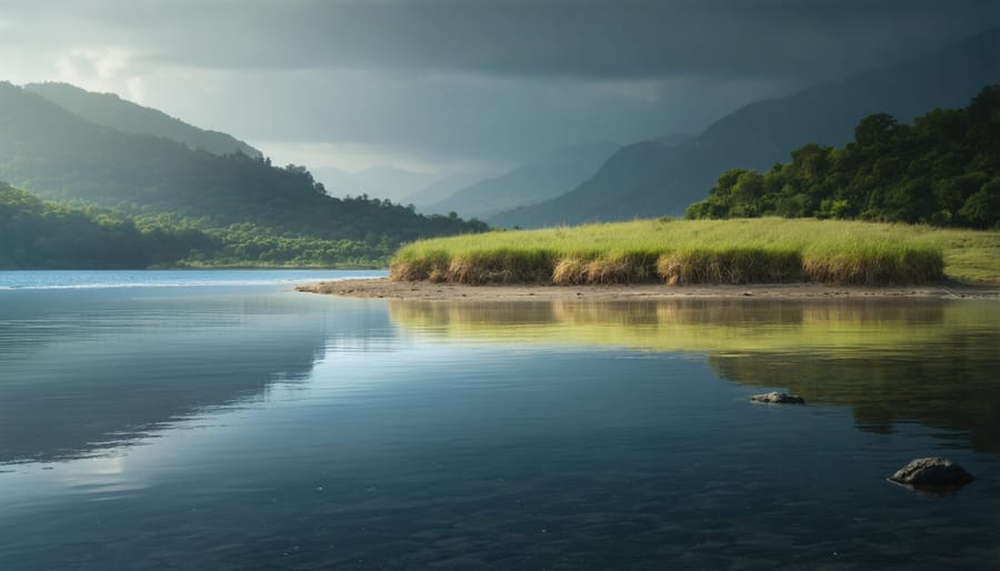
The Portfolio Performance Problem Photographers Keep Ignoring
Here’s a scenario that plays out more often than most photographers realize: A potential client discovers your portfolio through a social media link or Google search. They’re genuinely interested in booking you for their wedding, commercial project, or portrait session. Your landing page begins to load, and they wait. Three seconds pass. Five seconds. They see a spinning loader icon where your hero image should be. By the eight-second mark, they’ve hit the back button and moved on to the next photographer. You never even knew they existed.
This isn’t hypothetical. Studies show that 53% of mobile users abandon sites that take longer than three seconds to load. For photographers, this statistic is particularly devastating because your entire business depends on visual first impressions. The irony is cruel: you’ve invested thousands in camera equipment, spent hours perfecting your post-processing workflow, and captured genuinely stunning images, only to have them delivered through a sluggish website that drives potential clients away before they see a single photo.
Consider the real-world impact. A wedding photographer in Toronto recently discovered through analytics that her bounce rate was 67%. After optimizing her site’s performance and streamlining her client presentation workflows, that number dropped to 24%, and her inquiry rate doubled within two months. The difference wasn’t her photography—it was how quickly and smoothly people could experience it.
The performance problem extends beyond initial visits. Slow-loading galleries frustrate clients trying to review their photos, creating negative associations with your brand. When someone is excited to see their images and faces loading delays, that enthusiasm diminishes with each passing second. In a competitive market where dozens of talented photographers vie for the same clients, a slow portfolio site isn’t just inconvenient—it’s a business liability that costs you opportunities every single day.

Understanding Image Weight vs. Image Quality
What Your RAW Files Are Really Doing to Your Site
Here’s the reality check many photographers need: that stunning 45MB RAW file from your Canon R5 or Nikon Z9 might showcase every detail you captured, but it’s also killing your portfolio’s performance. I’ve seen countless photographer websites where a single gallery takes 30 seconds to load because they’re serving images straight from Lightroom’s export dialog with minimal optimization.
Let’s talk numbers. A typical RAW file from a modern full-frame camera weighs in at 25-50MB. Even after converting to JPEG at maximum quality, you’re often looking at 8-12MB per image. Now multiply that by a 20-image gallery, and you’ve got visitors downloading 160-240MB just to view your work. On a mobile connection, that’s several minutes of loading time, and most potential clients will bounce long before your first image appears.
The mistake isn’t just about file size itself. Many photographers export at full resolution (6000+ pixels wide) when most screens max out at 1920 pixels for desktop viewing. You’re delivering four times the data needed for proper display, with zero visual benefit to the viewer. This directly impacts your image quality considerations and user experience balance.
The practical difference? A properly optimized web image should be 200-500KB maximum. That’s a 95% reduction from those Lightroom exports, with virtually no visible quality loss on screens. Your portfolio loads in seconds instead of minutes, keeping potential clients engaged with your work.
The Sweet Spot for Portfolio Images
Finding the right balance between image quality and site performance doesn’t have to feel like guesswork. For grid or thumbnail views, aim for images around 400-600 pixels on the longest side, keeping file sizes under 150KB. This ensures your gallery loads quickly while still looking crisp on modern displays. When visitors click through to see your work in detail, full-screen images should be 1920-2400 pixels wide (depending on your layout), with file sizes between 200-500KB. These dimensions provide excellent quality on typical monitors without unnecessary bloat.
Mobile optimization deserves special attention since many viewers will discover your portfolio on their phones. Using responsive images that automatically serve smaller versions to mobile devices can cut load times dramatically. A good rule of thumb: mobile images should be 800-1200 pixels wide at most, staying under 250KB. Quality settings around 75-85 percent in your export tool typically hit the sweet spot where compression artifacts remain invisible to most viewers, but file sizes stay manageable.
Remember, these are starting points, not strict rules. A minimalist portfolio with fewer images can afford slightly larger files, while photographers showcasing extensive galleries should lean toward the conservative end of these ranges. Test your portfolio on various devices and connection speeds to see what works best for your specific situation.
Modern Image Formats That Actually Make a Difference
If you’re still saving images as JPEGs for your portfolio, you’re working harder than you need to. Modern image formats like WebP and AVIF have quietly revolutionized how we deliver photography online, and they’re worth understanding—not because they’re trendy, but because they genuinely solve real problems photographers face every day.
Think of it this way: traditional JPEG is like mailing prints in a standard envelope. It works, but it’s bulky. WebP is like vacuum-sealing those prints—same quality, half the space. AVIF takes it further, offering even better compression while maintaining the color depth and detail your work deserves.
WebP, developed by Google, typically reduces file sizes by 25-35% compared to JPEG without visible quality loss. For photographers, this means your 3MB landscape shot could become 2MB or less, loading faster while maintaining those crucial shadow details and color gradients. The format supports both lossy and lossless compression, plus transparency if you need it for logos or overlays.
AVIF is the newer contender, offering 20-50% smaller files than even WebP. It excels with high-resolution photography because it handles complex color information brilliantly. Those subtle tonal shifts in portrait skin tones or golden hour landscapes? AVIF preserves them beautifully at smaller file sizes.
Here’s the practical consideration: browser support. WebP enjoys near-universal compatibility now, with over 95% of browsers supporting it. AVIF sits around 85%, growing rapidly but not quite there yet. The smart approach? Use both through a technique called “fallback formatting,” where browsers automatically serve the best format they can handle, defaulting to JPEG when needed.
For most photography portfolios, WebP offers the sweet spot—excellent compression, broad compatibility, and straightforward implementation. AVIF is worth exploring if you’re targeting cutting-edge performance, but always include fallbacks. Your Lightroom exports remain JPEGs; the conversion to modern formats happens during your website’s optimization workflow.
Compression Without Compromise: Finding Your Balance
Tools That Understand Photography
The right compression tools can make the difference between a portfolio that loads instantly and one that keeps visitors waiting. Let’s explore some photographer-friendly options that won’t compromise your visual storytelling.
TinyPNG remains a favorite for good reason. This web-based tool uses smart lossy compression that specifically targets photographic content. Simply drag your images into the browser, and it typically reduces file sizes by 50-70% while maintaining remarkable visual quality. The free version handles up to 20 images at once, making it perfect for batch processing before uploads. Pro tip: compare the before and after by downloading a test image first to ensure you’re comfortable with the quality trade-off.
For more control, Google’s Squoosh offers a visual comparison slider that lets you see compression effects in real-time. This browser-based tool supports multiple formats including WebP, which can deliver even smaller file sizes than traditional JPEGs. The interface feels intuitive for photographers because you can literally see what you’re sacrificing as you adjust the quality slider.
If you’re already using Lightroom for editing, optimization should start there. When exporting for web, set your quality slider to 77-82 for JPEGs. This sweet spot maintains perceptual quality while dramatically cutting file size. Under image sizing, limit your longest edge to 2000-2400 pixels for full-screen hero images and 1200-1600 pixels for grid thumbnails. Enable “Sharpen For: Screen” with a standard amount to compensate for any softness from resizing.
ShortPixel and ImageOptim provide excellent desktop solutions for photographers managing larger archives, offering both lossless and lossy compression with customizable settings.
When to Prioritize Quality Over Speed
Understanding when to prioritize image quality over loading speed depends largely on your photography niche and target audience. For high-end commercial photographers working with advertising agencies or luxury brands, larger file sizes that preserve maximum detail are often essential. These clients expect to zoom in on images, examine fine details, and appreciate the full resolution of your work. Similarly, fine art photographers selling limited edition prints need to showcase the nuanced tonal gradations and textures that justify premium pricing. In these scenarios, your audience typically has patience for slightly longer load times because they’re seriously evaluating your work for significant investments.
However, wedding photographers, event photographers, and portrait artists targeting broader consumer markets should lean heavily toward optimization. These potential clients often browse portfolios on mobile devices during lunch breaks or commutes, making speed critical for keeping their attention. A portfolio that takes more than three seconds to load loses nearly half its visitors before they see a single image.
Consider a hybrid approach that serves both needs. Display optimized preview images initially, then allow viewers to click through to higher-resolution versions when they want closer inspection. This respects both the casual browser’s need for speed and the serious client’s desire for quality assessment. Think about matching your file size strategy to your visual quality standards and client expectations rather than applying a one-size-fits-all solution.
Lazy Loading and Progressive Display Techniques
When visitors land on your portfolio site, they don’t need every single image to load simultaneously. That’s the beauty of lazy loading, a technique that fundamentally changes how your photography portfolio performs online.
Think of lazy loading as a smart waiter at a restaurant. Instead of bringing out all 50 dishes at once and overwhelming your table, they bring courses as you’re ready for them. Similarly, lazy loading only loads images when they’re about to enter the viewer’s screen, typically as they scroll down. This means if someone lands on your homepage, only the images visible in their browser window load immediately, while images further down the page wait their turn.
For photography portfolios showcasing dozens or even hundreds of high-resolution images, this approach is transformative. Without lazy loading, a visitor might wait 15-20 seconds for a page to fully load, and most people will abandon your site within three seconds. With lazy loading, that initial load time drops to just a few seconds, keeping visitors engaged with your work.
But there’s more to creating a smooth experience than just delaying image loads. Progressive JPEG loading takes this further by displaying your images in stages. Instead of having blank spaces where images will eventually appear, progressive JPEGs show a low-quality version first that gradually sharpens as more data loads. Your visitors see something immediately, which feels much better than staring at loading spinners.
The blur-up technique builds on this concept beautifully. It starts by loading a tiny, heavily compressed version of your image, maybe 20-50 bytes, which appears instantly as a blurred placeholder. As the full-resolution image loads in the background, it smoothly transitions from blurry to crisp. This technique, popularized by platforms like Medium, creates an elegant, intentional feeling rather than the jarring experience of images popping into existence.
Together, these techniques ensure your visitors always see something engaging while maintaining the visual quality your photography deserves.
Content Delivery Networks for Photographers
If you’ve ever had a visitor from halfway around the world complain that your portfolio loads slowly, a Content Delivery Network (CDN) is your solution. Think of a CDN as a global network of servers that stores copies of your images closer to your visitors. Instead of someone in Tokyo loading your photos from a server in New York, they’d grab them from a nearby server in Asia, dramatically reducing load times.
Here’s the simple explanation: when you upload images to your portfolio site, a CDN automatically creates copies and distributes them across dozens or hundreds of servers worldwide. When someone visits your site, the CDN delivers your images from whichever server is geographically closest to them. This means faster loading, happier visitors, and better chances they’ll actually browse through your entire portfolio instead of clicking away.
The good news? Many popular portfolio platforms like Squarespace, Format, and Adobe Portfolio already include CDN services in their plans, so you’re covered without lifting a finger. If you’re building a custom site, services like Cloudflare offer free CDN plans that work excellently for photography portfolios. For WordPress users, plugins like WP Rocket and W3 Total Cache integrate CDN functionality with minimal technical knowledge required.
For photographers selling prints or handling high-resolution previews, Cloudinary deserves special mention. It’s photographer-focused, offering both CDN delivery and image optimization in one package. You can set up automatic resizing, format conversion, and quality adjustments based on the visitor’s device.
Implementation is usually straightforward: most services provide a simple DNS setting change or plugin installation. The performance improvement, especially for international audiences, makes this one of the most worthwhile optimizations you can implement for your portfolio site.
Responsive Images: One Photo, Multiple Sizes
Here’s the reality: every visitor to your portfolio arrives with a different device and screen size, and you need your images to look stunning on all of them without slowing things down. The good news? Modern web technology makes this automatic once you set it up correctly.
Think of responsive images like having a smart photo assistant who always hands viewers the perfect print size. Someone browsing on a phone doesn’t need your massive 4000-pixel-wide gallery image, while desktop visitors deserve the full resolution glory. This is where srcset and the picture element come in, and they’re easier to understand than you might think.
The srcset attribute is your first tool. When you upload a portfolio image, your website platform can automatically generate multiple versions: maybe a 400-pixel width for phones, 800 pixels for tablets, and 1600 pixels for desktop displays. Then you tell the browser about all these options using srcset, and it intelligently picks the right one based on the visitor’s screen. The code looks something like this: you list each image size with its width, and the browser does the math. No manual switching required on your end.
The picture element takes this further, giving you precise control when you need it. Say you have a horizontal landscape photo that looks perfect on desktop but gets too small on mobile. With the picture element, you can serve a cropped, portrait-oriented version to phone users while desktop visitors see the full panorama. You’re essentially creating art direction rules that execute automatically.
Most modern portfolio platforms, from WordPress with proper plugins to specialized photography sites, handle the technical implementation for you. You upload one high-quality image, and the system generates the variants and writes the code. Your job is simply ensuring this feature is enabled in your settings.
The result? Faster loading times for mobile users, sharper images for high-resolution displays, and better search engine rankings because Google loves optimized sites. Your portfolio works harder without you working harder.

Platform-Specific Solutions: Portfolio Builders That Handle Optimization
Choosing the right portfolio platform can save you countless hours of frustration and technical headaches. Many photographers don’t realize that modern portfolio builders come with impressive optimization features already baked in, meaning you might not need to become a web developer to create a fast, beautiful site.
Format has become a favorite among photographers for good reason. The platform automatically generates responsive images at multiple sizes, serving the appropriate version based on your visitor’s device. Their templates are specifically designed for visual work, and they handle lazy loading by default, which means images only load as users scroll down. Even better, Format includes automatic image compression that maintains quality while reducing file sizes by up to 70 percent without any manual intervention on your part.
Squarespace offers similar automatic optimization but adds sophisticated caching systems that speed up repeat visits. Their photography-focused templates include built-in lightbox galleries with keyboard navigation and smooth transitions. One practical advantage is their integrated CDN, which stores copies of your images on servers around the world, ensuring fast load times whether someone’s viewing from Tokyo or Toronto. The main limitation is less granular control over compression settings compared to Format.
Adobe Portfolio integrates seamlessly with Lightroom, which is a game-changer if you’re already in the Adobe ecosystem. Your edits sync automatically, and the platform handles all the technical optimization behind the scenes. However, customization options are more limited, making it better suited for photographers who want simplicity over extensive design control.
WordPress with photography themes like Flothemes or Showit provides the most flexibility but requires more hands-on management. You’ll need plugins like Imagify or ShortPixel for automatic compression, and consider WP Rocket for caching. The learning curve is steeper, but the payoff is complete control over every aspect of your site’s performance and appearance.
When evaluating platforms, test how they handle high-resolution images by uploading your largest files. Check loading speeds using Google PageSpeed Insights, and view your portfolio on different devices. The best platform is one that handles optimization automatically while matching your technical comfort level and aesthetic vision.
Testing Your Portfolio’s Real-World Performance
Testing your portfolio’s performance doesn’t require a computer science degree. In fact, some of the best testing tools are completely free and surprisingly easy to use. Let’s walk through how to diagnose any speed issues that might be frustrating your potential clients.
Start with Google PageSpeed Insights, which is about as straightforward as it gets. Simply paste your portfolio URL into the search bar, hit analyze, and wait about 30 seconds. You’ll receive a score out of 100 for both mobile and desktop performance. Don’t panic if you’re not hitting perfect scores right away. Anything above 80 is generally solid, though aiming higher never hurts. The tool breaks down exactly what’s slowing you down, from oversized images to render-blocking resources.
GTmetrix offers another perspective with slightly different metrics. It’s particularly helpful because it shows you a waterfall chart, a visual timeline of how every element on your page loads. This is where you’ll spot the troublemakers. For instance, if you see one image taking 8 seconds to load while others zip by in under 2, you’ve found your culprit.
Pay special attention to your homepage and the first few images visitors encounter. These make or break first impressions. If your testing reveals problems, look for patterns. Are all your issues coming from full-resolution images you uploaded directly from your camera? That’s an easy fix with proper optimization. Is one particular gallery page dragging everything down? Maybe it’s loading 50 images simultaneously instead of using lazy loading.
Run these tests from different locations if possible, as performance can vary by geography. Most importantly, test on your actual phone using your mobile data connection. Real-world testing beats theoretical scores every time.
A Workflow That Doesn’t Slow You Down
The key to consistent optimization is making it automatic. Think of it like your camera settings—once you’ve dialed in your preferred workflow, it becomes second nature.
Start by creating export presets in Lightroom or your editing software of choice. Set up three versions: a high-quality preset for prints or client downloads (maximum quality JPEG at 300 DPI), a web-optimized preset (2400 pixels on the long edge, 72 DPI, quality setting at 80), and a thumbnail preset for grid views (1200 pixels, quality at 70). Name them clearly so you’re not guessing each time you export.
When you’re ready to upload new work, follow this simple sequence. First, export your selected images using your web-optimized preset. Next, run them through your compression tool of choice—whether that’s TinyPNG for quick batching or built-in WordPress optimization. Then upload to your portfolio platform, adding descriptive filenames before you do (think “commercial-product-photography-watch.jpg” rather than “DSC_0234.jpg”). Finally, add alt text as you upload, describing what’s in the image for both accessibility and SEO benefits.
The real advantage of a repeatable workflow is that you can streamline your workflow and maintain quality standards without reinventing the process each time. Set aside 30 minutes monthly to batch-update your portfolio rather than scrambling before every client meeting. Your future self will thank you.
Here’s the truth: optimizing your portfolio isn’t about diluting your artistic vision or compromising the quality of your images. It’s about respecting both your work and your audience enough to ensure they actually experience what you’ve created. A technically stunning photograph loses its impact when a potential client gives up waiting for it to load, or worse, never sees it properly rendered because they’ve already moved on to the next photographer’s site.
Think of portfolio optimization the same way you’d approach professional presentation of your prints. You wouldn’t hand a client a beautiful image in a crumpled envelope, right? The same principle applies online. Fast load times, properly sized images, and smooth navigation aren’t technical obstacles—they’re the digital equivalent of a clean mat and protective sleeve.
The good news is you don’t need to tackle everything at once. Start with one actionable step today: run a speed test on your current portfolio using a free tool like Google PageSpeed Insights or GTmetrix. Just enter your URL and see what the data tells you. You might be surprised to discover that a few oversized images are dragging down your entire site’s performance. From there, you can prioritize what needs attention first. Your best work deserves to be seen exactly as you intended—sharp, vibrant, and without the frustrating wait.


 By
By