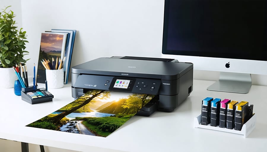
Transform your digital images into stunning physical prints by mastering essential photographic printing techniques. Calibrate your monitor using a professional colorimeter to ensure what you see on screen matches your final output. Select archival-quality paper that complements your image’s characteristics—glossy for vibrant colors and contrast, matte for subtle tones and art prints. Configure your printer’s color management settings to match your paper profile, maintaining consistent results across different media types.
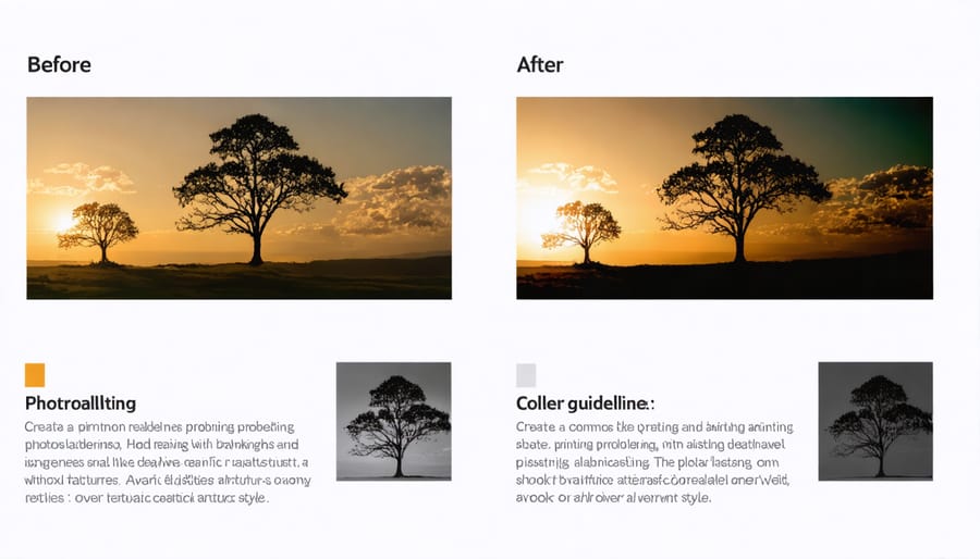
Beyond technical precision, successful photo printing demands understanding the relationship between image resolution, print size, and viewing distance. Professional prints require a minimum of 300 DPI at final output size, while larger formats viewed from greater distances can succeed with lower resolutions. Fine-tune contrast and sharpening specifically for print output, as images typically need 10-15% more contrast than their screen-optimized versions.
This meticulous attention to detail distinguishes amateur prints from gallery-worthy photographs, creating physical artifacts that faithfully represent your creative vision. Each print becomes a tangible expression of your photographic expertise, commanding attention through precise color accuracy, tonal depth, and material quality.
Understanding Different Photo Printing Methods
Inkjet vs. Dye-Sublimation
When it comes to photo printing, inkjet and dye-sublimation represent two distinct approaches, each with its own strengths. Inkjet printers work by spraying tiny droplets of liquid ink onto paper, creating images through precise dot patterns. These printers excel at producing vibrant colors and fine detail, making them ideal for landscape and nature photography where subtle gradients and sharp details matter.
Dye-sublimation, on the other hand, uses heat to transfer dye from a ribbon onto special paper. The process actually embeds the dye into the paper’s surface, creating prints that are more durable and resistant to fading. This technology is particularly popular for portrait photography and event photos because it produces smooth, continuous tones that are especially flattering for skin tones.
Inkjet printers offer more flexibility in terms of paper choices and sizes, allowing you to experiment with different media from glossy to fine art papers. They’re also generally more cost-effective for larger prints and low-volume printing. Dye-sublimation printers, while limited in paper options and typically smaller in size, produce prints that are instantly dry and ready to handle. They’re particularly popular in photo booths and event photography where speed and consistency are crucial.
For home use, inkjet printers are usually the more practical choice, offering better versatility and lower running costs. However, if you specifically need quick, durable prints in standard photo sizes, a dye-sublimation printer might be worth considering.
Laser Printing for Photos
While laser printers might not be the first choice that comes to mind for photo printing, they can be surprisingly effective for certain types of photographic work. The key advantage of laser printing lies in its durability and cost-effectiveness, particularly when producing large quantities of photos that don’t require exhibition-quality output.
Laser printers excel at producing black and white photographs, delivering crisp details and rich grayscale tones. They’re particularly well-suited for documentary photography, contact sheets, proof prints, and photography business materials like portfolios or promotional materials. The prints are water-resistant and less prone to fading compared to inkjet prints, making them ideal for long-term archival purposes.
However, it’s important to understand the limitations. Color laser printers typically can’t match the wide color gamut and subtle gradients that high-end inkjet printers achieve. The toner-based process also means that prints may have a slightly different texture and sheen compared to traditional photo prints.
For best results with laser printing, choose paper specifically designed for laser printers with a semi-gloss or matte finish. Standard photo paper won’t work well as it can melt in the printer. Many photographers keep both a laser printer for practical printing needs and an inkjet for their highest-quality photo work, combining the strengths of both technologies to meet different requirements.
Choosing the Right Paper
Paper Weights and Finishes
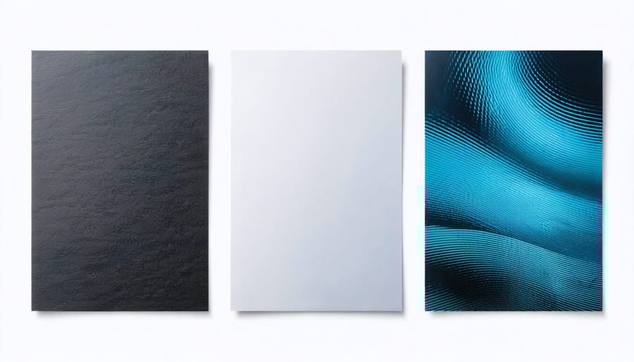
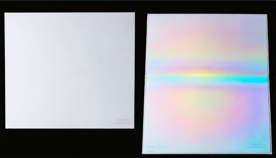
The paper you choose for your photo prints plays a crucial role in determining the final look and longevity of your images. Paper weight, measured in GSM (grams per square meter), affects both the feel and durability of your prints. Lighter papers (around 200 GSM) work well for casual prints, while heavyweight papers (300+ GSM) provide that prestigious gallery feel and enhanced durability.
Paper finish dramatically influences how your images appear. Glossy papers offer vibrant colors and deep blacks, making them perfect for high-contrast images and photos with rich details. However, they can be prone to glare and fingerprints. Semi-gloss or luster finishes provide an excellent middle ground, offering good color saturation while reducing glare and fingerprint visibility.
For a more artistic look, matte papers absorb ink differently, creating softer, more subdued prints with a distinctive fine art quality. While they may not produce the same vibrant colors as glossy papers, they excel in reproducing black and white images and creating prints with a timeless feel.
Textured papers, like watercolor or canvas, add dimension to your prints and can transform a simple photo into an art piece. These papers typically have higher weights (350+ GSM) and require careful printer settings to achieve optimal results.
Remember that different paper types may require specific ICC profiles and printer settings to achieve the best color accuracy and detail reproduction.
Archival Quality Considerations
Just as preserving your digital images is crucial, ensuring the longevity of your printed photographs requires careful consideration of archival quality materials and storage methods. The key to creating prints that stand the test of time lies in three main factors: ink selection, paper choice, and proper storage conditions.
For maximum print longevity, opt for pigment-based inks over dye-based options. While dye inks might offer vibrant colors initially, pigment inks provide superior fade resistance and can last up to 100 years when properly stored. Leading manufacturers like Epson and Canon offer specific archival-grade ink sets designed for longevity.
Paper selection is equally important. Look for acid-free papers with optical brightening agents (OBAs) appropriate for archival use. Fine art papers from brands like Hahnemühle and Canson are excellent choices, offering both aesthetic appeal and archival properties. The paper’s pH level should be neutral or slightly alkaline to prevent yellowing over time.
Storage environment plays a crucial role in print preservation. Keep prints away from direct sunlight and maintain consistent temperature and humidity levels (ideally 68-72°F and 45-55% relative humidity). Use archival-quality storage materials like acid-free boxes or sleeves, and avoid displaying prints in areas prone to environmental fluctuations.
Remember that proper handling is essential – always handle prints by their edges and consider using cotton gloves when managing valuable prints.
Color Management Essentials
Monitor Calibration
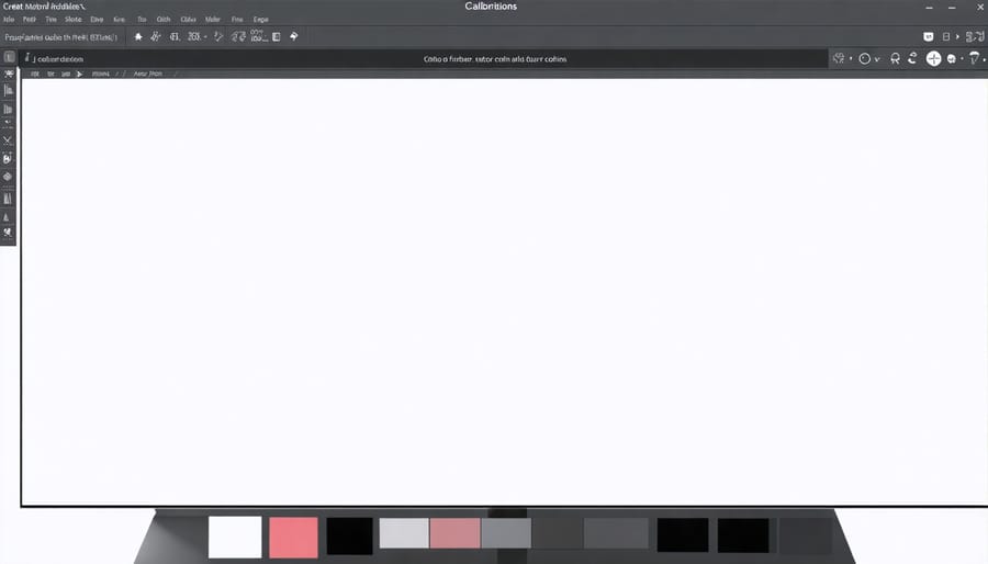
Getting accurate prints starts with a properly calibrated monitor. Think of it as establishing a reliable foundation – if your display isn’t showing colors correctly, you’ll be making adjustments based on incorrect information. Just as you might use camera control software to fine-tune your shots, monitor calibration ensures what you see is what you’ll get in print.
Start by letting your monitor warm up for at least 30 minutes before calibration. The room lighting matters too – aim for consistent, moderate lighting that won’t create glare or affect how you perceive colors. Position yourself directly in front of the monitor, as viewing angles can dramatically affect color perception.
While built-in operating system calibration tools can help, investing in a hardware calibration device (colorimeter) is worth considering for serious photographers. These devices measure your display’s output and create a custom color profile that corrects for any inconsistencies. Most come with user-friendly software that guides you through the process step by step.
Key settings to adjust during calibration include:
– Brightness (aim for 120 cd/m² for most editing environments)
– White point (typically 6500K for consistency with printing standards)
– Gamma (2.2 is standard for most workflows)
Plan to recalibrate your monitor every 2-4 weeks, as displays naturally drift over time. This might seem frequent, but it’s essential for maintaining color accuracy. Remember, even small color shifts can lead to noticeable differences in your prints, especially in subtle areas like skin tones and shadow details.
Printer Profiles and Settings
Getting the best prints starts with properly configuring your printer settings. To achieve optimal color accuracy, you’ll need to create and manage custom printer profiles for different paper types and lighting conditions.
Start by accessing your printer’s advanced settings menu. Here, you’ll find options for color management, print quality, and paper type selection. For photo printing, always choose the highest quality setting available, though be aware this will use more ink and take longer to print.
Paper type settings are crucial – matching these to your actual paper ensures proper ink distribution. If you’re using third-party papers, look up the manufacturer’s recommended settings or create a custom profile using a color calibration tool.
Resolution settings should match your image size. For most photo prints, 300 DPI (dots per inch) is ideal. Avoid artificially increasing resolution, as this can lead to quality loss.
Color management settings deserve special attention. If you’re using editing software like Photoshop, let it handle color management rather than the printer. Choose “Perceptual” rendering intent for most photos, as it preserves visual relationships between colors.
For consistent results, create separate profiles for each paper type you commonly use. Test prints using a color checker card can help fine-tune these profiles. Remember to disable any automatic color correction features in your printer driver, as these can interfere with your carefully calibrated settings.
Keep notes on successful combinations of settings for different papers and projects. This documentation will save time and materials on future prints, helping you achieve consistent, professional results.
Common Printing Problems and Solutions
Color Casting Issues
Have you ever noticed an unwanted blue, yellow, or magenta tint in your printed photos? Color casting is a common challenge in photo printing that can make your images look unnatural and unprofessional. These unwanted color tints often occur due to improper monitor calibration, incorrect printer profiles, or paper chemistry interactions.
To identify color casting, examine your prints under natural daylight or color-balanced lighting. Compare the print to your monitor display or, better yet, to the actual scene if possible. Pay special attention to neutral areas like whites, grays, and blacks – these should appear clean without any noticeable color shifts.
The first step in fixing color casting issues is ensuring your monitor is properly calibrated. This creates a reliable foundation for your editing process. Next, check that you’re using the correct ICC profile for your printer and paper combination. Many color casting problems stem from mismatched profiles or using generic settings.
If you’re still experiencing issues, try these practical solutions:
– Adjust your white balance settings during editing
– Use your printer’s built-in color correction tools
– Consider switching to a different paper type, as some papers naturally introduce subtle color casts
– Print a test image with color charts to identify specific problem areas
Remember that some papers, particularly those with optical brighteners, can introduce slight blue casts. In these cases, you might need to compensate during editing by warming up your images slightly before printing.
Banding and Pixelation
Two of the most frustrating issues photographers encounter in their prints are banding and pixelation. Banding appears as visible strips or lines across your image, often in gradients or solid colors, while pixelation makes your photos look blocky and lacking in detail. The good news is that both problems are usually fixable with the right approach.
To eliminate banding, start by checking your printer’s nozzles and running a cleaning cycle if necessary. Often, banding occurs when print heads are partially clogged or misaligned. Another common cause is using too low of a resolution in your print settings. Always print at the highest quality setting your printer supports for important photos, even though this uses more ink and takes longer.
Pixelation typically stems from insufficient image resolution. As a rule of thumb, aim for 300 DPI (dots per inch) for high-quality prints. If you’re enlarging a photo, make sure your original file has enough pixels to maintain this resolution. For instance, a 4×6 inch print at 300 DPI needs at least 1200×1800 pixels.
When editing your photos, avoid aggressive sharpening which can emphasize pixelation. Instead, use subtle sharpening techniques and consider using specialized print sharpening tools that account for paper type and printer characteristics. If you’re still seeing issues, try printing a test patch on different paper types – sometimes, certain papers can mask minor imperfections better than others.
Throughout this guide, we’ve explored the essential elements that contribute to creating stunning photo prints. From selecting the right printer and paper combination to mastering color management and understanding resolution requirements, each step plays a crucial role in achieving professional results.
Remember that consistency is key in photo printing. Maintain a well-calibrated workflow, including a properly calibrated monitor and a reliable backup system for your digital files. Always perform test prints before committing to large or important projects, and keep detailed notes about your successful print settings for future reference.
For best results, invest time in learning your printer’s capabilities and limitations. Experiment with different paper types and finishing options to develop your signature style. Don’t be discouraged by initial setbacks – even experienced photographers continually refine their printing techniques.
Finally, maintain your equipment regularly and store your materials properly. Quality papers and inks are investments in your art, and proper care ensures consistent results over time. Whether you’re printing family portraits or fine art photographs, applying these techniques consistently will help you achieve professional-quality prints that truly showcase your photography.