Transform ordinary photos into compelling visual stories by mastering photography composition – the art of deliberately arranging elements within your frame. Beyond just pointing and clicking, composition techniques are among the most essential photography skills that separate snapshot-takers from true photographers. Whether you’re framing a dramatic landscape or capturing an intimate portrait, these visual principles guide viewers’ eyes through your image, creating impact and emotional resonance.
Think of composition as your visual vocabulary – each technique adds a new way to express your creative vision. The Rule of Thirds divides your frame into a dynamic grid, leading lines draw viewers into your story, and careful manipulation of negative space creates powerful emphasis. These aren’t just arbitrary rules, but time-tested principles based on how human beings naturally process visual information.
By understanding and applying these fundamental composition techniques, you’ll develop an instinctive ability to see and capture scenes in ways that resonate with viewers. Let’s explore how these powerful tools can transform your photography from simple documentation into artistic expression.
The Rule of Thirds: Beyond the Basic Grid
Breaking Down the Grid
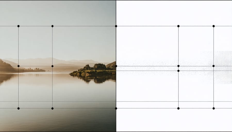
The rule of thirds grid divides your frame into nine equal sections using two horizontal and two vertical lines. While it may seem like a simple concept, understanding how to leverage this grid effectively can transform your photography from basic snapshots to compelling compositions.
When using the grid, place key elements of your scene along these lines or at their intersections (also called power points). For example, when shooting a landscape, try aligning the horizon with either the upper or lower horizontal line rather than cutting your image in half through the middle. This creates a more dynamic composition that draws viewers into the scene.
For portraits, position your subject’s eyes along the upper horizontal line and place them near one of the vertical lines rather than centering them in the frame. This creates negative space that adds context and visual interest to your image. The direction your subject is looking should typically face into this space, not away from it.
Remember that the grid isn’t meant to be a rigid rule but rather a flexible guide. Start by strictly following the grid to train your eye, then gradually learn when to break from it for creative effect. Most modern cameras and smartphones offer a grid overlay feature – take advantage of this tool while you’re learning, but don’t become overly dependent on it. With practice, you’ll naturally begin to visualize these lines even when they’re not visible in your viewfinder.
When to Break the Rules
While mastering composition rules is essential, knowing when to break them can lead to even more compelling photographs. The key is understanding that rules are guidelines rather than strict laws, and sometimes breaking them deliberately can create powerful visual impact.
Consider centering your subject instead of using the rule of thirds when you want to convey symmetry, power, or isolation. This works particularly well for architectural photography, reflections in water, or portrait shots where you want the subject to command complete attention.
Breaking compositional rules can be especially effective when:
– Capturing symmetrical patterns or reflections
– Emphasizing negative space
– Creating deliberate tension in the image
– Highlighting geometric shapes
– Shooting minimalist compositions
For instance, placing your horizon line in the middle of the frame – typically discouraged – can create a striking mirror effect in landscape photography. Similarly, positioning your subject dead center can emphasize their importance and create a bold, confrontational image.
The secret to breaking rules successfully lies in intention. Don’t break them because you don’t know better; break them because you know exactly what effect you’re trying to achieve. Remember, if your composition creates a strong emotional response or effectively communicates your vision, you’ve succeeded regardless of whether you followed traditional rules.
Experiment with different approaches, but always be mindful of your artistic intent. Sometimes the most memorable photographs are those that challenge conventional wisdom while maintaining visual interest and impact.
Leading Lines and Visual Flow
Natural Leading Lines
Natural leading lines are one of the most powerful tools in a photographer’s compositional arsenal, guiding viewers’ eyes through an image in an intuitive and engaging way. These lines exist abundantly in our environment, from winding roads and railway tracks to architectural elements and natural landscapes.
When photographing landscapes, look for elements like rivers, tree lines, or mountain ridges that create natural pathways through your frame. These features not only add depth to your images but also help establish a strong visual narrative. While capturing these scenes, remember to adjust your camera settings for landscapes to ensure optimal exposure and clarity.
In urban environments, staircases, bridges, and building facades offer compelling leading lines. Position yourself to maximize the impact of these elements – try shooting from different angles to see how the lines change and direct attention within your frame. The key is to use these lines purposefully, leading to a specific point of interest rather than letting them lead nowhere.
Remember that leading lines don’t always need to be straight. Curved paths, meandering streams, or spiral staircases can create even more dynamic and engaging compositions, adding a sense of movement and flow to your photographs.

Creating Artificial Leading Lines
While some scenes naturally present leading lines, photographers can actively create these powerful compositional elements to enhance their images. One effective technique is positioning subjects or objects in a way that forms implicit lines drawing the viewer’s eye through the frame. For example, arranging a series of rocks or pieces of driftwood on a beach can create a path leading to your main subject.
Lighting can also be used strategically to craft artificial leading lines. By carefully positioning your flash or external light source, you can create shadows that act as directional elements. Similarly, long exposure photography with light painting allows you to literally draw lines of light into your composition.
In urban environments, try positioning yourself to align multiple elements like lamp posts, bollards, or street furniture to form a continuous visual path. Even simple props like rope, ribbon, or fabric can be arranged to create compelling leading lines in still life or portrait photography.
When shooting portraits, pose your subject’s arms, legs, or body angle to create natural lines that guide viewers toward their face. In fashion photography, clothing folds and accessories can be deliberately arranged to form leading lines that complement the overall composition.
Remember that artificial leading lines should appear natural and purposeful rather than forced or distracting. The key is subtlety – these created lines should enhance your image’s story without drawing attention to their constructed nature.
Balance and Symmetry
Achieving Visual Balance
Visual balance in photography is like arranging weights on a scale – it’s about distributing visual elements across your frame to create harmony and stability. When elements are properly balanced, they guide the viewer’s eye naturally through the image while maintaining their interest.
The simplest form of balance is symmetrical, where similar elements mirror each other across the frame. Think of a reflection in still water or a perfectly centered architectural shot. While symmetry can create powerful images, it’s not the only way to achieve balance.
Asymmetrical balance is often more dynamic and interesting. This involves placing different elements that have varying visual weights to create equilibrium. For example, a small, bright object in one corner might balance a larger, darker mass in the opposite area. Color, size, shape, and texture all contribute to an element’s visual weight.
Consider the rule of visual mass: darker objects appear heavier than lighter ones, and larger objects carry more weight than smaller ones. You can use this principle to your advantage by placing a small, high-contrast element to balance a larger, less prominent one.
Radial balance occurs when elements radiate from a central point, like petals on a flower or spokes on a wheel. This creates a natural focal point while maintaining harmony throughout the frame.
Remember that achieving balance doesn’t mean your image needs to feel static. Sometimes, intentionally creating slight imbalance can add tension and drama to your composition, making it more compelling and memorable.
Symmetrical vs. Asymmetrical Composition
Balance in photography comes in two main flavors: symmetrical and asymmetrical composition. Each approach creates a distinct visual impact and can dramatically influence how viewers interpret your images.
Symmetrical composition creates a mirror-like effect, where elements on both sides of the frame are nearly identical. Think of a reflection in still water or a perfectly centered architectural shot. This technique works wonderfully for formal portraits, architectural photography, and landscapes where you want to convey a sense of order and stability. When shooting symmetrically, holding your camera steady becomes crucial to maintain precise alignment.
Asymmetrical composition, on the other hand, relies on visual weight rather than mirror images. It’s like balancing a see-saw with different-sized objects – you might have a large element on one side balanced by several smaller elements on the other. This approach often creates more dynamic, interesting images that draw viewers’ eyes through the frame. It’s particularly effective in street photography, environmental portraits, and creative landscape shots.
To master both techniques, start by practicing with simple subjects. For symmetry, try photographing buildings head-on or bridges reflected in water. For asymmetrical balance, experiment with the rule of thirds and place your main subject off-center, using secondary elements to create equilibrium. Remember, while symmetry requires precision, asymmetry offers more creative freedom and often produces more engaging results.
Framing and Perspective
Natural Framing Elements
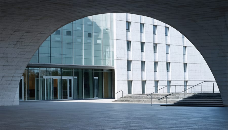
Natural framing is one of photography’s most powerful composition techniques, using elements in the environment to create a frame within your image. Think of it as nature’s way of drawing a border around your main subject. Common framing elements include archways, doorways, tree branches, rock formations, or even human-made structures like windows and bridges.
When using natural frames, look for elements that complement your subject rather than compete with it. For instance, shooting through an ancient stone archway can add depth and context to architectural photography, while overhanging tree branches can create an intimate, mysterious mood for portrait shots.
The beauty of natural framing lies in its versatility. In landscape photography, you might use a cave opening to frame a distant mountain range, creating a sense of depth and drawing the viewer’s eye toward the scene. For urban photography, consider using building corridors, alleyways, or tunnels to direct attention to your subject.
To effectively use natural frames:
– Ensure your frame doesn’t overpower the main subject
– Pay attention to the lighting within and around your frame
– Consider partial frames (they don’t need to surround all four sides)
– Use frames to add context or tell a story about your location
– Experiment with different perspectives and positions
Remember that natural frames can also add layers to your composition, creating a more dynamic and engaging image that guides viewers through your photograph exactly as you intend.
Creative Perspective Techniques
Changing your perspective can dramatically transform an ordinary scene into a compelling photograph. One of the most powerful ways to create impact is by getting low to the ground, known as the “worm’s eye view.” This angle can make subjects appear more imposing and create a sense of drama, particularly effective when photographing architecture or tall subjects.
Conversely, shooting from above, or “bird’s eye view,” can reveal patterns and compositions that aren’t visible from eye level. This perspective works wonderfully for landscape photography and urban scenes, revealing geometric shapes and leading lines that might otherwise go unnoticed.
Don’t forget about the power of tilting your camera. The Dutch angle, where you deliberately tilt your frame, can add dynamism and tension to your images. However, use this technique sparingly, as it can become distracting if overused.
Consider shooting through objects in your foreground to create natural frames or add depth to your composition. This could be through tree branches, doorways, or even crowds of people. This layering technique adds visual interest and guides the viewer’s eye through your image.
Remember that changing your physical position relative to your subject can dramatically affect the emotional impact of your photo. Getting close can create intimacy, while stepping back can provide context and tell a broader story. Sometimes, simply taking a few steps to the left or right can transform an ordinary composition into something extraordinary.
Color and Contrast in Composition
Color Harmony
Color harmony in photography is like orchestrating a visual symphony, where different hues work together to create emotionally compelling images. Understanding the color wheel is your first step toward mastering this technique. Complementary colors, which sit opposite each other on the wheel (like blue and orange, or purple and yellow), create dynamic tension and visual interest that naturally draws the viewer’s eye.
When working with natural light techniques, you’ll often find complementary colors in nature – think of a golden sunset against a deep blue sky, or vibrant autumn leaves against purple mountains. These combinations create striking contrasts that can make your images pop.
Analogous colors, which sit next to each other on the color wheel (like yellow, yellow-green, and green), create a more harmonious and peaceful feeling in your photographs. This approach works beautifully for landscape photography or portraits where you want to convey a sense of calm and unity.
To effectively use color harmony, try these practical tips:
– Look for naturally occurring color combinations in your environment
– Use color to guide the viewer’s attention to your subject
– Consider the emotional impact of your color choices
– Experiment with both bold contrasts and subtle harmonies
– Pay attention to how different times of day affect color relationships
Remember, sometimes breaking these rules deliberately can create powerful images, but understanding them first is key to knowing when to break them effectively.

Contrast as a Compositional Tool
Contrast is one of the most powerful tools in a photographer’s compositional arsenal, capable of transforming ordinary scenes into visually striking images. When we talk about contrast in photography, we’re not just limited to the interplay between light and dark – though this is certainly a fundamental aspect of mastering light in photography.
Think of contrast as a way to create visual tension and interest in your images. High contrast can draw attention to specific elements, while low contrast can evoke a more subtle, moody atmosphere. You can work with tonal contrast (blacks and whites), color contrast (complementary colors like blue and orange), or even conceptual contrast (smooth versus rough textures).
To effectively use contrast, start by identifying the primary subject of your image and consider how contrast can make it stand out. For instance, positioning a dark subject against a light background creates immediate visual impact. Similarly, a splash of vibrant color in an otherwise monochromatic scene can become a powerful focal point.
Remember that contrast doesn’t always mean extreme differences – subtle variations can be just as effective, especially when you’re aiming for a more nuanced emotional response from your viewers. Experiment with different levels of contrast to find what best serves your creative vision.
Common Composition Mistakes (And How to Fix Them)
Even experienced photographers occasionally stumble into common composition pitfalls, but recognizing these mistakes is the first step to avoiding them. Let’s explore some frequent composition errors and their solutions.
One of the most common mistakes is centering everything. While the rule of thirds isn’t absolute, constantly placing subjects dead-center can make images feel static and uninteresting. Instead, try positioning your main subject off-center to create more dynamic and engaging compositions.
Another frequent error is cluttered backgrounds that compete with the main subject. To fix this, take a moment before shooting to scan the entire frame. Look for distracting elements like branches, signs, or bright objects that draw attention away from your subject. Sometimes, simply changing your position or shooting angle can eliminate these distractions.
Horizons that aren’t level can ruin an otherwise perfect shot. While this is easily corrected in post-processing, it’s better to get it right in-camera. Use your camera’s built-in grid or electronic level, or look for natural horizontal lines in the scene to ensure straight horizons.
Many photographers also struggle with leaving too little breathing room around their subjects. This cramped composition can make images feel claustrophobic. Give your subjects space to “look” into the frame, and ensure there’s adequate room around the edges for a more balanced composition.
Finally, avoid cutting off important parts of your subject at the edges of the frame. Pay special attention to joints in portrait photography – cutting off at ankles, knees, wrists, or elbows can make images appear awkward. Instead, crop deliberately at natural break points or include the entire element in your frame.
Mastering composition techniques in photography is a journey that requires both knowledge and practice. The principles we’ve explored – from the rule of thirds to leading lines, symmetry to framing – serve as powerful tools in your creative arsenal. However, remember that these guidelines are meant to inspire rather than restrict your artistic vision. The best photographers know when to follow these rules and when to break them for dramatic effect.
As you continue developing your photographic eye, start by consciously implementing one technique at a time in your shoots. Take multiple shots of the same subject using different compositional approaches to understand how each method affects the final image. Don’t be afraid to experiment and make mistakes – they’re valuable learning opportunities.
Keep in mind that strong composition isn’t about following a strict formula; it’s about creating images that effectively communicate your intended message or emotion. With practice, these techniques will become second nature, allowing you to focus more on capturing the perfect moment rather than thinking about rules.
Take your camera out regularly, challenge yourself with different subjects, and most importantly, enjoy the creative process. Your unique perspective, combined with these fundamental composition techniques, will help you create compelling photographs that stand out and tell powerful stories.