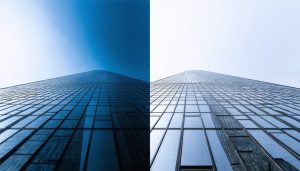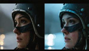
Yellow color grading transforms ordinary footage into compelling visual narratives, wielding warmth and psychological impact that spans from subtle vintage aesthetics to bold, modern statements. Master cinematic color grading techniques by understanding how yellow’s tonal variations evoke specific emotional responses – from the golden hour’s nostalgic embrace to the high-contrast urgency of contemporary thrillers. While most colorists focus solely on saturation levels, the true art lies in manipulating yellow’s interaction with complementary blues and its influence on skin tones. Professional colorists leverage yellow’s unique ability to create depth through selective grading, using power windows and precise HSL qualifiers to target specific image elements without affecting the entire frame. This targeted approach, combined with yellow’s natural ability to draw viewer attention, creates sophisticated visual hierarchies that guide audience focus while maintaining the footage’s organic feel.
The Science Behind Yellow Color Grading
Color Temperature and Mood
Yellow color grading plays a pivotal role in setting the emotional temperature of an image or scene. When applied thoughtfully, yellow tones can create a sense of warmth that instantly makes viewers feel more comfortable and connected to the subject matter. Think of how the golden hour’s natural yellow light makes everything feel more inviting and nostalgic.
In color psychology, yellow is associated with optimism, happiness, and energy. When incorporated into color grading, these qualities can enhance feelings of comfort and well-being in your audience. A subtle yellow grade can make indoor scenes feel more intimate and welcoming, while stronger yellow tones might evoke memories of sun-soaked summer afternoons.
However, it’s essential to strike the right balance. Too much yellow can create an artificial or sickly appearance, potentially making viewers uncomfortable rather than relaxed. The key lies in understanding that different yellow temperatures convey different moods – warmer, orange-leaning yellows tend to feel more comforting, while cooler, greenish yellows might create tension or unease.
For best results, consider the context of your shot and the story you’re trying to tell. A family gathering might benefit from warm, honey-toned yellows, while a documentary about urban life might call for more neutral yellow grading.
Yellow’s Role in Visual Hierarchy
Yellow plays a crucial role in guiding viewers’ attention within a frame, making it a powerful tool in visual composition principles. When used strategically in color grading, yellow creates natural focal points that draw the eye while establishing visual hierarchy within your scenes.
Think of yellow as a spotlight in your visual narrative. Due to its high luminance value, even subtle yellow tones can create emphasis without overwhelming the frame. For instance, in street photography, a yellow taxi or storefront sign naturally becomes a point of interest, while in portraiture, warm yellow highlights can guide attention to your subject’s face.
The key is understanding yellow’s weight in your composition. Brighter yellow elements will dominate darker or cooler tones, so consider placement carefully. You can use this to your advantage by slightly boosting yellow in areas where you want viewers to look first, while desaturating it in less important regions. This selective approach helps create a clear visual path through your image, enhancing storytelling and emotional impact.
Remember that yellow’s attention-grabbing nature means a little goes a long way. Subtle adjustments often work better than dramatic shifts, allowing you to direct attention without making your color grading obvious or distracting.
Yellow Grading Techniques
Basic Yellow Grading Methods
Mastering yellow color grading starts with understanding the fundamental techniques that create that warm, inviting aesthetic. When combined with proper cinematic lighting, these methods can transform your images dramatically.
Begin by adjusting your white balance toward the warmer end of the spectrum, typically between 5000K and 6500K. This creates a natural foundation for yellow toning. Next, focus on your highlights and mid-tones using the color balance tools in your preferred editing software. Gradually increase yellow saturation in these areas while maintaining natural skin tones.
The split-toning technique is particularly effective for yellow grading. Start by adding yellow to your highlights (around 10-15% saturation) and complementary blue to your shadows (5-10% saturation). This creates depth while maintaining a cohesive look. For a more subtle approach, use the selective color adjustment tool to fine-tune specific color channels.
Don’t forget to work with your curves. Adding slight adjustments to the red and green channels can enhance the yellow tones without making them appear artificial. A gentle S-curve in these channels often yields the most natural results.
Remember to periodically toggle your adjustments on and off to ensure you’re not overdoing the effect. The goal is to create a warm, inviting atmosphere that enhances your image without drawing attention to the grading itself.
Advanced Selective Coloring
Advanced selective coloring with yellow requires a precise approach to target specific areas while maintaining natural-looking results. Using luminance masks and color range selections, you can isolate particular elements of your image for yellow color grading without affecting the entire frame.
Start by creating a selection based on brightness values, which helps preserve detail in highlights and shadows. For instance, when working with a sunset scene, you might want to enhance the yellow tones in the mid-tones while keeping the deep shadows neutral. Use the Color Range tool to select specific color channels, then refine your selection with feathering to ensure smooth transitions.
Layer masks are your best friends for precise control. Paint with varying opacity levels to selectively apply yellow grading – higher opacity for areas needing stronger enhancement, lower opacity for subtle adjustments. When working with skin tones, use a lower opacity (around 10-15%) to avoid making subjects look jaundiced.
For complex scenes, consider using multiple adjustment layers with different blending modes. Soft Light works well for subtle yellow warmth, while Overlay can create more dramatic effects. Remember to use adjustment layers with curves and selective color to fine-tune the intensity and balance of your yellow grading.
Pro tip: Create custom brushes with varying hardness levels for precise masking around difficult areas like hair or foliage. This allows for natural-looking transitions between graded and ungraded areas.
Balancing Yellow with Other Tones
Balancing yellow tones with other colors is crucial for achieving natural-looking results in your color grading work. The key lies in understanding that yellow rarely exists in isolation – it’s usually accompanied by complementary or contrasting colors that help create depth and visual interest.
Start by identifying the dominant colors in your image besides yellow. In most cases, you’ll want to maintain a balance between warm and cool tones. For example, if you’re enhancing yellow in a sunset shot, consider slightly cooling down the shadows with subtle blues to create a more balanced look. This prevents the image from becoming overwhelmingly warm.
When working with skin tones, be particularly careful with yellow adjustments. Too much yellow can make subjects appear jaundiced or sickly. Instead, aim for subtle warmth by using selective color grading tools to target specific areas while preserving natural skin coloration.
A helpful technique is to use split-toning, where you can add yellow to the highlights while maintaining cooler midtones and shadows. This creates depth while avoiding an artificial appearance. Remember to periodically toggle your adjustments on and off to ensure you haven’t gone too far – sometimes stepping away for a few minutes helps provide fresh perspective.
For landscape shots, consider the time of day you’re depicting. Morning light naturally contains more yellow, while evening light tends toward orange and red. Adjust your yellow grading accordingly to maintain authenticity in your final image.
Common Yellow Grading Mistakes
Oversaturation Issues
One of the most common pitfalls in color grading is excessive yellow tinting, which can make your images look artificial or sickly. The key to avoiding oversaturation lies in maintaining subtle balance and knowing when to pull back. Start by working with small adjustments – it’s easier to add more yellow than to correct an oversaturated image.
A helpful technique is to periodically toggle your yellow adjustments on and off while editing, giving your eyes a chance to reset. This prevents gradient blindness, where you become desensitized to the intensity of the yellow tones. Additionally, take breaks during editing sessions to maintain fresh perspective.
When working with skin tones, pay special attention to avoid the “jaundiced” look. Use reference images of natural skin tones and consider creating a split-screen view to compare your grading against the original footage. If you’re targeting a warm, golden hour look, focus on selective adjustments rather than applying yellow tints globally.
Remember that different display devices might show colors differently. Always check your work on multiple screens and consider how your audience will view the final product.
Color Balance Problems
Balancing yellow tones while maintaining natural color harmony can be one of the trickiest aspects of color grading. When pushing yellow into your images, it’s essential to watch for unwanted color shifts in skin tones, which can make subjects appear jaundiced or sickly. To prevent this, always monitor your vectorscope while adjusting yellow values, and pay special attention to maintaining proper separation between yellow and red channels.
A common pitfall is over-saturating yellows in an attempt to achieve a warm, golden look. This can lead to muddy shadows and loss of detail in highlight areas, particularly in nature scenes or architectural shots. Instead, try working with selective color adjustments, targeting specific luminance ranges to maintain detail while enhancing yellow tones.
To preserve overall color harmony, consider using complementary colors as counterbalances. Blues and purples can help create a balanced palette when working with strong yellow grades. Additionally, using parallel color grading techniques – adjusting multiple colors simultaneously while maintaining their relative relationships – can help prevent yellow from becoming too dominant in your final image.
Remember that yellow affects perceived brightness significantly, so subtle adjustments often yield better results than dramatic ones. Start with small increments and regularly toggle your adjustments on and off to ensure you’re maintaining a natural look.
Real-World Applications
Portrait Photography
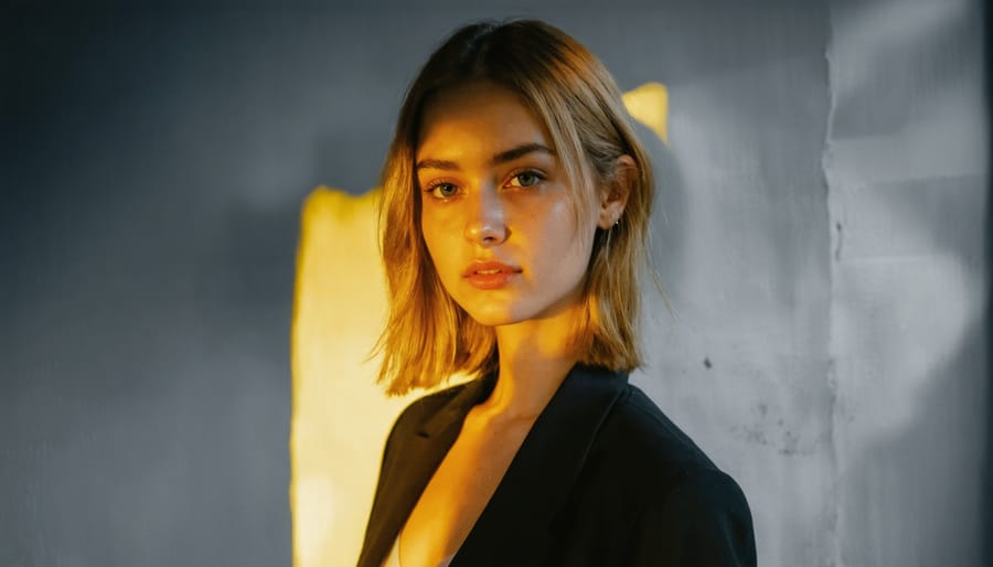
Yellow color grading can work wonders in portrait photography, particularly when it comes to enhancing skin tones and creating a warm, inviting atmosphere. When applied thoughtfully, yellow tones can add a golden hour-like quality to your portraits, even when shooting under less-than-ideal lighting conditions.
Start by introducing subtle yellow tints to the highlights while maintaining natural skin tones in the mid-tones. This technique creates a luminous glow that’s especially flattering for portraiture. You can achieve this effect through your editing software’s selective color adjustments or by using lens filters during the shoot.
For darker skin tones, be particularly careful with yellow grading – use it to enhance natural undertones rather than dramatically alter them. A touch of yellow in the shadows can add depth and dimension while maintaining authenticity. Light skin tones can benefit from yellow grading in the highlights to create a sun-kissed effect, but avoid pushing the effect too far as it can make subjects appear jaundiced.
Consider the emotional impact of yellow grading in your portraits. Warmer yellow tones often convey happiness, optimism, and comfort, making them perfect for lifestyle portraits or family photography. For professional headshots, opt for more subtle yellow grading to maintain a polished, natural look while still benefiting from its skin-enhancing properties.
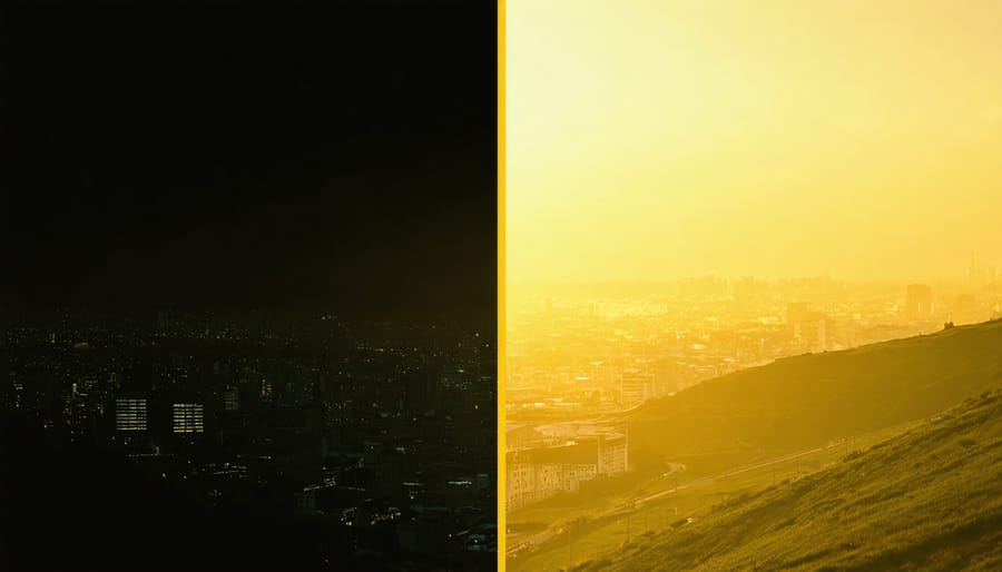
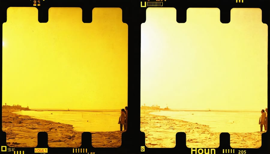
Landscape and Urban Photography
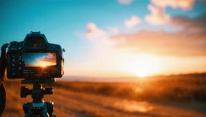
Yellow color grading can transform landscape and urban photography, adding warmth and nostalgia to environmental shots. In landscape photography, yellow grading works particularly well during golden hour, enhancing the natural warm tones of sunrise or sunset. It can turn an ordinary countryside scene into a dreamy, ethereal vista by emphasizing the golden qualities of natural light.
When applying yellow grading to urban scenes, the technique can create a vintage aesthetic that’s particularly effective with architecture photography. Old buildings take on a timeless quality, while modern structures gain a warmer, more inviting appearance. The yellow tint can soften harsh concrete and glass surfaces, making cityscapes feel more approachable and less sterile.
For the best results, start with subtle adjustments to your yellow saturation and temperature settings. Pay special attention to the highlights and mid-tones, where yellow grading can have the most impact. In urban settings, be mindful of artificial lighting sources, as yellow grading can intensify sodium vapor street lamps and indoor lighting bleeding through windows.
Weather conditions also play a crucial role in yellow grading success. Overcast days benefit from yellow tones that add warmth to otherwise flat lighting, while clear blue skies can be transformed into more dramatic golden-hour scenes. When shooting in fog or mist, yellow grading can create an atmospheric, almost painterly effect that adds depth and dimension to your environmental shots.
Remember to maintain natural skin tones in any people present in your urban shots, as excessive yellow grading can make subjects appear jaundiced or artificial.
Yellow color grading is a powerful tool that can transform your images and videos when used thoughtfully and purposefully. As we’ve explored throughout this guide, the key to successful yellow grading lies in understanding its psychological impact, technical application, and contextual relevance.
Remember to always start with a clear creative vision before diving into the grading process. Whether you’re aiming for a warm, nostalgic feel or a bold, contemporary look, yellow grading can help you achieve your desired outcome when applied with intention and restraint.
Keep these essential tips in mind as you experiment with yellow color grading:
– Always preserve skin tones and critical elements in your composition
– Use secondary color correction to maintain balance with other hues
– Test your grades across different displays to ensure consistency
– Consider the emotional response you want to evoke in your audience
– Start subtle and build up gradually rather than beginning with extreme adjustments
Don’t be afraid to break conventional rules once you’ve mastered the basics. Some of the most compelling visual stories emerge from creative experimentation. However, always ensure your color choices serve the narrative and enhance rather than distract from your subject matter.
With practice and patience, you’ll develop an intuitive sense for when and how to implement yellow grading effectively. Keep experimenting, stay observant of yellow grading in professional work, and continue refining your technique to create truly memorable visual experiences.