
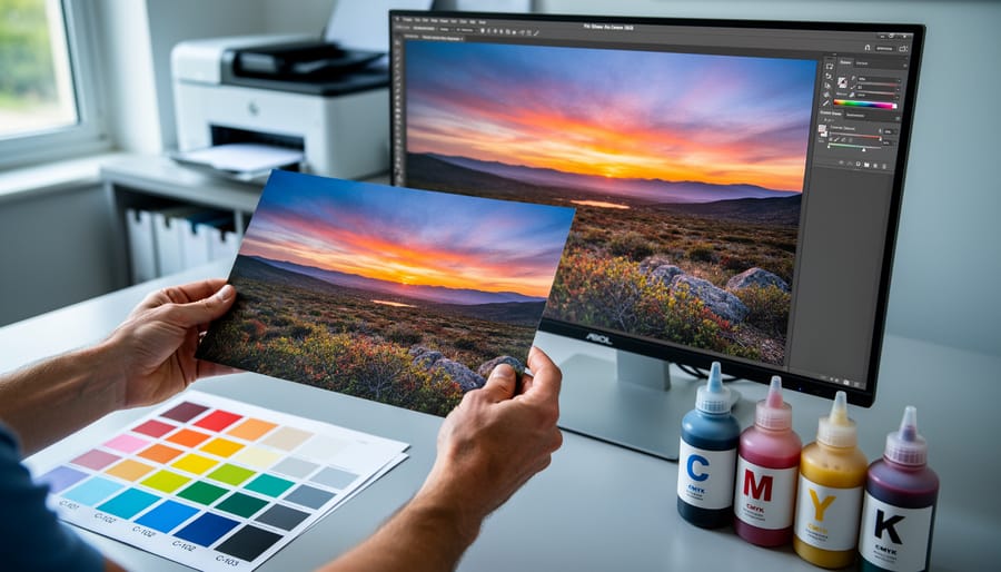
You’ve spent hours perfecting an image in Lightroom—the colors are vibrant, the tones balanced—only to receive prints that look muddy, flat, or completely wrong. The culprit? A fundamental misunderstanding of how colors translate from screen to paper. When you edit photos, you’re working with light-based RGB colors, but commercial printing uses either process colors (CMYK inks mixed to create your image) or spot colors (premixed inks for exact shades). This distinction directly impacts whether your sunset oranges stay brilliant or turn dull, whether your carefully crafted blues remain true or shift unexpectedly.
Process color printing combines cyan, magenta, yellow, and black inks in varying percentages to reproduce millions of colors—the standard for photo prints and most publications. Spot colors use premixed inks like Pantone formulations to achieve specific, consistent hues that CMYK can’t always replicate accurately, typically reserved for logos, branding elements, or when exact color matching is non-negotiable. For photographers, understanding this difference transforms how you prepare files, utilize soft proofing techniques, and communicate with print labs.
Most photography prints use process color exclusively, but knowing when certain colors fall outside CMYK’s reproducible range—its gamut—prevents frustrating surprises. This guide breaks down both systems, shows you how to identify potential color problems before printing, and provides practical workflow adjustments that ensure your prints match your vision.
The Two Worlds of Color: Process and Spot Explained
What Process Color Really Means for Photographers
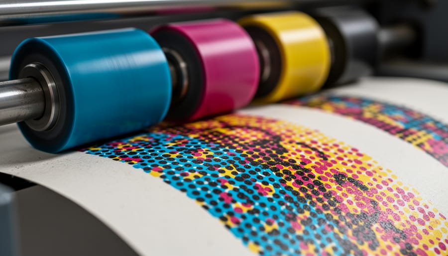
Process color is the foundation of how your photographic prints come to life on paper, whether you’re creating a portfolio book, gallery prints, or magazine spreads. The term refers to the CMYK printing method—cyan, magenta, yellow, and black inks—that work together to reproduce the full spectrum of colors in your images.
Here’s how it works: your printer lays down tiny dots of these four inks in varying densities and patterns. When you look at the print from a normal viewing distance, your eye blends these dots together to perceive millions of different colors. That stunning sunset you captured? It’s actually hundreds of tiny cyan, magenta, yellow, and black dots working in harmony. The density and overlap of these dots determine whether you see a rich crimson or a soft peachy glow.
This matters tremendously for photographers because the process color system has limitations compared to what your camera captures. Your digital files exist in RGB (red, green, blue), which represents a wider range of colors than CMYK can reproduce. Those vibrant electric blues in a tropical lagoon or the intense greens of spring foliage might appear slightly muted when converted to process color for printing.
Real-world applications are everywhere in photography. Coffee table books showcasing travel photography use process color. Magazine editorial spreads rely on it. Even those gorgeous fine art prints from online labs typically use advanced CMYK printing. Understanding this helps you prepare your images properly, adjusting saturation and tones during editing to compensate for the translation from screen to paper.
Spot Colors: When Precision Trumps Everything
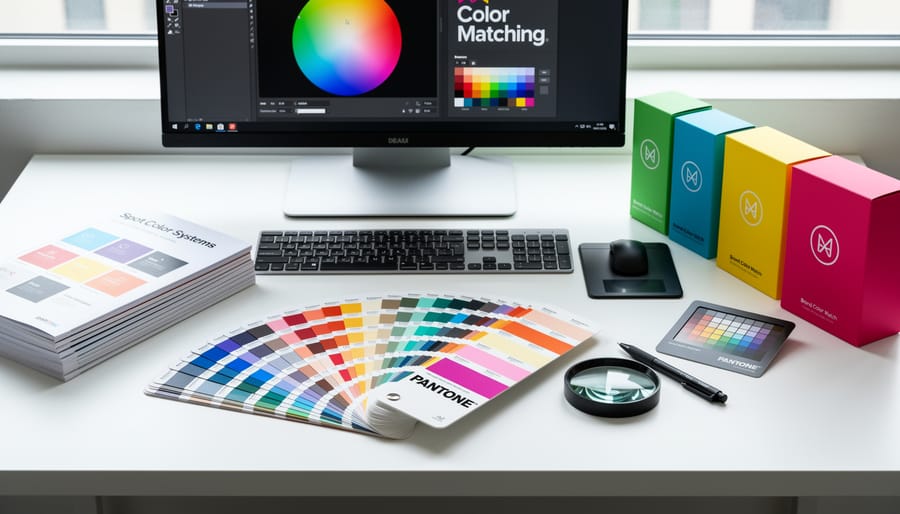
While process colors mix inks to approximate colors, spot colors take a completely different approach. A spot color is a premixed ink formulated to produce one exact, consistent color. Think of it like buying a can of paint mixed to a specific shade at the hardware store, rather than trying to recreate that shade by mixing primary colors on your palette at home.
The most recognized spot color system is Pantone, which provides a standardized library of over a thousand precisely formulated colors. Each Pantone color has a unique number and name, ensuring that Pantone 185 Red looks identical whether printed in Tokyo, Toronto, or Tanzania. This consistency matters tremendously when brand identity is at stake. When Nike needs that exact swoosh orange or Tiffany requires that signature robin’s egg blue, they specify a Pantone spot color.
As a photographer, you’ll most likely encounter spot colors when creating branded materials like business cards, promotional postcards, or portfolio books where your logo must match perfectly across all printed pieces. Art book publishers sometimes use spot colors for specific design elements or to achieve colors impossible with standard CMYK, like metallic golds, fluorescent pinks, or rich blacks.
Here’s the practical reality: spot colors cost more because each one requires its own printing plate and ink reservoir. That’s why most photographic prints stick with process colors. However, if you’re producing high-end marketing materials or limited edition artist books where color precision and special finishes matter, spot colors become worth the investment. Understanding when to specify them demonstrates professional print knowledge.
Where Your Color Management Workflow Fits In
Why Your Monitor Shows What Your Printer Can’t Deliver
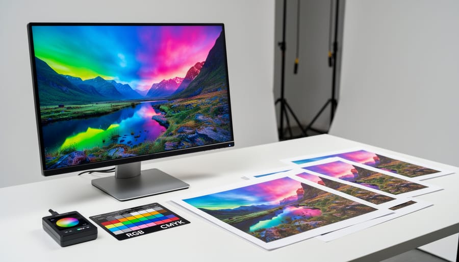
You’ve likely experienced this frustrating scenario: you’ve spent hours perfecting an image on your monitor, adjusting that brilliant turquoise sky to absolute perfection, only to receive prints where those same vibrant hues look dull and muddy. The culprit isn’t a faulty printer or poor print quality—it’s the fundamental difference between how screens and printers create color.
Your monitor uses RGB (red, green, blue), which creates colors by emitting light. Think of it like shining colored flashlights together—the more light you add, the brighter things get, eventually reaching pure white when all three colors combine at full intensity. This additive color system can produce an incredibly wide range of vibrant, luminous colors because it’s literally made of light.
Process printing, however, uses CMYK (cyan, magenta, yellow, and black), which works by absorbing light. When you look at a printed page, you’re seeing light that bounces off the paper after passing through layers of ink. This subtractive process has inherent limitations. Each ink layer absorbs certain wavelengths of light, and the more ink you add, the darker and muddier the result becomes. The range of colors a system can reproduce is called its color gamut, and CMYK’s gamut is significantly smaller than RGB’s.
Those electric blues, neon greens, and brilliant oranges that look stunning on your screen often fall outside CMYK’s reproducible range. When you send these colors to print, they get automatically converted to the closest CMYK equivalent—which might be considerably less vibrant. Understanding this limitation isn’t about accepting inferior prints; it’s about working smarter by soft proofing your images in CMYK mode before sending them to the printer, allowing you to make informed adjustments that translate beautifully to the printed page.
When Spot Color Becomes Your Secret Weapon
While process color handles most photographic printing needs beautifully, there are situations where spot colors become your best friend. Think of spot colors as your insurance policy for absolute color accuracy.
Brand work is where spot colors truly shine. If you’re shooting for a corporate client whose logo features a specific Pantone color, that exact shade matters tremendously. A soft drink company’s signature red or a tech company’s particular blue isn’t just aesthetic preference—it’s brand identity worth millions. When you specify a spot color for these elements, you’re guaranteeing that red will look identical whether printed in New York or Tokyo.
Metallic and fluorescent effects represent another prime opportunity. Standard CMYK simply cannot reproduce true metallic gold, silver, or copper tones. If you’re creating a high-end portfolio piece, gallery announcement, or luxury product catalog where metallic accents elevate the design, spot colors with metallic inks deliver results that process printing can’t touch. The same applies to fluorescent colors that need to pop off the page with intensity CMYK can’t achieve.
Limited edition prints and fine art projects often benefit from spot color varnishes or fifth-color additions. You might print your image in CMYK but add a spot varnish to emphasize certain areas—perhaps adding extra richness to jewelry in a fashion shoot or making water appear more luminous in a landscape.
The tradeoff? Spot colors increase printing costs since each requires its own press run. For critical projects where color accuracy trumps budget concerns, though, spot colors deliver unmatched reliability.
Soft Proofing: Your Bridge Between Screen and Print
Setting Up Soft Proofing in Your Favorite Photo Editor
Soft proofing is your secret weapon for previewing how your images will look when printed with process or spot colors. Think of it as a dress rehearsal before the big performance. Modern photo editing software includes powerful soft proofing tools that simulate different printing conditions right on your screen.
In Photoshop, navigate to View, then Proof Setup, and select Custom. Here’s where it gets practical: choose your specific printer and paper profile from the Device to Simulate dropdown menu. The most critical setting is Rendering Intent. For photographs, start with Perceptual, which maintains the relationship between colors even if it shifts them all slightly. Check the Black Point Compensation box to preserve shadow detail. Enable the Preview option to see your image transform in real-time. Notice how those vibrant blues might dullen slightly? That’s process color limitations showing themselves before you waste paper and ink.
Lightroom users should head to the Soft Proofing button below the histogram in the Develop module. Select your profile under Other, then choose your rendering intent. The white background surrounding your image changes to paper white, giving you an accurate preview of how your bright whites will actually appear on your chosen paper stock.
In Capture One, access Proof Recipe from the top toolbar. Create a new recipe with your printer profile and rendering intent. The side-by-side comparison view here is particularly helpful for spotting color shifts between your working space and the final output.
Pro tip: calibrate your monitor regularly. Even the best soft proofing setup falls apart if your display isn’t showing accurate colors to begin with.

Reading the Warning Signs: Out-of-Gamut Colors
You’ve probably seen them—those little warning triangles or exclamation marks that appear in Lightroom or Photoshop when you’re working with certain colors. These are gamut warnings, and they’re your software’s way of saying, “Hey, this color you’re seeing on screen? It’s not going to print the way you think it will.”
Here’s what’s actually happening: Your monitor displays colors using RGB (red, green, blue) light, which has a wider range of colors than what process printing can physically reproduce with CMYK inks. When a color exists in the RGB space but falls outside the CMYK gamut, your software flags it. Think of those vibrant, electric blues and saturated oranges you might add during editing—they’re often the culprits.
To spot these warnings in Photoshop, enable gamut warning from the View menu. Out-of-gamut colors will display as a gray overlay on your image. In Lightroom’s Soft Proofing module, these colors appear highlighted when you toggle the gamut warning option. Don’t panic when you see them—they’re informational, not catastrophic.
The real question is what to do about them. You have two approaches: You can adjust those specific colors to bring them into gamut by reducing saturation or shifting hues slightly, or you can let your software handle the conversion automatically when you export to CMYK. The first approach gives you more control, while the second is faster but less predictable.
My recommendation? Use soft proofing to preview how your image will actually look when printed, then make selective adjustments only to the areas that show significant color shifts. Sometimes a small tweak to saturation preserves your creative intent while ensuring accurate reproduction. Other times, you might decide that keeping the vibrant screen version matters more than print accuracy—and that’s a valid creative choice too.
Making Color Decisions That Actually Print Well
Converting RGB Images for Process Color Printing
Converting your RGB images to CMYK doesn’t have to be a guessing game, but timing and technique matter more than you might think. The key question isn’t just how to convert, but when to do it in your workflow.
Here’s the straight truth: keep your images in RGB throughout your entire editing process. RGB has a wider color gamut than CMYK, giving you more flexibility for all those editing decisions you’re making. Only convert to CMYK as the absolute last step before sending files to your printer. Think of it like this: you wouldn’t want to paint a masterpiece with half your colors missing from the palette.
When you’re ready to convert, the right color profile makes all the difference. Your commercial printer should provide their specific ICC profile, which accounts for their particular presses, inks, and paper stocks. If they can’t provide one, FOGRA39 (Coated V2 in Adobe applications) serves as a reliable industry-standard profile for coated papers in North America and Europe.
In Photoshop, navigate to Edit, Convert to Profile, and select your printer’s ICC profile. Avoid simply changing the color mode, as this bypasses proper color management and typically produces disappointing results.
Expect some color shift during conversion, it’s unavoidable physics. CMYK simply can’t reproduce those brilliant, saturated blues and vibrant oranges that your RGB monitor displays effortlessly. The solution? Soft proofing before you convert. Enable View, Proof Colors in Photoshop to simulate how your image will actually print. This preview lets you make informed adjustments to compensate for problem areas before finalizing the conversion, saving you from expensive reprinting surprises.
Communicating with Printers About Color Expectations
Before sending your files to print, having a clear conversation with your print service can save both headaches and money. Start by asking what color profiles they recommend for your specific output—whether that’s fine art prints, gallery canvases, or photo books. Most commercial printers work primarily with process colors (CMYK), which handle the majority of photographic work beautifully.
However, if your image features critical brand colors, vibrant oranges, metallic tones, or specific hues that must match exactly, mention this upfront. Ask to see their color gamut chart or request test prints. A reputable printer will be honest about what their process color capabilities can reproduce versus what might require spot color additions. For example, if you’re printing a series for a corporate client with strict brand guidelines, spot colors might be essential. For landscape photography or general portfolio work, accepting process color limitations is usually the practical choice.
Request soft proofs whenever possible—these are digital simulations showing how your colors will translate to their specific printer and paper combination. Incorporate reviewing these proofs into your photo editing workflow before final approval. Be realistic: some colors visible on your calibrated monitor simply cannot be reproduced with ink on paper. Rather than fighting this limitation, work with your printer to find the closest achievable match. Ask questions about paper choices too, since substrate dramatically affects color appearance. A glossy paper might handle saturated blues better than matte, for instance. Building this relationship with your print service ensures consistent, predictable results across all your projects.
Common Pitfalls (And How to Avoid Them)
The ‘Brilliant Blue Sky’ Problem
You’ve captured that perfect azure sky—vibrant, electric blue that stretches endlessly across your frame. But when it comes back from the printer, it looks flat, muted, almost grayish. Welcome to one of CMYK printing’s most frustrating limitations.
The problem lies in the CMYK gamut’s inability to reproduce highly saturated blues and cyans. That brilliant sky blue you see on your RGB monitor simply doesn’t exist in process color printing. The cyan ink used in CMYK can’t reach the same intensity as the light-based blues your screen produces.
Here’s the practical fix: during editing, slightly desaturate and darken your bright blues before sending files to print. Instead of maxing out cyan at 100%, try pulling back to 85-90% and adding a touch of magenta to give the blue more depth. This creates a richer, more dimensional blue that actually looks more saturated in print than a fully maxed-out cyan.
Use soft proofing in Photoshop or Lightroom to preview how your blues will translate to CMYK. It’s counterintuitive, but what looks slightly duller on screen often prints more vibrantly. Think of it as pre-compensating for the medium’s limitations—you’re working with the printing process, not against it.
When Spot Color Quotes Make Your Eyes Water
Let’s talk money. Spot color printing typically costs more than standard CMYK process printing, especially for small print runs. Why? Each spot color requires its own printing plate and ink setup, which adds both time and materials to the job. If your stunning landscape photo needs that perfect Pantone blue for the sky, you’re looking at additional charges per color beyond the standard four-color process.
Here’s the reality check: spot colors make financial sense when color accuracy is non-negotiable. Think gallery exhibitions, limited edition prints, or client work where brand colors must match perfectly. A corporate photographer delivering headshots with company logo overlays needs those brand colors spot-on, making the investment worthwhile.
For budget-conscious photographers, consider these alternatives. Extended gamut printing uses additional process inks to approximate spot colors without custom plates. Many professional print shops now offer seven-color or eight-color presses that bridge the gap beautifully. Another option? Reserve spot colors for accent elements rather than full images. That metallic gold border on your print portfolio? Perfect spot color candidate. The photograph itself? Process color works wonderfully.
The sweet spot is understanding when precision justifies the premium. For personal projects or general stock photography, process color delivers excellent results at a fraction of the cost.
Understanding the difference between process and spot colors isn’t just technical knowledge—it’s practical power that directly impacts your final prints. When you grasp how CMYK builds colors through layered dots versus spot colors delivering precise, premixed hues, you gain control over the entire printing process. This knowledge helps you communicate effectively with printers, anticipate potential color shifts, and make informed decisions during editing.
Soft proofing bridges the gap between your screen and the printed page, letting you preview how process colors will actually render before committing to production. Rather than relying on guesswork or expensive test prints, you can adjust your images with confidence, knowing exactly what to expect. Start experimenting with soft proofing in your workflow today—convert a few images to CMYK, compare them to your RGB originals, and notice the differences. This hands-on experience will transform how you prepare files for print, saving you time, money, and frustration while ensuring your creative vision translates beautifully from screen to paper.