
You’ve spent hours perfecting an image on your calibrated monitor—adjusting shadows, tweaking colors, getting the skin tones just right. The file goes to your printer, and when you open the package days later, your heart sinks. The colors are dull, the blues have shifted to purple, and those carefully crafted highlights are blown out. Sound familiar?
This disconnect between screen and print is one of the most common frustrations in photography, but it’s also one of the most preventable. The culprit isn’t usually your printer or paper—it’s the absence of color proofing in your workflow. Color proofing, specifically soft proofing, is the process of simulating how your image will appear when printed, right on your screen, before you commit to paper and ink.
Think of soft proofing as a preview function on steroids. While your monitor displays colors in RGB (red, green, blue) using light, your printer outputs in CMYK or other ink-based color spaces that have a narrower range of reproducible colors. What looks vibrant and saturated on screen might be physically impossible for your printer to recreate. Soft proofing reveals these limitations before you waste materials and time.
The good news? Once you understand the fundamentals of color management and implement a proper soft proofing workflow, you’ll gain precise control over your final prints. You’ll know exactly what to expect, make informed editing decisions, and produce prints that match your creative vision consistently.
What Color Proofing Actually Means
The Screen-to-Print Problem Every Photographer Faces
You’ve spent hours perfecting an image on your computer screen. The colors are vibrant, the tones are balanced, and everything looks exactly how you envisioned it. Then the print arrives, and your heart sinks. The blues look purple, the skin tones appear too orange, and those deep shadows you carefully crafted have turned into muddy black blobs. Sound familiar?
This frustrating disconnect happens because screens and printers speak fundamentally different color languages. Your monitor displays colors using RGB (Red, Green, Blue), which works by emitting light. Think of it like shining colored flashlights: when you combine red, green, and blue light at full intensity, you get white. This is called additive color, and it can produce incredibly bright, luminous colors because it’s literally generating light.
Printers, however, use CMYK (Cyan, Magenta, Yellow, and Black), which relies on reflected light. Ink on paper absorbs certain wavelengths and reflects others back to your eye. This is subtractive color: the more ink you add, the darker things get. When you combine cyan, magenta, and yellow at full strength, you theoretically get black (though printers add a separate black ink for richer results).
Here’s the catch: RGB can display colors that CMYK simply cannot reproduce on paper, particularly those electric blues, bright greens, and neon-like hues you see glowing on screen. When you send an RGB image to print without accounting for these limitations, the printer makes its best guess at translating those colors, often with disappointing results. That’s where color proofing becomes essential.

Where Soft Proofing Fits in Your Workflow
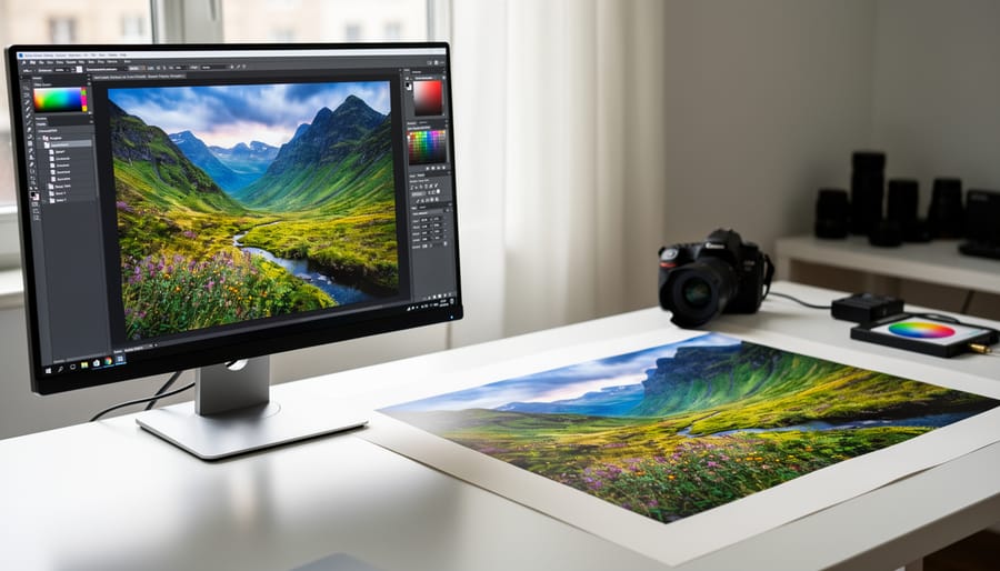
Soft proofing sits comfortably in the middle of your post-processing workflow, acting as a critical checkpoint between editing and printing. Think of it as a final quality control step before you commit to paper and ink.
Here’s where it fits: You’ve finished your primary editing in Lightroom or Photoshop, adjusting exposure, color balance, and sharpening to perfection. Your image looks stunning on screen. This is the moment to activate soft proofing before making your final export decisions.
During soft proofing, you’ll preview how your specific printer and paper combination will reproduce those colors. You might discover that vibrant sunset red you loved will actually print much duller, or those deep shadow details won’t survive the transition. This preview gives you the opportunity to make targeted adjustments, like boosting saturation slightly or lightening shadows, compensating for the limitations of your output medium.
Once you’ve tweaked your image while viewing the soft proof, you can export with confidence, knowing what to expect when your print emerges. This single step eliminates the costly trial-and-error cycle of reprinting until you get it right.
How Soft Proofing Works Behind the Scenes
Color Profiles: The Translator Between Devices
Think of color profiles like travel phrasebooks. Just as a phrasebook translates English to French, an ICC profile (International Color Consortium profile) translates color information between different devices. Your camera sees colors one way, your monitor displays them differently, and your printer interprets them in yet another language entirely.
Every device has its own color vocabulary, what we call a color gamut, the range of colors it can capture, display, or reproduce. A high-end monitor might speak fluent “vibrant blue,” while your inkjet printer can only manage “moderately saturated blue.” Some printers excel at warm tones but struggle with deep blues, while others do the opposite. Even the same printer produces different results on glossy versus matte paper, each combination requiring its own unique profile.
ICC profiles are the technical dictionaries that describe these capabilities precisely. They tell your computer, “This monitor can display these specific colors, and this printer on this paper can only reproduce these colors.” Without these profiles, your computer makes wild guesses about how to translate colors between devices, which explains why your brilliant sunset often prints as a muddy orange mess.
The magic happens when you combine profiles from your monitor and your printer. Your editing software can then accurately predict how colors will shift during printing, showing you on-screen what your printer can actually achieve. This prediction is the foundation of soft proofing, letting you make informed adjustments before wasting expensive paper and ink on disappointing results.
Rendering Intent: Choosing How Colors Translate
When you’re soft proofing, rendering intent determines how your image editing software handles colors that fall outside your printer’s reproducible range (its gamut). Think of it as choosing different translation strategies when converting between color languages.
Perceptual rendering intent is your go-to for most photographic prints. It compresses the entire color range proportionally to fit within the printer’s gamut, maintaining the relationships between colors. While some hues shift slightly, the overall image appearance stays harmonious. This works beautifully for landscapes with vibrant skies or portraits with smooth skin tones, where preserving visual relationships matters more than absolute color accuracy.
Relative colorimetric preserves colors that already fit within the printer’s gamut and clips those that don’t to the nearest printable color. It’s excellent for images with predominantly printable colors, like studio portraits or product photography. The paper white becomes your reference point, making it ideal when your monitor and paper have similar white points. However, watch out for posterization in highly saturated areas like tropical sunsets or neon signs.
Absolute colorimetric simulates the exact white point of the target paper, useful when you’re proofing for a specific substrate or creating contract proofs. Most photographers rarely need this option for their own printing.
Saturation prioritizes vivid colors over accuracy, making it suitable for graphics and charts but generally inappropriate for photographic work where natural color relationships matter.
For 95 percent of photographic printing situations, start with perceptual. Switch to relative colorimetric only if you notice unwanted color shifts in already-printable hues.
Setting Up Soft Proofing in Your Editing Software
Getting the Right Printer and Paper Profiles
ICC profiles are essentially translation dictionaries between your printer, paper, and ink combinations. Without the right profile, you’re asking your printer to guess what colors you want—and it will guess wrong.
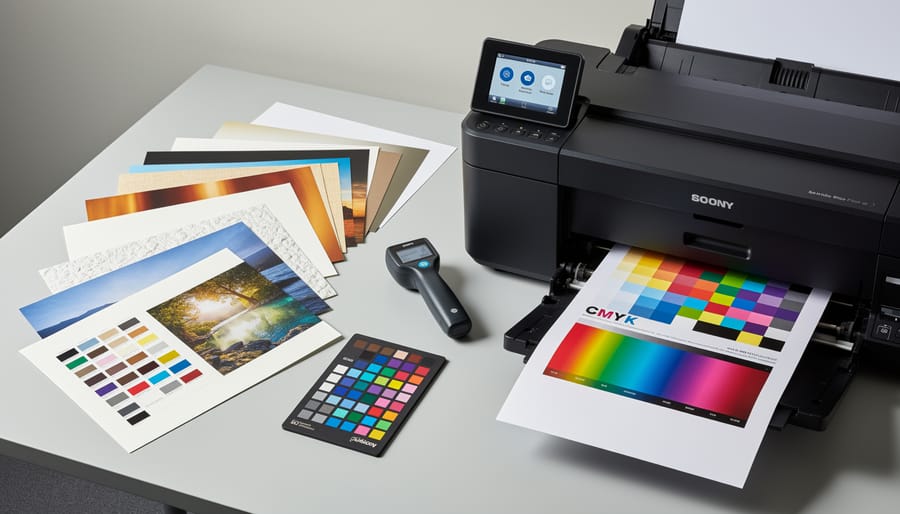
Start with manufacturer profiles, which are free and readily available. Paper manufacturers like Hahnemühle, Canson, and Red River Paper provide downloadable ICC profiles for their papers paired with specific printer models. Visit the paper manufacturer’s website, find your exact printer model, and download the profile. These work surprisingly well for most photographers and cost nothing.
Install profiles by placing them in your computer’s designated color profile folder. On Mac, that’s Library/ColorSync/Profiles. On Windows, it’s Windows/System32/spool/drivers/color. Your soft proofing software will automatically detect newly installed profiles.
For critical work where absolute color accuracy matters—like gallery prints or client proofs—consider custom profiles. Services like Chromix ColorValet or local color management specialists will send you a test target to print, then create a profile specifically for your unique printer, ink, and paper combination. This accounts for variables like your printer’s age, ambient humidity, and even slight manufacturing differences between printers.
Custom profiles typically cost between 50 and 150 dollars per paper type, but the investment pays off when you’re printing high-value work. Think of it as insurance against expensive reprints and dissatisfied clients.
Activating Soft Proof Mode Step-by-Step
Activating soft proof mode is simpler than you might think, though the exact steps vary depending on your editing software. Let’s walk through the process in the two most popular applications.
In Adobe Photoshop, navigate to View, then Proof Setup, and select Custom. This opens a dialog box where you’ll configure your soft proof settings. Under Device to Simulate, choose the ICC profile that matches your printer and paper combination. If you’re printing on glossy paper with an Epson printer, for example, you’d select the specific Epson profile for that paper type. Enable Preserve RGB Numbers if you’re already working in your printer’s color space, though most photographers leave this unchecked. The Rendering Intent dropdown typically works best set to Relative Colorimetric for photographs, as this maintains color relationships while mapping out-of-gamut colors to the nearest printable alternative. Check the Black Point Compensation box to prevent shadow detail loss. Once configured, click OK, and Photoshop will display how your image will appear when printed.
In Lightroom Classic, the process happens during the print preparation stage. Navigate to the Print module and look for the Color Management section on the right panel. Under Profile, select the appropriate ICC profile for your printer and paper. Choose Relative for the Intent setting in most photographic scenarios. While Lightroom doesn’t offer a persistent soft proof view like Photoshop, this preview accurately shows how your final print will render, allowing you to make adjustments before committing ink to paper.
Reading the Warning Signs: Gamut Alerts
When you enable gamut warnings in your editing software, you’re essentially turning on a visual alarm system for unprintable colors. Most applications display these warnings as bright overlay colors, typically neon blue, gray, or a customizable hue that highlights areas where your image colors fall outside your printer’s capabilities.
Think of gamut warnings like a weather alert for your print. When you see those highlighted areas, you’re looking at colors that will shift during printing, often becoming duller or muddier than what appears on screen. A vibrant sunset with saturated oranges and reds commonly triggers these warnings, as do deeply saturated blues in sky or water scenes.
Here’s the practical approach: don’t panic when you see warnings pop up. Not all gamut violations are equally problematic. A small out-of-gamut area in an unimportant background element matters far less than skin tones or key subject areas showing warnings. Focus your adjustments where it counts.
To address problematic areas, gradually reduce saturation or adjust hue slightly until the warning disappears. Some photographers prefer working with warnings visible throughout their editing process, while others toggle them on periodically for spot checks. Experiment to find what works best for your workflow and helps you achieve prints that match your creative vision.
Making Color Adjustments Based on Your Soft Proof
When to Adjust vs. When to Accept
Understanding the difference between a problem you can fix and a printer’s natural limitations will save you hours of frustration. Here’s how to tell them apart.
If your soft proof shows a dramatic color shift or warning indicators for large portions of your image, you’re likely hitting your printer’s gamut limits. For example, vibrant sunset oranges or neon tropical flowers often fall outside what inkjet printers can reproduce. This isn’t a problem to solve, it’s physics. Your best move is to accept the limitation and use rendering intent adjustments to find the closest printable alternative.
On the other hand, if your entire print comes out with a magenta cast or consistently darker than your screen, that’s a calibration issue you can fix. This typically means your monitor profile is inaccurate or your printer profile doesn’t match your paper and ink combination.
A real-world example: One photographer spent weeks trying to print electric blue skies from Iceland, assuming something was wrong with their workflow. The reality? That particular cyan simply exceeded their printer’s capabilities. Once they adjusted their expectations and used perceptual rendering intent, they achieved beautiful prints that captured the scene’s mood, even if not the exact color values.
Targeted Corrections for Out-of-Gamut Colors
When soft proofing reveals colors that fall outside your printer’s reproducible range, you’ll see those dreaded out-of-gamut warnings pop up on your screen. The good news? You don’t need to accept the default gamut mapping or let your printer make these decisions for you. Strategic, targeted corrections give you control over how these problematic colors translate to print.
Start by identifying which specific colors are causing issues. In Photoshop, enable the gamut warning (View > Gamut Warning) to see exactly which areas won’t print accurately. You’ll typically find vibrant blues, cyans, and saturated reds causing the most trouble. Rather than applying blanket color adjustments that affect your entire image, use targeted selection tools to isolate these problem areas.
For oversaturated colors, reduce saturation gradually while monitoring the soft proof preview. Often, dropping saturation by just 10-15% brings colors back into gamut while maintaining visual impact. If desaturation alone makes colors look muddy, try subtle hue shifts instead. A vibrant cyan sky might shift slightly toward blue, staying visually similar while becoming printable.
Luminosity adjustments offer another powerful tool. Sometimes darkening an out-of-gamut highlight or brightening a shadow brings colors within range without noticeable changes to the image’s emotional impact. The key is making small, incremental adjustments while constantly checking your soft proof. Think of it like seasoning food—add a little, taste, adjust, repeat.
Remember, these corrections preserve your creative vision while respecting physical printing limitations. You’re not compromising; you’re translating your digital vision into printed reality.
The Foundation: Why Monitor Calibration Matters
Calibration Hardware You Actually Need
You don’t need to break the bank for accurate color calibration. For most photographers, a mid-range colorimeter like the X-Rite i1Display Pro or Datacolor SpyderX Pro delivers excellent results for $200-300. These devices measure your monitor’s actual color output and create custom profiles that correct discrepancies between what you see and what’s actually being displayed.
If you’re on a tighter budget, the Datacolor SpyderX Express (around $100) handles basic calibration well, though it lacks some advanced features like ambient light measurement. It’s perfectly adequate if you’re just starting your color-managed workflow.
What makes a good calibration device? Look for hardware that can measure brightness levels down to the black point, supports multiple monitors if needed, and comes with software that lets you set specific calibration targets (typically D65 white point and 120 cd/m² brightness for print matching). Avoid smartphone apps or visual calibration methods – they’re notoriously unreliable because they depend on your subjective perception, which is exactly what we’re trying to eliminate.
Professional retouchers might invest in higher-end solutions like the X-Rite i1Studio (around $500), which includes projector calibration and printer profiling capabilities, but most photographers find mid-range options perfectly sufficient for achieving print-to-screen accuracy.

Ambient Lighting and Viewing Conditions
Your viewing environment plays a surprisingly significant role in color proofing accuracy. Think of it this way: you wouldn’t judge a print’s colors under your car’s dome light, yet many photographers work with inconsistent ambient lighting that’s equally problematic.
For reliable soft proofing, aim for neutral workspace lighting around 5000K to 6500K, which mimics standard daylight viewing conditions. Avoid colored walls near your monitor as they cast subtle color shifts that influence your perception. Your monitor’s brightness should match your typical print viewing conditions, usually between 80-120 cd/m² for matte papers. This might feel dimmer than you’re used to, but it prevents you from creating overly dark prints to compensate for an excessively bright screen.
Here’s a practical tip: evaluate your prints in the same lighting where they’ll ultimately be displayed. A gallery-bound photograph needs assessment under gallery lighting, while a living room print should be judged under typical indoor conditions. Consider using a daylight-balanced LED panel as your primary workspace light, and minimize glare on your monitor by positioning it perpendicular to windows. Even something as simple as wearing neutral-colored clothing while color correcting can help, since brightly colored shirts can reflect onto your screen and influence your judgment.
Common Soft Proofing Mistakes and How to Avoid Them
Using the Wrong Color Profile
One of the most common soft proofing mistakes is selecting a color profile that doesn’t match your actual output destination. I’ve seen this countless times: a photographer soft proofs using a generic “Glossy Paper” profile, but their print lab uses Canson Baryta with specific characteristics that render quite differently.
Here’s a real-world example: You might be viewing your image through an sRGB profile while your printer uses Adobe RGB, or worse, you’re proofing for generic matte paper when you’re actually printing on premium luster. These mismatches mean your soft proof is simulating completely different paper characteristics, ink absorption, and color gamut than what you’ll receive.
To avoid this frustration, always obtain the exact ICC profile from your print lab or paper manufacturer before you start editing. Most professional labs provide downloadable profiles for their specific printer and paper combinations on their websites. If you’re printing at home, install the profiles that came with your paper or download updated ones from the manufacturer’s site.
In Photoshop’s soft proof setup, carefully select the precise profile matching your output. Don’t guess or use “close enough” profiles. The difference between semi-gloss and glossy profiles, for instance, can significantly affect shadow detail and color saturation. Taking this extra minute to verify your profile selection will save you from costly reprints and disappointment.
Over-Correcting Based on Soft Proofs
Here’s a common trap: you run a soft proof, notice the colors look a bit duller than your working space preview, and immediately start cranking up saturation and vibrance to compensate. Stop right there. This knee-jerk reaction often leads to prints that look oversaturated and unnatural.
Remember, a soft proof shows you what your printer can actually reproduce within its specific color gamut. If your sunset appears less vibrant in the proof, that might be the physical limitation of your paper and ink combination, not something you should force. Making aggressive adjustments based on soft proofing often results in colors that push beyond what your printer can handle, causing unpredictable color shifts or muddy shadows.
The smarter approach? Make subtle, incremental adjustments. If you notice a slight color cast or tonal shift in your soft proof, tweak your image by small amounts—think 5-10% adjustments rather than dramatic slider movements. Better yet, create a duplicate layer specifically for print adjustments so you can toggle the changes on and off for comparison.
Most importantly, do a test print. Nothing replaces actually seeing ink on paper under proper lighting. Print a small section or a reduced-size version first. This real-world feedback will tell you far more than any screen simulation, helping you fine-tune your approach without wasting expensive paper on full-size prints that miss the mark.
Real-World Workflow: From Capture to Perfect Print
Let me walk you through how landscape photographer Sarah approaches a typical print job, demonstrating a complete workflow from camera to gallery-quality print.
Sarah returns from shooting sunrise at a coastal location with several promising captures. After importing her images, she begins with standard RAW file processing in Lightroom—adjusting exposure, recovering shadow detail, and fine-tuning the warm morning light. Once satisfied with the overall look, she exports to Photoshop for final refinement.
Here’s where soft proofing becomes essential. Sarah plans to print this image on Epson Exhibition Fiber Paper using her Epson P900 printer. Before making any final edits, she enables soft proofing by navigating to View > Proof Setup > Custom. She selects the ICC profile for her specific paper and printer combination, then checks Simulate Paper Color to see exactly how the print will render.
The transformation is immediate and revealing. Her vibrant blues shift slightly toward cyan, and the deepest shadows lose some punch. This is normal—glossy photo papers simply cannot reproduce the full range of colors visible on her calibrated monitor. Instead of being disappointed at print time, Sarah now makes informed adjustments.
She increases saturation slightly in the blues to compensate for the shift, then adds a subtle curves adjustment to restore depth to the shadows without crushing detail. Critically, she makes these changes while viewing the soft proof, so she’s editing for the final output, not for the screen.
Throughout the process, Sarah toggles soft proofing on and off using Command+Y, comparing the original vision with the print simulation. This helps her strike the right balance—maintaining creative intent while respecting the physical limitations of paper and ink.
Finally, she prints, confident that the result will match what she sees on screen. No surprises, no wasted paper, no frustration. The print emerges looking exactly as expected, ready for framing. This predictable, professional approach transforms printing from a guessing game into a controlled, repeatable process.
If you’ve made it this far, you’re well on your way to eliminating the guesswork from your printing workflow. Soft proofing isn’t just a technical exercise—it’s a practical solution that saves you real money in wasted paper and ink while delivering the predictable results you’ve been chasing. Instead of printing multiple test versions and hoping for the best, you can make informed decisions right on your screen, adjusting colors and tones before committing to paper.
The beauty of soft proofing is that you don’t need to master everything at once. Start simple: calibrate your monitor, load your printer profile, and toggle soft proofing on and off in your editing software to see what changes. Even this basic approach will give you insights that transform your printing experience. As you grow more comfortable, you’ll naturally develop an eye for spotting potential issues and making subtle adjustments that yield professional-quality prints.
Think of soft proofing as building a new skill rather than learning a complicated system. Every image you proof teaches you something about how colors translate from screen to paper. You’ll start recognizing patterns—maybe your printer consistently shifts blues toward cyan, or your vibrant reds need subtle desaturation. These insights become invaluable knowledge that speeds up your entire workflow.
The photographers who consistently produce stunning prints aren’t necessarily the most technically gifted—they’re simply the ones who’ve invested time in understanding their output process. Start today, be patient with yourself, and watch your confidence grow with each successful print.