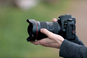
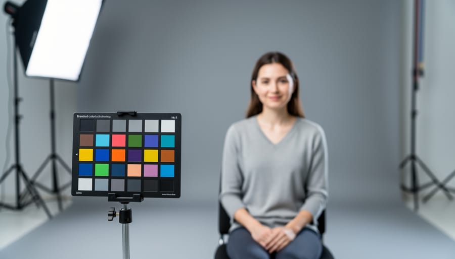
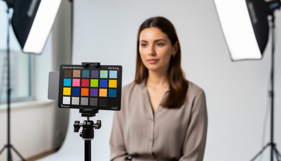
Place your color calibration chart in even, neutral lighting at the same angle as your subject to capture a reference frame before every important shoot. This single frame becomes your blueprint for correcting color casts and ensuring accurate skin tones, product colors, and landscape hues in post-processing.
Photograph the chart at the beginning of each lighting setup change, whether you’re moving from shade to sunlight outdoors or switching from window light to strobes in studio. Your editing software reads the neutral gray patches on the chart to calculate precise white balance adjustments, eliminating the guesswork of eyeballing colors on your monitor.
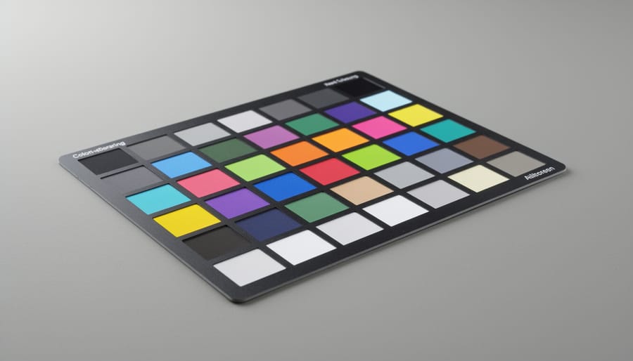
Select charts with at least 18-24 color patches including neutral grays, primary colors, and skin tone references for comprehensive calibration. Professional charts like the X-Rite ColorChecker provide standardized reference values that remain consistent across different shooting conditions, allowing you to match colors between sessions months apart.
Use the chart’s gray cards to set custom white balance in-camera when shooting JPEG, or rely on the full color patches when shooting RAW files for maximum flexibility in post-production. This approach proves essential for commercial work where clients expect their products to appear exactly as they do in person, and for portrait photographers who need reliable skin tone reproduction across varying lighting conditions.
The investment in a quality calibration chart pays immediate dividends in reduced editing time and increased client satisfaction, transforming color correction from frustrating trial-and-error into a repeatable, professional workflow.
What Is a Color Calibration Chart and Why Does It Matter?
A color calibration chart is a physical reference tool featuring precisely manufactured color swatches with known, standardized values. Think of it as a Rosetta Stone for your camera—it provides a universal language that helps your imaging equipment understand what colors should actually look like under specific lighting conditions.
These charts work by giving your camera a reference point. When you photograph the chart in the same lighting as your subject, you’re essentially telling your editing software, “This is what neutral gray, pure red, and all these other colors should be.” Your software can then analyze the captured image and adjust any color shifts throughout your entire photo shoot.
Why does this matter so much? Consider these real-world scenarios where color accuracy becomes critical.
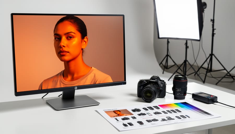
Product photographers face perhaps the highest stakes. Imagine shooting clothing for an online retailer, and the burgundy sweater you photographed appears rust-colored on the website. The result? Returns, angry customers, and lost credibility. One commercial photographer shared how a single color mismatch cost her client thousands in returns before they implemented proper color calibration.
Portrait photographers need accurate skin tones above all else. We’re incredibly sensitive to how skin looks—even slight color casts can make subjects appear jaundiced, sunburned, or simply unnatural. Without calibration, you might spend hours tweaking individual images, trying to nail that perfect complexion.
Landscape photographers might think they have more flexibility, but consider this: if your sunset blues lean too cyan or your autumn foliage shifts toward orange, you’re not capturing the scene as you experienced it. You’re creating a distorted memory.
Poor color accuracy also creates workflow nightmares. Without a calibrated reference, you’re essentially guessing at corrections, making editing inconsistent and time-consuming. Different monitors display colors differently, and without an objective standard, you’ll chase perfect colors endlessly. A color calibration chart eliminates the guesswork, providing measurable, repeatable results that save time and maintain consistency across your entire body of work.
The Science Behind Color Accuracy (Without the Headache)
How Your Camera Sees Color vs. How You See It
Your eyes are remarkable instruments, constantly adapting to different lighting conditions without you even thinking about it. Walk from bright sunlight into a dimly lit room, and within seconds, your brain recalibrates what “white” looks like. That yellow-tinted lamp? Your visual system compensates automatically, rendering the walls neutral rather than the warm amber they actually are.
Your camera sensor, however, doesn’t have this biological superpower. It captures light data objectively, recording exactly what wavelengths hit each photosite. This is one of several camera sensor limitations that photographers need to understand and work around.
The difference becomes even more apparent when you consider color spaces. Human vision can perceive roughly 10 million distinct colors across a range that scientists call the visible spectrum. Your camera, meanwhile, captures color information in specific color spaces like sRGB or Adobe RGB, which represent only a portion of what you can see. Think of it as your camera speaking a limited vocabulary compared to your eye’s complete dictionary.
This gap explains why that stunning sunset you witnessed might look disappointingly flat on your screen, or why skin tones sometimes appear oddly green under fluorescent lights. Without proper calibration, your camera makes educated guesses about color accuracy, but these guesses aren’t always reliable. A color calibration chart provides your camera with a known reference point, essentially teaching it to speak the same color language your eyes naturally understand.
Why Auto White Balance Fails You
Your camera’s auto white balance works remarkably well in many situations, but it’s essentially making an educated guess about what should look neutral in your scene. The problem? It can be fooled surprisingly easily.
Picture this: you’re shooting a sunset portrait and your camera decides all that gorgeous warm light is a color cast that needs correcting. The result? Cool, lifeless skin tones that completely miss the mood you wanted. Or consider indoor shots where mixed lighting creates chaos. Your camera might balance for the overhead tungsten lights while ignoring the daylight streaming through windows, leaving half your scene looking off.
Auto white balance particularly struggles with dominant colors. Photograph someone in a red sweater against a red wall, and your camera may overcorrect, turning everything muddy and desaturated. The same happens with large expanses of single colors like blue sky or green foliage.
Modern lighting adds another layer of complexity. When testing LED lighting, you’ll discover that many LEDs have inconsistent color spectrums that confuse auto white balance algorithms. Your camera simply doesn’t have enough information to make the right call every time, which is precisely where color calibration charts become invaluable.
Types of Color Calibration Charts You’ll Actually Use
Gray Cards: The Gateway to Better Colors
Gray cards are the simplest and most affordable entry point into color calibration. These cards feature a neutral 18% gray surface that reflects light evenly across the color spectrum, making them perfect for setting custom white balance in-camera or during post-processing.
The beauty of gray cards lies in their simplicity. Just photograph the card under your shooting conditions, then use that image to set your camera’s white balance or create a custom profile in software like Lightroom or Capture One. This eliminates color casts caused by different lighting sources, whether you’re shooting under tungsten bulbs, fluorescent tubes, or mixed lighting at a wedding reception.
The advantages are compelling: gray cards are inexpensive (often under $20), portable, and easy to use. They’re particularly effective for photographers working in controlled environments or those who shoot in consistent lighting conditions throughout a session.
However, gray cards have limitations. They only address white balance, not the broader color accuracy issues that more comprehensive charts tackle. They also require manual referencing for each lighting setup and won’t correct for camera-specific color rendering quirks. For basic color consistency and correcting obvious color casts, though, they’re an excellent starting point that delivers immediate, noticeable improvements to your images.
ColorChecker Charts: The Professional Standard
When photographers talk about the gold standard in color calibration, X-Rite’s ColorChecker series inevitably enters the conversation. The ColorChecker Classic, featuring 24 scientifically engineered color patches, has been the industry reference since the 1970s. Each patch represents a real-world color, from skin tones to primary colors, arranged in a way that mimics the color distribution you’d encounter in everyday photography.
Here’s how they work: You photograph the chart under your shooting conditions, then use software to compare your captured colors against the known reference values. The software creates a custom profile that corrects any color shifts from your camera or lighting. Think of it as creating a translation dictionary between what your camera sees and what colors actually are.
The ColorChecker Passport, a more portable version, includes additional gray balance targets and creative enhancement patches, making it particularly useful for location work. For studio photographers, the larger ColorChecker Digital SG with 140 patches offers even more precision.
Are they worth the investment? If you’re regularly dealing with critical color work like product photography, skin tone accuracy, or client deliverables where color matters, absolutely. A ColorChecker typically costs between 80 to 300 dollars depending on the model. For hobbyists shooting occasionally, simpler gray card solutions might suffice. However, professionals who’ve made the investment rarely look back, citing the time saved in post-processing and confidence in their color accuracy.
Digital vs. Physical Charts: What’s the Difference?
The debate between digital and physical color charts ultimately comes down to your specific workflow needs. Physical charts, like the popular X-Rite ColorChecker Passport, offer rock-solid consistency. They don’t suffer from screen variations or battery drain, and they work in any shooting environment without needing a power source. When you photograph a physical chart alongside your subject, you’re capturing reference data under the exact same lighting conditions, which is invaluable for critical color work.
Digital solutions and smartphone apps provide convenience and portability. They’re perfect for quick checks and on-the-go color reference, especially if you’ve forgotten your physical chart. However, accuracy can vary depending on your device’s screen calibration and ambient lighting affecting the display. The screen itself introduces another variable since you’re photographing light rather than reflected color.
For serious color accuracy, physical charts remain the gold standard. They’re more durable, don’t require updates, and provide consistent reference points year after year. Consider digital options as supplementary tools rather than complete replacements for professional color calibration work.
How to Use a Color Calibration Chart (Step-by-Step)
Setting Up Your Shot with the Chart
Getting accurate color starts with capturing your reference image correctly. Begin by placing your color calibration chart in the same lighting conditions where you’ll photograph your main subject. This is crucial because different light sources create different color casts, and your camera needs to understand the specific environment you’re working in.
Position the chart so it faces your camera straight-on, avoiding any angles that might cause reflections or uneven lighting across the patches. Keep it flat and smooth—wrinkles or curves will catch light differently and throw off your readings. If you’re shooting outdoors, make sure the chart receives the same quality of light as your subject. Shooting portraits in open shade? Put the chart there too. Working in direct sunlight? Same deal.
The chart should fill a decent portion of your frame—roughly 20 to 30 percent works well. You want those color patches clearly visible without needing to zoom in excessively during post-processing. Ensure your exposure is spot-on by checking your histogram; you don’t want blown highlights or crushed shadows on the chart itself.
One practical tip: take this reference shot at the beginning of your session and again if lighting conditions change significantly. Think of it as your color insurance policy. This simple step gives your editing software the information it needs to render colors as they truly appeared in the scene.
Creating a Custom White Balance Profile
Setting a custom white balance in-camera using a color calibration chart is surprisingly straightforward, though the process varies slightly between manufacturers. The goal is to photograph your chart under the same lighting conditions where you’ll be shooting, then tell your camera to use that as its white balance reference.
For Canon users, navigate to your custom white balance setting in the menu, photograph the chart so it fills most of the frame, then select that image as your reference. Nikon shootings follow a similar path through the PRE setting in white balance, requiring you to trigger the shutter while pointing at the chart. Sony cameras typically offer a custom setup option under white balance where you’ll capture the chart and set it as your baseline.
The key is ensuring your chart fills the frame without any bright highlights or shadows creeping in. You don’t need perfect focus since you’re capturing color information, not detail. Some photographers keep multiple custom presets saved for their most common lighting scenarios, like window light at golden hour or fluorescent office spaces.
This technique delivers far more accurate colors than relying on auto white balance or presets, especially under mixed lighting conditions where your camera struggles to make the right call on its own.
Post-Processing with Color Calibration Data
Once you’ve captured an image of your calibration chart under proper lighting, the real magic happens in post-processing software. Most professional editing applications offer color profile creation tools that work seamlessly with calibration charts.
In Adobe Lightroom, you can use the ColorChecker Passport plugin or third-party tools like X-Rite’s software to create custom DNG profiles. Simply import your chart image, let the software detect the color patches, and it generates a profile that corrects your camera’s color response for those specific lighting conditions. You’ll apply this profile to all images shot under the same lighting setup.
Capture One users benefit from built-in color calibration tools. Navigate to the Color tab, select Create ICC Profile, and follow the prompts to photograph your chart and build a custom camera profile. This process typically takes just a few minutes but dramatically improves color accuracy across your entire shoot.
For manual corrections, create a custom white balance by clicking on the neutral gray patch of your chart. Then use the chart’s color patches as reference points to fine-tune individual color channels. Many photographers save these adjustments as presets for similar shooting scenarios, streamlining future workflow and ensuring consistency across projects.
Understanding White Balance Calibration Calculators
White balance calibration calculators are specialized tools that help you determine the precise color temperature of your lighting conditions and translate that information into accurate camera settings. Think of them as mathematical interpreters between what your calibration chart reveals and what your camera needs to know. While the concept might sound complex, these calculators simplify what would otherwise be tedious manual adjustments.
At their core, white balance calculators work by analyzing the color values from your calibration chart reference images. When you photograph a chart under specific lighting, the calculator compares the known values of the neutral gray patches to what your camera actually captured. This comparison reveals any color cast present in your lighting or camera settings. Software-based calculators like those built into Adobe Lightroom, Capture One, or dedicated applications such as ColorChecker Camera Calibration can process this data automatically, generating custom camera profiles or suggesting specific Kelvin temperature adjustments.
Manual calculation methods still have their place, particularly when you want to understand the underlying principles. By measuring the RGB values of a neutral gray patch in your image editing software and comparing them to the ideal values (where red, green, and blue should be equal), you can determine which color channel needs adjustment. For instance, if your gray patch shows RGB values of 128, 135, 128, you know there’s excess green that needs correction.
The real-world benefit becomes apparent when shooting product photography for e-commerce or when consistency across multiple lighting setups matters. One professional food photographer I know uses white balance calculators to ensure her dishes look equally appetizing whether photographed in morning sunlight or evening studio light. She captures a single reference frame with her calibration chart, runs it through her calculator, and applies those corrections across the entire shoot.
Most modern calculators also account for variables like camera sensor characteristics and lens color shifts, providing remarkably accurate results that would be nearly impossible to achieve through trial and error alone.
Running Your Own Color Accuracy Test
Testing Different Lighting Scenarios
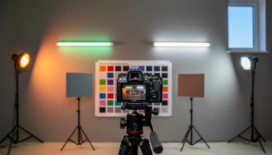
Light sources dramatically affect how colors appear in your photographs, so testing your color calibration chart under different lighting conditions is essential for consistent results. Natural daylight typically serves as the reference standard—it’s balanced and reveals colors most accurately. Position your chart near a window on an overcast day or in open shade for the most neutral daylight conditions.
Indoor lighting presents more challenges. Tungsten bulbs cast a warm orange glow, while fluorescent tubes often add a green tint that’s particularly unflattering to skin tones. Modern LED lighting varies wildly between manufacturers and can introduce LED flicker issues that affect both video and still photography at certain shutter speeds.
Here’s a practical approach: photograph your chart under each light source you commonly work with, using the same camera settings. Compare the resulting images side-by-side in your editing software. You’ll quickly see how each light source shifts colors differently. This testing helps you create custom white balance presets for various situations and understand why your studio shots look different from outdoor portraits.
Don’t forget mixed lighting scenarios either. If you’re combining window light with flash photography, test with both sources active. Understanding these variations transforms how you approach color correction during shooting and post-processing.
Documenting and Comparing Results
Once you’ve captured test shots with your color calibration chart, the real work begins with documenting your findings. Think of this process like keeping a maintenance log for your vehicle—it helps you spot issues before they become problems.
Start by creating a simple spreadsheet or notebook system to track your results. Record the date, lighting conditions, camera settings, and any color shifts you observe. This baseline data becomes invaluable when you notice inconsistencies later. For example, you might discover your camera consistently renders reds too orange under tungsten lighting, a pattern that’s easy to miss without proper documentation.
Export your calibrated reference profiles and save them with descriptive names like “Canon-5D4-Studio-Tungsten-2024.” Similar to camera testing methods used for evaluating performance, consistent naming conventions make finding the right profile quick and painless.
Take it further by creating comparison images. Shoot the same chart under different conditions—daylight, shade, artificial light—and arrange these images side-by-side in your editing software. You’ll quickly identify which scenarios challenge your camera’s color accuracy most.
Many photographers also photograph the chart alongside their actual subjects, ensuring they can reference accurate colors during editing sessions weeks or months later when memory fades.
Common Mistakes (And How to Avoid Them)
Even experienced photographers stumble when working with color calibration charts. Let’s walk through the most common pitfalls and how to sidestep them entirely.
The biggest mistake? Uneven lighting across the chart surface. I’ve seen countless photographers position their chart at an angle or use a single light source, creating gradients that throw off the entire calibration. Your chart needs perfectly even illumination from edge to edge. Think of it like this: if one corner receives 20% less light than the center, your software will try to “correct” colors that weren’t actually wrong to begin with. The fix is simple—position your chart perpendicular to your light source and check for hotspots or shadows before shooting. Use a handheld light meter if you’re serious about precision, or simply review your histogram to ensure even exposure.
Another frequent error involves photographing the chart in different lighting than your actual subject. Here’s a real-world example: a product photographer once told me about calibrating under their studio strobes, then switching to continuous LED lights for video work without recalibrating. The color shift was noticeable across their entire catalog. Always capture your calibration reference in the exact lighting conditions you’ll use for your shoot.
Distance and framing issues also trip people up. Shooting too close can introduce lens distortion, while too far makes the chart occupy insufficient frame space. Aim for the chart to fill roughly 50-70% of your frame without tilting your camera.
Finally, many photographers forget to white balance their camera before shooting the chart. Yes, you’ll create a profile afterward, but starting from a neutral baseline gives you cleaner, more reliable results. Set your camera to a manual Kelvin temperature around 5500K rather than auto white balance.
When Color Calibration Actually Matters (And When It Doesn’t)
Let’s be real: not every photograph needs laboratory-grade color precision. Understanding when color calibration truly matters can save you time, money, and unnecessary frustration.
Color calibration becomes essential when you’re shooting product photography for e-commerce clients. That coral dress needs to look exactly like coral when it arrives at the customer’s door, or you’re facing returns and angry phone calls. Similarly, if you’re photographing artwork for reproduction, food for packaging, or cosmetics for advertising, accurate color isn’t negotiable—it’s literally your job.
Wedding photographers also benefit significantly from calibration, though for different reasons. Skin tones need to look natural and consistent across hundreds of images, and brides tend to notice when their carefully chosen color palette looks off in the final album.
On the flip side, certain photography genres offer more creative freedom. Landscape photographers often enhance colors deliberately for dramatic effect. Street photographers prioritize capturing the moment over perfect color rendition. And if you’re shooting artistic portraits where you’ll apply heavy creative editing anyway, spending hours on calibration becomes counterproductive.
Here’s a practical test: ask yourself whether someone would reject your work because a color doesn’t match reality. If the answer is yes, calibrate. If you’re creating art where interpretation matters more than accuracy, your time might be better spent elsewhere.
The key is matching your tools and effort to your actual needs rather than chasing perfection for its own sake.
Getting started with color calibration doesn’t have to be overwhelming or expensive. If you’re new to this, begin with a basic gray card or an affordable chart like the X-Rite ColorChecker Passport. Even a simple $15 gray card can dramatically improve your white balance accuracy and give you more consistent results across your shoots. As you develop your workflow and see the difference accurate color makes, you can gradually invest in more comprehensive tools.
The key is making calibration a habit rather than an afterthought. Include your chart in the first few frames of every shoot, especially when lighting conditions change. This simple step takes five seconds but can save you hours in post-processing frustration. Remember, you’re creating reference points that make color correction faster and more precise, not adding complicated steps to your workflow.
Think of color calibration as investing in your creative vision. When you’re confident your colors are accurate, you spend less time second-guessing adjustments and more time perfecting the mood and story of your images. Start small, practice consistently, and watch how this one tool transforms not just your color accuracy, but your entire editing efficiency.