Look at your camera’s LCD screen after a shot in bright sunlight, and that image might appear perfectly exposed—until you open it on your computer and discover blown highlights or crushed shadows. This common frustration reveals exactly why understanding histograms transforms your photography from guessing to knowing.
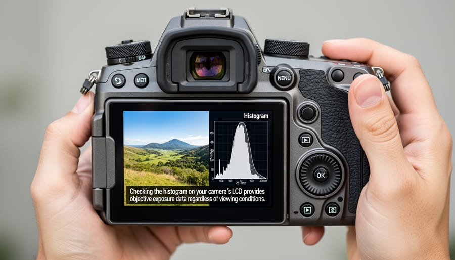
A histogram is a graph displaying the tonal distribution of your image, showing how many pixels exist at each brightness level from pure black (left) to pure white (right). Unlike your camera’s screen, which changes appearance based on ambient light and brightness settings, the histogram provides objective, mathematical data about your exposure. Think of it as an X-ray of your photograph’s exposure values, revealing details your eyes might miss.
For photographers moving beyond automatic modes and exploring camera settings fundamentals, the histogram becomes an essential diagnostic tool. It tells you immediately whether you’ve captured recoverable detail in highlights and shadows, or whether critical information has been lost forever to clipping. This matters because digital sensors have limited dynamic range—once detail is clipped to pure white or black, no amount of post-processing can recover it.
Mastering histogram interpretation means you’ll nail exposure in challenging lighting conditions, maximize your raw files’ editing potential, and stop relying on unreliable screen previews. Whether shooting weddings, landscapes, or portraits, the histogram gives you confidence that your exposure decisions are technically sound before you leave the scene.
What Exactly Is a Photography Histogram?
A photography histogram is a graphical representation that shows you the distribution of tones in your image, from the darkest blacks to the brightest whites. Think of it as a bar chart that maps out exactly how many pixels exist at each brightness level in your photograph.
Here’s how it works: the horizontal axis (x-axis) represents the range of brightness values, running from pure black on the far left to pure white on the far right, with all the midtones filling the space between. The vertical axis (y-axis) shows you the quantity of pixels at each brightness level. When you see a tall peak at any point along the graph, that tells you there are many pixels at that particular brightness value. A low or flat section means few pixels exist at that tone.
To make this more relatable, imagine you’re sorting a bag of marbles by shade, from darkest to lightest, and lining them up in columns. The taller columns show which shades you have the most of. That’s essentially what a histogram does with the pixels in your photo.
You’ll encounter histograms in two main places during your photography workflow. First, most digital cameras display a histogram on the LCD screen when you review images, either automatically or through the display options menu. Second, every major photo editing application, from Adobe Lightroom to Capture One to your smartphone editing apps, includes a histogram prominently in the interface.
Understanding this graph matters because it gives you objective data about your exposure. While your camera’s LCD screen can be misleading depending on its brightness setting or the ambient light where you’re shooting, the histogram doesn’t lie. It shows you the mathematical reality of your image’s tonal distribution, making it an invaluable tool for getting your exposures right in-camera and making informed editing decisions later.
Reading Your Histogram: The Landscape of Your Exposure
The Three Zones: Shadows, Midtones, and Highlights
Think of your histogram as a graph divided into three neighborhoods, each representing a different brightness level in your image. On the left side, you’ll find the shadows—the darkest areas of your photo. The middle section shows your midtones, which contain most of the detail in a typical scene. And on the right, the highlights represent the brightest parts of your image.
When you look at your histogram, you’re essentially seeing where your pixels have decided to gather. If you notice a heavy concentration on the left side bunching up against the edge, your image likely has large dark areas, possibly underexposed. Picture photographing someone in a dimly lit room—you’d see that left-heavy distribution.
A clustering in the middle suggests a balanced exposure with plenty of detail in those crucial midtone values. This is what you’ll often see in evenly lit scenes, like a landscape on an overcast day. It’s not necessarily ideal for every shot, but it indicates you’re working with plenty of usable information.
When pixels pile up on the right side, you’re dealing with bright areas. A sunset sky or snow scene will naturally push data toward the highlights. However, if the histogram slams against the right edge and appears “clipped,” you’ve lost detail in those bright areas—they’ve become pure white with no recoverable information.
The key is understanding that there’s no universally perfect histogram distribution. A moody, low-key portrait should look different from a bright, airy wedding photo. What matters is knowing whether your distribution matches your creative vision.
Common Histogram Shapes and What They Tell You
Understanding common histogram patterns helps you quickly assess your exposure, but here’s the good news: there’s no universally “correct” histogram shape. What matters is whether the histogram matches your creative vision and scene.
A balanced or centered histogram shows tones distributed across the middle range, with gradual tapering at both ends. This pattern works beautifully for evenly lit scenes like portraits on overcast days or landscapes with a mix of highlights and shadows. The data clusters around midtones, indicating a well-balanced exposure that preserves detail throughout.
Left-skewed histograms bunch data toward the shadow side (left edge), typical of underexposed images. However, this isn’t always a problem. Low-key portraits, moody interior shots, or silhouettes intentionally create left-skewed histograms. The key question: did you lose important shadow detail by letting the histogram slam against the left edge? If those dark areas contain crucial information, you’ve likely underexposed.
Right-skewed histograms push data toward the highlight side (right edge), often indicating overexposure. But again, context matters. Snow scenes, beach photography, and high-key portraits naturally produce right-skewed histograms. The challenge with bright scenes is preventing “clipping”—when highlights push so far right they lose all detail, appearing as pure white blobs in your final image.
The lesson? Learn to read your histogram in context. That bright, right-skewed histogram might be perfect for your snowy mountain landscape but disastrous for a portrait. Rather than chasing an idealized bell curve, ask yourself: does this distribution preserve the details I care about? With practice, you’ll instinctively recognize when your histogram matches your scene, making confident exposure decisions in any lighting condition.
The Danger Zones: Clipping Explained
When pixels slam into either edge of the histogram, you’ve entered what photographers call the danger zone: clipping. This occurs when your sensor captures brightness values beyond its recording range. Those jammed-up pixels at the extreme left (pure black) or right (pure white) represent areas where detail is completely gone—irrecoverably lost in your digital file.
You’ll spot clipping easily on your histogram. Look for tall spikes touching the far edges, like mountain peaks cut off at the graph’s borders. These spikes signal trouble, indicating portions of your image where the sensor simply gave up trying to record any tonal variation.
Here’s the critical question: which is worse? In the digital photography world, blown highlights (clipped whites) are generally considered more problematic than blocked shadows (clipped blacks). Think about photographing a bride’s white dress against a dark background. If the dress blows out to pure white, no amount of editing will recover the fabric’s texture. However, those deep black shadows? Modern cameras often retain hidden detail in underexposed areas that you can lift during post-processing without excessive noise.
That said, neither extreme is ideal. Your goal is keeping important details away from both edges whenever possible.
Why Your Camera Screen Lies (But Your Histogram Doesn’t)
We’ve all been there. You’re shooting outdoors on a gorgeous sunny day, checking your camera’s LCD screen between shots, and everything looks absolutely perfect. The exposure seems spot-on, the colors are vibrant, and you’re feeling confident about your images. Then you get home, open those files on your computer, and discover half your highlights are blown out. What happened?
The harsh truth is that your camera’s LCD screen is unreliable. It’s affected by several factors that can dramatically skew your perception of exposure. Screen brightness is the biggest culprit. Most cameras ship with their LCD brightness set fairly high to make images pop, which can make underexposed photos appear properly exposed. Conversely, if you’ve manually adjusted your screen brightness to be darker, you might think images are underexposed when they’re actually fine.
Ambient light conditions compound this problem. Shooting in bright sunlight is the perfect storm of misleading feedback. Your screen becomes difficult to see, so you squint at it, maybe cup your hand around it, and make your best guess. That image that looked acceptable on your sun-washed screen? It might be two stops overexposed, with lost detail in skies and highlights that can’t be recovered in post-processing.
Your histogram, however, doesn’t care about any of these variables. It’s simply raw, objective data showing the actual distribution of tones in your image. The histogram reads the same whether you’re in blazing sunlight or a dark room, regardless of your screen brightness settings or how new your battery is. This mathematical representation of your exposure eliminates guesswork and subjective perception, giving you reliable information to make informed decisions about your settings before you press the shutter.
Putting Histograms to Work in Real Shooting Scenarios
Using Histograms with Your Camera’s Metering Modes
Your camera’s metering modes and histogram work together like dance partners—each influences the other, and understanding their relationship helps you nail exposure every time.
When you switch between evaluative (or matrix), center-weighted, and spot metering, you’re telling your camera which part of the scene to prioritize. Evaluative metering analyzes the entire frame, typically producing a histogram with data spread across the tonal range. It works beautifully for evenly lit scenes, and your histogram should show a balanced distribution without major gaps.
Center-weighted metering concentrates on the middle of your frame, which can shift your histogram depending on what’s there. If you’re photographing a person against a bright sky, this mode meters for your subject, potentially pushing sky highlights toward the right edge of the histogram. That’s exactly what you want—the histogram confirms your metering choice prioritized the subject correctly.
Spot metering creates the most dramatic histogram variations. When you meter off a dark area, your histogram shifts right as the camera brightens everything to make that spot middle-toned. Meter off a bright area, and everything shifts left. This is where the histogram becomes invaluable—it shows you immediately whether your spot metering choice created the exposure you envisioned.
In manual mode, this relationship becomes even clearer. Your metering mode suggests an exposure, but the histogram reveals the truth. If you spot-meter off a bride’s white dress and see your histogram slammed left, you know to add 1-2 stops of exposure to render that dress properly bright rather than muddy gray.
The ‘Expose to the Right’ Technique
Once you understand how to read your histogram, you can put this knowledge to work with a powerful technique called “Expose to the Right” or ETTR. The concept is straightforward: when shooting in RAW format, you want to push your exposure as far right on the histogram as possible without clipping your highlights. Think of it as getting your graph to kiss the right edge without going over.
Why bother with this approach? Your camera’s sensor captures significantly more tonal information in the brighter areas than in the shadows. When you expose to the right, you’re maximizing the data your sensor records, which translates to cleaner images with less noise, especially when you bring down the exposure in post-processing. It’s like starting with a richer ingredient list when cooking—you have more to work with.
In practice, this means your images might look a bit bright on your camera’s LCD screen, which can feel uncomfortable at first. But check your histogram. If those highlights aren’t climbing the right wall and spilling over, you’re actually capturing optimal image quality. Later, during editing, you can easily reduce the exposure, and you’ll discover beautifully smooth shadows with minimal noise compared to images exposed more conservatively.
RGB Histograms vs. Luminosity Histograms: Which One Should You Use?
When you press the histogram button on your camera, you’ll typically see the luminosity histogram first—a single graph that combines all color information into brightness values. But many cameras also offer RGB histograms, which display separate graphs for red, green, and blue channels. Understanding the difference can save your color-critical shots.
The luminosity histogram shows overall brightness distribution, making it perfect for quick exposure checks and general shooting. It’s simple, fast to read, and works beautifully for black-and-white photography or situations where you’re primarily concerned with tonal balance. Think of it as your everyday exposure companion.
RGB histograms, however, tell a more detailed story. Each color channel gets its own graph, revealing clipping problems that the luminosity histogram might hide. Here’s a real-world example: imagine photographing a sunset with vibrant orange clouds. Your luminosity histogram might look perfectly fine, but check the red channel and you might discover it’s completely blown out, losing all that gorgeous color detail.
This happens because the luminosity histogram averages the channels together. If your red channel is clipped but green and blue are fine, the combined histogram won’t show a problem. For landscape photographers capturing colorful scenes, product photographers needing accurate color reproduction, or anyone shooting situations with intense single-color elements—like red flowers, blue skies, or yellow sunsets—RGB histograms are invaluable.
Use luminosity histograms for general shooting and quick exposure decisions. Switch to RGB histograms when color accuracy matters, when you’re working with highly saturated subjects, or when you notice unexpected color shifts in your images. Many photographers develop the habit of checking both, especially when the lighting gets tricky.
Common Histogram Mistakes (and How to Fix Them)
Even experienced photographers fall into common histogram traps that can sabotage their exposures. Let’s clear up the biggest misconceptions so you can use this tool effectively.
The most widespread mistake? Chasing the “perfect” bell curve for every single shot. Many photographers assume a proper histogram should look like a smooth bump in the middle, with gentle slopes toward both edges. But real-world scenes don’t follow textbook examples. A portrait against a white background will legitimately push data toward the right side of the histogram, and that’s exactly what you want. Forcing it into a centered bell curve would underexpose your subject.
This connects directly to the second major pitfall: ignoring what you’re actually photographing. The classic examples are snow scenes and coal piles. Your camera’s meter wants to render everything as middle gray, so fresh snow often comes out dingy while dark subjects get blown out. If you’re photographing a winter landscape and your histogram clusters toward the left, something’s wrong. Snow should push right. Conversely, a nighttime street scene or dark portrait should show data weighted left. Always ask yourself: does this histogram match what’s in front of me?
Finally, don’t forget creative intent. A moody low-key portrait should show heavy left-side weighting. A bright, airy high-key image belongs on the right. The histogram is a diagnostic tool, not a rule enforcer. Use it to ensure you’re capturing what you envision, not to dictate what your vision should be.
The histogram isn’t just another feature buried in your camera’s menu system—it’s one of the most reliable tools you have for achieving accurate exposures every single time you shoot. While camera screens can deceive you with their brightness adjustments and environmental glare, the histogram delivers objective, data-driven feedback that never lies. It’s your exposure truth-teller, showing precisely where your tonal values fall regardless of lighting conditions or display settings.
Making histogram reading part of your essential photography skills doesn’t require advanced technical knowledge—just consistent practice. The more you check your histogram during shoots, the faster you’ll develop an intuitive understanding of what balanced, high-key, and low-key distributions look like for different scenes. Trust the graph over what you see on screen, especially when shooting outdoors or in challenging lighting situations.
Ready to put this knowledge into action? Head into your camera settings right now and enable the histogram display in your image review options. Then commit to checking it after every few shots during your next photography session. You’ll quickly discover how this simple habit transforms your exposure accuracy and gives you confidence that your images are technically sound before you leave the scene.