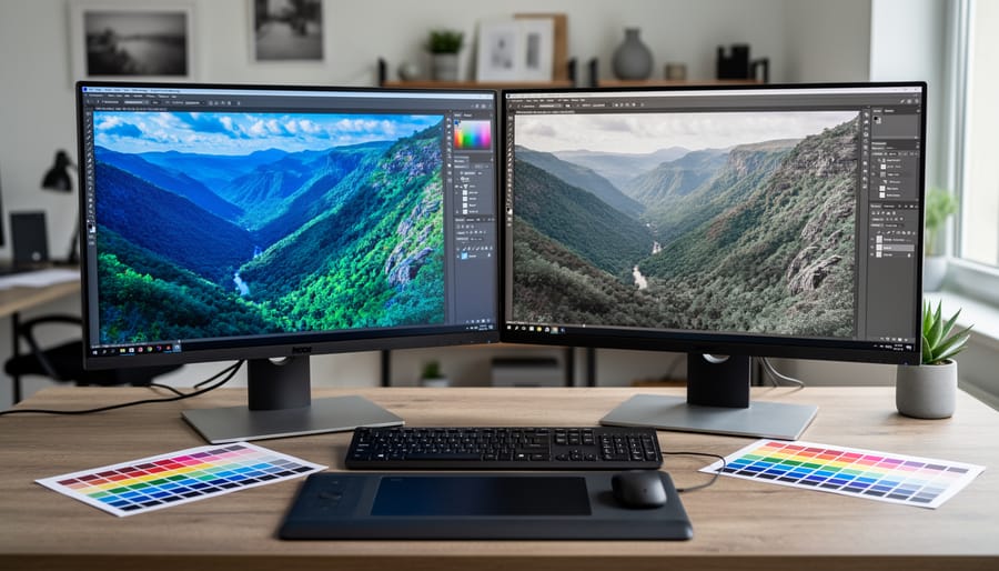
Understand that your monitor is lying to you right now. That vibrant sunset you captured and carefully edited on your screen? It might appear completely different when printed, shared online, or viewed on another display. This disconnect happens because every monitor interprets color data differently straight out of the box, and without calibration software working alongside a hardware colorimeter, you’re essentially editing blind.
Display calibration software serves as the translator between what your camera captures and what your screen displays. It works by measuring how your monitor currently reproduces colors, then creates a custom color profile that corrects these discrepancies. Think of it as teaching your display to speak the same language as industry-standard color spaces like sRGB or Adobe RGB. For anyone building a professional editing workstation, this software represents the foundation of color-accurate work.
The calibration process itself typically takes 10-15 minutes and involves the software displaying a series of color patches while a hardware sensor measures what actually appears on screen. The software then calculates the difference between intended and actual values, generating a profile that corrects brightness, contrast, white point, and color accuracy. This profile loads automatically each time you start your computer, ensuring consistency across every editing session.
What confuses many photographers is that calibration software rarely works alone. While some displays include basic built-in calibration tools, professional solutions require dedicated hardware sensors from companies like X-Rite, Datacolor, or Calibrite. The software component is what processes the measurements, generates profiles, and often provides ambient light monitoring to maintain accuracy as room conditions change throughout the day.
What Display Calibration Software Actually Does
The Hardware-Software Partnership
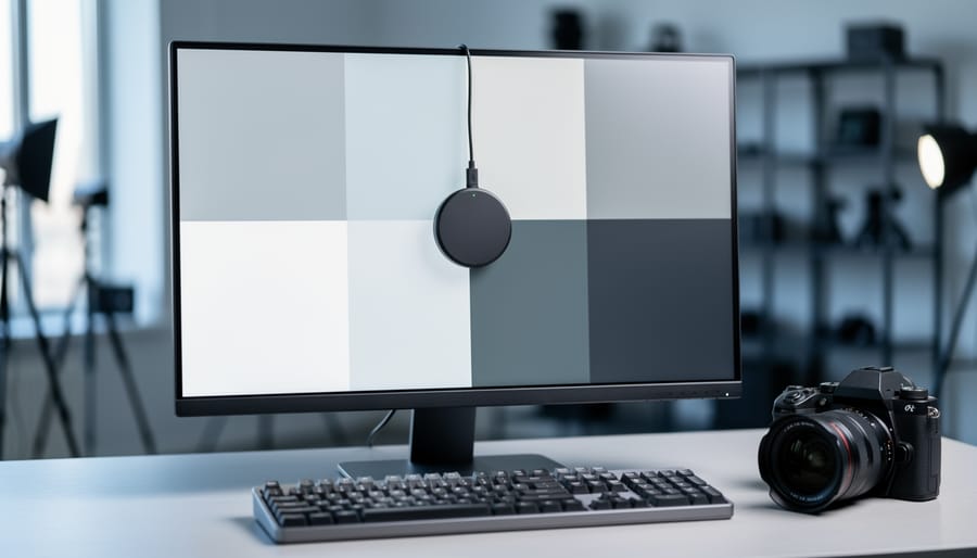
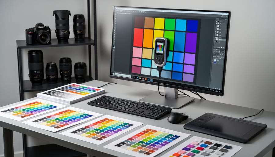
Think of display calibration as a health checkup for your monitor. The calibration device—a colorimeter or spectrophotometer—is like the doctor’s stethoscope and thermometer, taking precise measurements. The software acts as the doctor’s brain, interpreting those readings and writing the prescription to fix any issues.
Here’s how the partnership works in practice: When you run a calibration, the hardware device sits against your screen like a small puck, measuring the actual colors your monitor displays. The software flashes a series of color patches on screen—reds, blues, greens, grays, and everything in between. As each color appears, the device measures what your monitor actually produces versus what it should be producing.
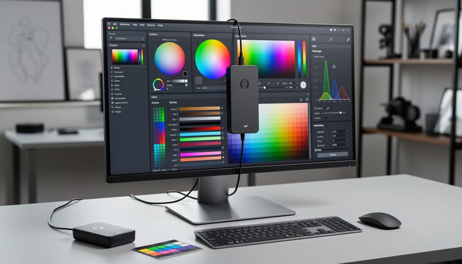
The software then compares these measurements against known color standards. If your monitor displays a red that’s too orange or a gray that’s slightly blue-tinged, the software records these discrepancies. Once all measurements are complete, the software creates an ICC profile (International Color Consortium profile) or ICM profile—essentially a translation file that tells your computer, “When you want to display this specific shade of blue, actually send this adjusted value to the monitor to compensate for its quirks.”
This profile sits quietly in your operating system, automatically correcting colors across your photography applications. Without the hardware to measure, the software would be guessing. Without the software to interpret and correct, the hardware would just be collecting meaningless numbers. Together, they ensure what you see matches what your camera captured.
Why Your Eyes Can’t Be Trusted
Here’s the truth that might sting a little: your eyes are terrible judges of color accuracy. Our visual system is remarkably adaptive, which serves us well in daily life but becomes a liability when editing photos. Your brain constantly adjusts to ambient lighting and compensates for color casts, meaning what looks “correct” to you is actually subjective and changes throughout the day.
Consider this real-world scenario: you edit a portrait in the morning, adjusting skin tones until they look perfect. You return that afternoon and suddenly those same tones appear too warm or too cool. Nothing changed in the file, but your perception shifted based on surrounding light, eye fatigue, and even your monitor’s warm-up state.
Here’s where things get worse. LCD and LED displays drift over time. Their backlights age, color temperature shifts, and brightness decreases, sometimes within just a few months of use. What displayed accurately in January might be noticeably different by summer. Professional work demands consistency, not just across your own workflow but with clients, print labs, and other devices. When a client complains that prints don’t match what they saw on screen, subjective calibration is often the culprit. Display calibration software removes this guesswork by measuring actual output against known standards, ensuring your monitor displays colors as they truly are, not as your adaptive eyes interpret them.

Key Features to Look For in Calibration Software
Target Settings and Standards
When you open display calibration software for the first time, you’ll encounter several target settings that might seem intimidating. Let’s break them down so you can configure your color-accurate editing workflow with confidence.
Brightness, or luminance, is measured in candelas per square meter (cd/m²). For most photo editing environments, aim for 120 cd/m² in a moderately lit room. This prevents eye strain while maintaining detail visibility. If you work in darker spaces, you might drop to 80-100 cd/m², while brighter offices may require 140-160 cd/m².
White point determines how warm or cool your whites appear, measured in Kelvin. The standard D65 (6500K) mimics average daylight and works perfectly for most photographers. Some prefer D50 (5000K) for print work since it matches standard viewing booth lighting.
Gamma controls the relationship between input values and screen brightness. A gamma of 2.2 is the standard for digital photography and matches how most devices display images. Print-focused workflows sometimes use 2.4 for darker midtones.
Color space selection matters tremendously. sRGB is the internet standard—use it if you’re primarily sharing images online or your clients view photos on standard devices. It’s the smallest but most universally compatible color space. Adobe RGB offers about 35% more colors, particularly in cyan and green tones, making it ideal for high-quality prints and commercial work. ProPhoto RGB encompasses even more colors but requires careful handling since many colors exist outside what monitors or printers can reproduce.
For general photography, start with sRGB, D65 white point, 2.2 gamma, and 120 cd/m² brightness. Print photographers should consider Adobe RGB with otherwise identical settings.
Ambient Light Measurement
Some calibration software includes ambient light measurement features that automatically adjust your display’s brightness and color temperature based on your room’s lighting conditions. This sounds sophisticated, and it can be genuinely useful in certain situations, but it’s worth understanding when you actually need it.
The concept is straightforward: a small sensor measures the ambient light in your workspace, and the software adjusts your display accordingly to maintain accurate color perception. This matters most if you’re editing photos in spaces with dramatically changing natural light throughout the day, like a home office with large windows. Our eyes naturally adapt to different lighting conditions, but this adaptation can affect how we perceive colors on screen.
For professional photographers working in controlled studio environments with consistent lighting, ambient light adjustment is usually overkill. You’ve already invested in proper lighting conditions, which is the better approach. The same goes for dedicated editing suites where you can control the environment.
Here’s the practical reality: most photographers benefit more from simply establishing consistent viewing conditions than from automated ambient adjustments. Draw your curtains, use neutral-colored walls around your workspace, and maintain steady lighting. If your workspace lighting genuinely varies and you can’t control it, ambient light measurement becomes more valuable, particularly for commercial work requiring precise color matching across different times of day.
Validation and Quality Reporting
After calibration completes, your software presents a validation report that tells you how accurately your display reproduces colors. The most important metric here is delta-E, which measures the difference between a target color and what your screen actually displays. Think of it as a scoring system where lower numbers mean better accuracy.
Delta-E values below 2 are generally considered excellent and imperceptible to most viewers. Values between 2-4 are acceptable for most photography work, while anything above 4 becomes increasingly noticeable. Professional print work typically demands delta-E below 1.5 for critical color matching.
Most calibration software shows before-and-after comparisons with visual graphs and numerical data. You’ll see which colors were most problematic initially and how much the calibration improved them. Pay special attention to grayscale delta-E values, as neutral tones are crucial for accurate photo editing. The report might also display color gamut coverage, showing what percentage of sRGB or Adobe RGB your monitor can reproduce.
If your results show consistently high delta-E in specific color ranges, it might indicate hardware limitations rather than calibration failure. This information helps you understand your display’s capabilities and whether it meets your photography needs.
Popular Calibration Software Options Compared
Manufacturer-Bundled Software
When you purchase a hardware calibration device, it typically includes proprietary software designed specifically for that device. The most common options are X-Rite i1Profiler (bundled with ColorMunki and i1Display devices), Datacolor SpyderX software, and Calibrite PROFILER (formerly X-Rite ColorChecker). These packages represent the most straightforward path to accurate color management for most photographers.
The primary advantage of using manufacturer-bundled software is compatibility. You never need to worry about whether your calibration hardware will communicate properly with the software, since they’re designed to work together seamlessly. The interfaces are also optimized for their specific sensors, meaning you’ll get the full capabilities of your hardware investment. For photographers who want a reliable, tested solution without complications, this approach makes perfect sense and integrates smoothly into professional workflows.
However, there are some limitations to consider. Manufacturer software can sometimes feel restrictive if you own multiple calibration devices from different brands, as you’ll need separate programs for each. The interfaces also vary in user-friendliness. Some photographers find certain bundled software overly simplified, while others appreciate the streamlined approach that eliminates unnecessary options.
Another consideration is cost. Advanced features like ambient light monitoring or multiple profile creation may require upgrading to professional versions of the bundled software, adding unexpected expenses. Still, for most photographers starting their calibration journey, the included software provides everything needed to achieve accurate, consistent color across displays.
Third-Party and Advanced Options
While hardware-bundled software handles most calibration needs, some photographers discover they need more control or flexibility. That’s where third-party options come into play.
DisplayCAL stands out as the most popular open-source calibration solution. Built on the robust Argyll CMS engine, it offers professional-level features without the price tag. What makes DisplayCAL particularly appealing is its hardware compatibility—it works with nearly any colorimeter or spectrophotometer, making it perfect if you’ve inherited equipment or want to use older devices. The interface might feel less polished than commercial options, but the depth of control is remarkable. You can fine-tune gamma curves, adjust white point targets with precision, and create custom profiling workflows. For photographers who enjoy tinkering or need specific calibration parameters, DisplayCAL delivers exceptional value.
BasICColor represents the professional tier, particularly popular in commercial photography studios and print houses. Their software suite includes specialized tools for printer profiling and quality assurance testing. You’ll pay considerably more than consumer options, but you’re getting software designed for demanding color-critical workflows where even minor variations matter.
When might you need these advanced alternatives? If you’re calibrating multiple monitors regularly, managing complex printing workflows, or working with legacy hardware, third-party software makes sense. Similarly, photographers collaborating with print houses or clients who require specific color standards often appreciate the additional control. However, if you’re primarily editing photos for web delivery or occasional printing, the bundled software from reputable hardware manufacturers will serve you perfectly well. The best tool is the one that matches your actual workflow requirements, not necessarily the most feature-rich option available.
Operating System Compatibility Considerations
When choosing calibration software, your operating system plays a more significant role than you might expect. Windows and Mac handle color management differently at the system level, which directly affects how calibration software interacts with your display.
Most professional calibration packages like X-Rite i1Profiler and Datacolor SpyderX work seamlessly across both platforms, but there are subtle differences. Mac users benefit from ColorSync, Apple’s built-in color management system that automatically applies ICC profiles system-wide. Windows users need to ensure their applications are color-managed, as Windows applies profiles less consistently across different programs.
Driver compatibility deserves special attention. Before purchasing calibration hardware, verify that current drivers exist for your operating system version. I’ve seen photographers struggle when upgrading to a new OS only to discover their calibration device lacks updated driver support. This is particularly common with older hardware on the latest Mac operating systems, where Apple’s security requirements can block outdated drivers.
For laptop users, especially MacBook Pro owners with factory-calibrated displays, understand that calibration software will override Apple’s default profiles. This isn’t necessarily problematic, but it means you’re relying on your calibration device’s accuracy rather than the factory calibration. Windows laptop users typically see more dramatic improvements from calibration since factory color accuracy varies widely across manufacturers.
Always check manufacturer websites for compatibility lists before committing to specific software.
Setting Up Your First Calibration: What to Expect
Pre-Calibration Prep
Before diving into calibration software, proper preparation ensures accurate results. Think of it like setting up a studio shoot—the environment matters as much as the equipment.
Start by warming up your monitor for at least 30 minutes before calibration. Modern displays need time to reach stable operating temperatures, and color accuracy can shift during those initial minutes. I’ve seen calibration attempts fail simply because photographers rushed this step.
Next, control your ambient light. Close blinds, dim overhead lights, and avoid direct sunlight on your screen. Your viewing environment should remain consistent whenever you’re editing photos. While you don’t need complete darkness, aim for moderate, stable lighting conditions that match your typical editing setup.
Clean your screen gently with a microfiber cloth to remove dust and fingerprints. Smudges might seem trivial, but they can interfere with the calibration sensor’s readings.
Finally, reset your monitor to factory defaults through its on-screen display menu. This removes any previous adjustments that could throw off the calibration process. Set brightness to around 120 cd/m² if your monitor allows manual adjustment—a good starting point for photo editing work. These simple preparation steps create the foundation for reliable, repeatable calibration results.
The Calibration Process Step-by-Step
When you launch your calibration software, you’ll first encounter a setup wizard that asks about your display type and ambient lighting conditions. The actual calibration process typically takes 10 to 20 minutes, though comprehensive profiling can extend to 30 minutes for wide-gamut displays.
During calibration, the software displays a series of colored patches across your screen, usually starting with white, gray, and black tones, then cycling through primary and secondary colors. Your colorimeter or spectrophotometer measures each patch, comparing what your display shows against known color values. You’ll see dozens, sometimes hundreds, of these patches flash by.
Behind the scenes, the software builds a mathematical model of your display’s color behavior. It identifies deviations from target values and calculates corrections. The software then generates an ICC profile, essentially a translation dictionary that tells your operating system and color-aware applications how to adjust colors for accurate display.
Most software requires minimal interaction once started. You’ll keep your workspace lighting consistent with your typical editing workspace setup, avoid touching your monitor’s brightness controls during the process, and let the software complete its measurements uninterrupted. The process is straightforward, though patience helps as the software methodically works through its measurement sequence.
Common First-Time Mistakes
Even experienced photographers stumble when first calibrating their displays. One of the most common mistakes is attempting calibration in a room with inconsistent or inappropriate lighting. Your ambient light directly affects how you perceive colors on screen, so calibrate in the same lighting conditions where you’ll be editing. Another frequent error is rushing the process before your monitor has warmed up properly. Give your display at least 30 minutes to reach stable temperature and brightness levels before starting calibration.
Many newcomers also select the wrong target settings for their specific workflow. While the standard recommendation is 6500K color temperature and 120 cd/m² brightness for photography, these aren’t universal rules. If you primarily prepare images for print, your targets might differ from someone creating content for web display. Take time to understand what values align with your output medium. Finally, don’t forget to recalibrate regularly. Monitors drift over time, and that initial perfect calibration won’t stay accurate forever. Set a reminder to recalibrate monthly for critical color work, or quarterly for less demanding workflows.
Maintenance and Recalibration: Keeping Your Colors Accurate
Here’s the truth about calibration that nobody tells you upfront: it doesn’t last forever. Your beautifully calibrated display will gradually drift out of accuracy, which is why understanding maintenance schedules is just as important as the initial calibration itself.
Most professionals recommend recalibrating every 4-6 weeks for critical color work. If you’re editing client photos or preparing images for print, mark your calendar and stick to this schedule. For hobbyists who aren’t working under deadline pressure, every 2-3 months is generally sufficient. Some high-end displays with stable backlights can stretch this to quarterly intervals, but it’s better to err on the side of caution.
What causes calibration drift? Several factors conspire against your color accuracy. Display backlights naturally degrade over time, causing brightness and color temperature shifts. Environmental changes matter too—seasonal temperature fluctuations in your workspace can affect display performance. Even the age of your monitor plays a role, with older displays drifting faster than newer models. LED-backlit displays tend to be more stable than older CCFL technology, but nothing escapes drift entirely.
Watch for these telltale signs that recalibration is overdue: prints that no longer match what you see on screen, noticeable color shifts when comparing your display to calibrated devices, or that nagging feeling that your whites look yellowish or your blacks seem washed out. Trust your instincts here.
A practical tip from the field: keep a reference image that you know well—perhaps a favorite photo with known color values. Open it regularly and check if it still looks right. If something feels off, it probably is. This simple habit has saved countless photographers from delivering work with color casts they couldn’t see on their drifted displays.
Troubleshooting Common Calibration Issues
When Calibration Makes Things Worse
Here’s an uncomfortable truth: sometimes calibration software reveals problems it simply can’t fix. If you’re working with an older monitor or a budget display not designed for color-critical work, the software might struggle to bring it within acceptable color accuracy standards.
Hardware limitations are the main culprit. Displays with narrow color gamuts, limited bit depth, or aging backlights can’t reproduce colors they’re physically incapable of showing. Think of it like trying to tune a piano with broken strings—the calibration software does its job, but the hardware isn’t capable of responding properly. You might see wild adjustments during calibration that create banding in gradients or crush shadow details.
The most telling sign is when calibration results in worse overall image quality than you started with. If your shadows look muddy or colors appear posterized after calibration, your display has likely hit its limits.
For older displays showing age-related color drift, calibration might provide temporary improvement, but if the hardware is failing, it’s time to consider an upgrade. With budget monitors, you’ll need to decide whether approximate calibration is better than none at all. For casual photo editing, it might suffice, but if you’re printing work or delivering images to clients, investing in a display designed for color accuracy becomes essential.
Profile Loading and Application Issues
Even after successfully calibrating your display, you might notice some applications still show inaccurate colors. This frustrating issue typically stems from how applications handle color management at the system level. Not all software is color-aware, meaning programs like web browsers or some image viewers may ignore your carefully crafted color profile entirely. For photographers, this becomes particularly noticeable when viewing the same image in Photoshop versus a basic image viewer, where colors appear dramatically different.
GPU driver conflicts represent another common culprit. Graphics card drivers occasionally override color profile settings, especially after driver updates. If your colors suddenly look off after updating your NVIDIA or AMD drivers, checking whether your profile is still active should be your first troubleshooting step. Some gaming-oriented GPU software includes color enhancement features that can interfere with professional calibration.
Operating system profile management also creates complications. Windows, for example, sometimes reverts to default profiles after updates or when switching between display modes. macOS generally handles profiles more reliably, but even there, multiple displays can cause confusion about which profile applies to which screen. The solution often involves manually reloading your profile through your calibration software or verifying that automatic profile loading is enabled in your system settings.
Think of calibration software as the conductor of your color accuracy orchestra. While your calibration hardware provides the measurement tools, the software is what interprets those readings, creates custom color profiles, and ensures your display shows colors exactly as they should appear. Neither component works effectively without the other—they’re two halves of a complete system.
The beauty of modern calibration software is that it removes the guesswork from color management. Instead of eyeballing adjustments or hoping your monitor looks “close enough,” the software creates mathematical precision. It measures how your display currently renders colors, compares that to established standards, and builds a correction profile that compensates for any deviations. This profile then ensures that what you see on screen matches what your printer produces or what clients view on calibrated displays.
When choosing calibration software, start with your workflow needs. Are you primarily editing JPEGs for web delivery, or working with RAW files destined for fine art printing? Do you need to match colors across multiple displays in a professional editing environment? Understanding your specific requirements helps narrow the options.
Here’s the reassuring truth: investing in proper calibration software pays immediate dividends. You’ll spend less time second-guessing your color decisions, fewer prints will miss the mark, and client revisions based on color discrepancies will virtually disappear. The frustration of mismatched colors evaporates, replaced by confidence that your creative vision translates accurately from capture to final output.