
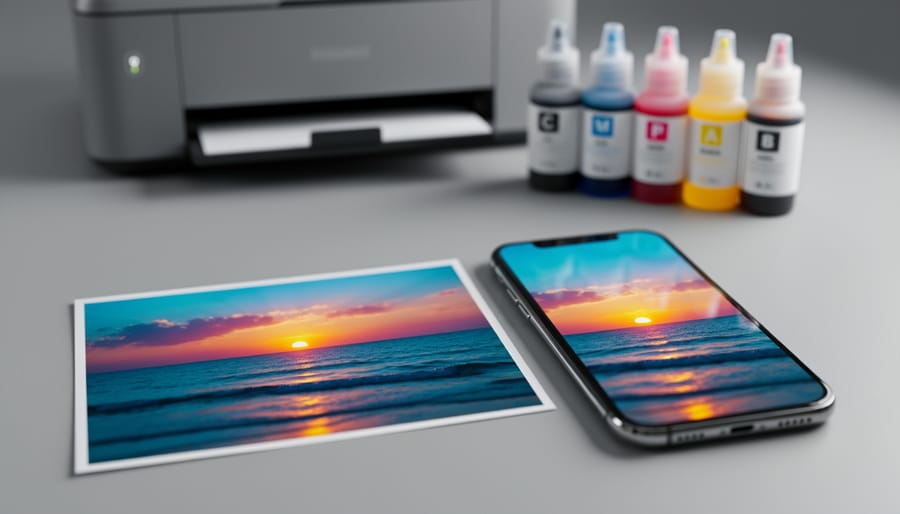
You’ve captured a stunning moment on your smartphone, the colors vibrant and perfect on your screen, only to receive prints that look muddy, dull, or completely off. This frustrating disconnect happens because your phone’s glowing screen uses light-based RGB colors (red, green, blue), while commercial printers rely on the 4 color printing process using CMYK inks (cyan, magenta, yellow, and black). Understanding this fundamental difference is the key to bridging the gap between what you see and what you get.
The 4 color printing process, also known as CMYK printing, works by layering tiny dots of these four ink colors in varying densities to create the full spectrum of colors you see in a finished print. When you shoot using smartphone photography techniques, your device captures and displays images in RGB, which offers a wider color gamut than CMYK can physically reproduce with ink on paper. This means some of those brilliant blues, electric greens, and neon hues simply can’t translate to print.
The good news is that you can take control of this process. By understanding how CMYK works and implementing proper color management workflows, you’ll preview how your images will actually print, adjust your colors before sending files to the printer, and finally receive prints that match your creative vision. This guide will walk you through the technical foundation you need and provide practical strategies to ensure your smartphone photos translate beautifully from screen to paper.
What Is the 4-Color Printing Process?
CMYK vs. RGB: The Fundamental Difference
Think about shining colored flashlights at a wall. When you overlap red, green, and blue light, they combine to create white light—that’s RGB, the additive color system your smartphone screen uses. Every pixel emits light, and adding more colors makes things brighter. It’s the reason your phone can display millions of vibrant hues with incredible intensity.
Now imagine mixing paint like you did in elementary school. Combine yellow and blue, you get green. Keep adding more colors, and you eventually end up with a muddy brown or black. That’s subtractive color—the foundation of CMYK printing. Instead of emitting light, printed inks absorb (or subtract) wavelengths of light and reflect what’s left back to your eyes.
Here’s where the disconnect happens: that brilliant sunset photo glowing on your phone exists in RGB, capable of producing colors that simply don’t exist in the CMYK spectrum. When you send that image to print, it must be converted from light-based colors to ink-based colors. Some of those vivid blues, bright greens, and saturated oranges your screen displays have no equivalent in standard printing inks.
This explains why your prints often look duller than expected. Your screen can display roughly 16.7 million colors, while standard CMYK printing reproduces a smaller range—maybe 55-70% of what you see on screen. It’s not that the printer is broken or the print shop made a mistake. You’re simply witnessing the physical limitations of translating light into ink, two fundamentally different ways of creating color.
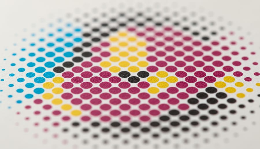
How Halftone Dots Create Your Photo
Here’s where the magic happens. The four-color printing process doesn’t actually mix inks on paper like watercolors blend on canvas. Instead, it uses a clever optical trick called halftone screening. Your image gets broken down into millions of tiny dots, each one printed in cyan, magenta, yellow, or black. These dots vary in size and spacing depending on how much of each color is needed in that area.
When you look at a printed photo from normal viewing distance, your eyes can’t distinguish the individual dots. Instead, your brain blends them together, creating the illusion of smooth gradients and a full spectrum of colors. A purple sky? That’s actually tiny magenta and cyan dots sitting next to each other. Skin tones? A careful arrangement of yellow, magenta, and cyan dots with occasional black for depth.
Want to see this for yourself? Grab a magnifying glass or loupe and examine any magazine photo or printed advertisement. You’ll spot the distinctive dot pattern immediately. In darker areas, the dots are larger and closer together. In highlights, they’re smaller and more spread out. This is why understanding the four-color process matters for smartphone photographers: your bright, backlit phone screen shows continuous color, but print reveals every limitation of translating that digital information into physical dots of ink.
Why Smartphone Photos Struggle With Print Translation
The Color Gamut Problem
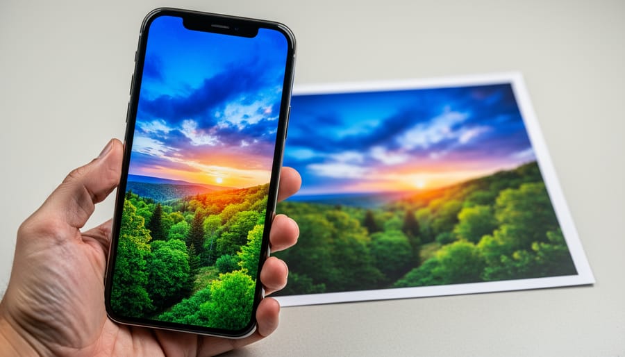
Here’s the frustrating truth: that stunning sunset photo glowing on your smartphone screen will likely look disappointingly dull when printed. This phenomenon isn’t a problem with your printer or the print shop—it’s a fundamental limitation of the 4-color printing process itself.
Your phone screen uses RGB (Red, Green, Blue) technology, which creates colors by emitting light. This additive color system can produce an incredibly wide range of vibrant, saturated hues. Meanwhile, CMYK printing relies on subtractive color, where inks absorb light rather than emit it. The result? A significantly smaller color gamut, or range of reproducible colors.
The most common disappointments happen with specific color families. Those electric neon pinks and oranges you captured at a music festival? They’ll appear muted and flat in print. Deeply saturated blues, like a brilliant azure sky or vibrant royal blue fabric, often shift toward purple or lose their punch entirely. Bright, lime greens typically become duller and more olive-toned. Even certain reds, particularly those leaning toward fluorescent territory, simply can’t be matched with standard CMYK inks.
This limitation is related to broader smartphone camera limitations, but it affects all digital photography regardless of your camera. Understanding this color gamut gap is essential for managing your expectations and adjusting your workflow before sending files to print. The good news? Once you understand which colors are problematic, you can compensate during editing.
What Happens During Color Conversion
When you tap “print” on that stunning sunset photo from your smartphone, something fascinating happens behind the scenes. Your image needs to transform from the RGB (Red, Green, Blue) color space your phone uses into CMYK (Cyan, Magenta, Yellow, Black) that printers require. Think of it like translating between two different languages where not every word has a perfect equivalent.
Here’s what actually occurs: Your printing software or the printer itself analyzes each pixel in your RGB image and calculates the closest possible CMYK combination to match it. This process is called color mapping or gamut mapping. The challenge is that RGB and CMYK don’t speak exactly the same color language. RGB creates colors by emitting light (like your phone screen does), while CMYK creates colors by absorbing light on paper.
This difference means RGB can produce certain vibrant colors that CMYK simply cannot replicate on paper. Those electric blues, neon greens, and brilliant oranges you see on your screen often fall outside what printers call the “printable gamut.” When the conversion happens, these out-of-gamut colors get shifted to the nearest printable alternative, which typically appears less saturated or slightly duller.
The loss isn’t random, though. Modern conversion algorithms try to preserve the overall look of your image by adjusting colors intelligently. However, you’ll often notice that bright, punchy colors lose some intensity, and subtle gradients might show slight banding. Understanding this limitation helps you set realistic expectations and adjust your images before printing for better results.
Color Management: Taking Control Before You Print
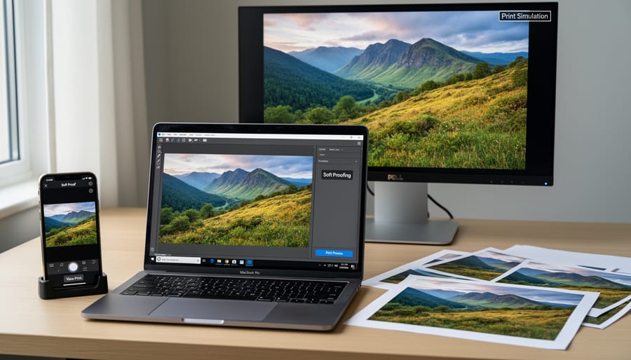
Using Soft Proofing to Preview Print Colors
Soft proofing is your crystal ball for predicting print results before spending money on actual prints. Think of it as a digital preview that simulates how your RGB phone photos will translate to CMYK printing, helping you spot potential color shifts before they happen.
The process works by applying an ICC profile that mimics your printer’s characteristics, showing you on-screen what your final print will look like. Modern color management tools make this surprisingly accessible, even for mobile photographers.
For desktop workflows, Adobe Lightroom Classic offers robust soft proofing capabilities. Navigate to View and select Soft Proofing, then choose a profile matching your intended printer and paper combination. Watch how your vibrant sunset might lose some saturation or how deep blues could shift slightly. You can then adjust your image specifically for that output, creating a custom version optimized for printing.
On mobile devices, Lightroom Mobile provides basic soft proofing features, though with fewer profile options than the desktop version. For more comprehensive mobile soft proofing, consider apps like Print Studio, which lets you preview images with various printer profiles before sending files to print services.
Here’s a practical workflow: First, get the ICC profile from your print lab. Most professional services provide these for download. Install the profile on your device, then enable soft proofing with that specific profile. Make subtle adjustments to compensate for predicted shifts, focusing on maintaining overall balance rather than chasing exact screen matches. Finally, save or export a CMYK-optimized version specifically for printing while keeping your original RGB master file intact for future uses.
Adjusting Your Photos for Better Print Results
Getting your photos print-ready requires different adjustments than what looks good on your phone screen. Since most mobile editing techniques optimize for backlit displays, you’ll need to make specific tweaks for the 4 color printing process.
Start by increasing contrast slightly, around 5-10%. Prints naturally appear flatter than screens because they rely on reflected light rather than emitted light. I learned this the hard way when my first landscape prints looked disappointingly dull compared to the vibrant images on my phone. A modest contrast boost compensates for this difference without creating harsh shadows.
Next, consider selective saturation adjustments. Boost mid-tone colors by 10-15%, but be cautious with highly saturated reds and bright blues. These colors often fall outside the CMYK gamut and can shift dramatically during printing. For example, that brilliant electric blue sky might print as dull purple. When in doubt, slightly desaturate problem areas before sending files to print.
Sharpening is essential but requires restraint. Apply sharpening at 100% view and use a radius between 0.5-1.0 pixels. Over-sharpening creates visible halos in prints that your screen might not reveal.
Finally, avoid pure black text or graphics by using rich black instead (a mix of all four CMYK inks). Pure black often prints gray and flat, while rich black delivers the depth you expect from printed materials.
Understanding Color Profiles and ICC Standards
Color profiles are like translators between your screen and the printer, ensuring everyone speaks the same visual language. When you capture a photo on your smartphone, it typically uses sRGB, a color profile designed for screens and web viewing. Adobe RGB offers a wider range of colors, popular among professional photographers. However, printers work in CMYK, which has a different color range altogether.
Think of ICC profiles as detailed instruction manuals that tell your printer exactly how to interpret the colors in your image. When you embed the correct color profile in your photo file, you’re essentially giving the printer a roadmap to reproduce your colors accurately. Without this embedded information, the printer makes its best guess, which explains why your vibrant sunset might print looking muddy or dull.
Here’s the practical takeaway: before sending files to print, ensure they’re tagged with the appropriate color profile. Most professional print services will specify which CMYK profile to use, and modern editing software can convert your sRGB smartphone photos to the correct profile while minimizing color shifts. This simple step prevents the frustrating disconnect between what you see on your phone and what emerges from the printer.
Choosing Print Services That Handle Color Correctly
Professional Labs vs. Consumer Services
Understanding your printing options helps ensure your smartphone photos translate beautifully to physical prints. The differences between professional labs and consumer services go far beyond just price.
Drugstore kiosks and big-box retail printers offer convenience and speed, typically using standardized color profiles that work reasonably well for everyday snapshots. These systems often apply automatic color corrections, which can be helpful for casual prints but problematic when you want precise color matching. Think of them as using a one-size-fits-all approach to color management. You’ll usually get decent results with well-exposed, properly lit photos, but images with subtle color gradations or specific color requirements may not print as expected.
Professional photo labs, whether online services like Mpix or Nations Photo Lab, or local specialty shops, provide significantly more control over the 4-color printing process. They typically offer ICC color profiles you can download and preview in photo editing apps, allowing you to see how your image will translate to CMYK before ordering. Many professional labs also use higher-quality inks and papers, resulting in better color accuracy, wider gamut reproduction, and improved longevity.
For casual family photos and quick gift prints, consumer services work perfectly fine and save money. However, when printing important images where color accuracy matters, or when creating portfolio pieces or wall art from your best smartphone photography, investing in professional lab services makes a noticeable difference. Professional labs also provide customer support to help troubleshoot color issues, something automated kiosks simply can’t offer.
Questions to Ask Your Print Provider
Before committing to a print provider, arm yourself with these essential questions to ensure your smartphone photos translate beautifully to paper.
Start with color management: “What color profiles do you use, and can I access them for soft proofing?” A professional provider should offer ICC profiles for their specific printer and paper combinations. Ask whether they work in Adobe RGB or sRGB color space, since your phone likely captures in sRGB.
Proofing is your safety net: “Do you offer proof prints before the full run?” This might cost extra, but it’s invaluable for important projects. Also inquire, “Can I see sample prints on different paper stocks?” Seeing actual output helps you understand how your images will render.
Paper selection matters enormously: “What paper types do you recommend for photographic prints, and how does each affect color reproduction?” Glossy papers often show more vibrant colors, while matte finishes offer subtler tones.
Quality control separates professionals from amateurs: “What calibration schedule do you follow for your printers?” Monthly calibration is standard for serious providers. Finally, ask about their revision policy: “If colors don’t match expectations, what’s your reprint process?” Understanding these terms upfront prevents disappointment and ensures you’re working with a provider who stands behind their color accuracy.
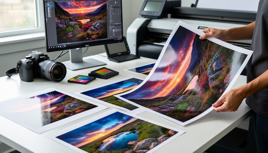
Real-World Workflow: From Smartphone Capture to Perfect Print
Let’s walk through a complete workflow that takes you from capturing an image on your smartphone to holding a stunning printed photograph in your hands. This practical guide combines everything we’ve covered about the four-color printing process into actionable steps.
Start with capture fundamentals. When photographing with your smartphone, shoot in your device’s native camera app using maximum quality settings. If your phone supports it, enable RAW capture (like Apple ProRAW or Android RAW format) to preserve more color information before CMYK conversion happens. Pay attention to lighting—well-lit scenes with good dynamic range translate much better to print than overly dark or blown-out images. The CMYK gamut is smaller than what your phone can display, so scenes with vibrant blues and greens need particular attention since these colors often shift during conversion.
Move to the editing phase with color-aware adjustments. Use reputable apps like Adobe Lightroom Mobile or Snapseed for optimizing smartphone photos. Here’s the key: slightly reduce saturation by 5-10% compared to what looks good on screen. This accounts for the smaller CMYK gamut and prevents disappointment when printed colors appear duller. Increase contrast slightly and ensure your blacks are true black rather than dark gray—this helps compensate for how CMYK handles shadows. If printing portraits, warm up skin tones just a touch, as the conversion process can sometimes render them slightly cooler.
Before ordering prints, preview your image at 100% zoom to check for any sharpness issues. Your print resolution should be at least 300 pixels per inch at the desired print size. A 12-megapixel smartphone photo prints beautifully at 8×10 inches but may show quality loss beyond 11×14.
When selecting a print service, choose established providers like Mpix, Nations Photo Lab, or local professional labs rather than drugstore kiosks. These services use calibrated equipment and higher-quality CMYK processes. Upload full-resolution files and avoid any auto-correction options—you’ve already optimized for print. Order a small test print first, especially for important images. This 4×6 proof lets you evaluate the CMYK conversion before committing to larger, expensive prints.
Consider requesting a soft proof if available—some professional labs provide digital previews showing how your RGB image will look after CMYK conversion. This preview eliminates guesswork and lets you make final adjustments before printing.
Understanding the 4 color printing process isn’t just about technical knowledge—it’s about taking control of your creative vision from capture to print. When you grasp how CMYK printing works and why your vibrant smartphone photos sometimes lose their punch on paper, you’re no longer at the mercy of guesswork. Instead, you can set realistic expectations and make informed decisions at every stage of your workflow.
The beauty of this knowledge is that it empowers you to be proactive rather than reactive. You’ll know when to adjust those sunset oranges during editing, when to request test prints before committing to large formats, and how to communicate effectively with print labs about your specific needs. Remember, even professional photographers don’t get perfect prints every time on the first try—they test, adjust, and learn.
Here’s my encouragement: start experimenting. Order small test prints of images that represent your typical style. Photograph landscapes? Test those rich blues and greens. Love portrait work? See how skin tones translate. Shoot vibrant street photography? Push those saturated colors and observe what happens. Each print is a learning opportunity that teaches you something specific about how your work translates to paper.
The investment in a few test prints now will save you disappointment and money later. You’ll develop an intuitive sense of what works for your particular style and subject matter, building confidence that your printed images will match your artistic intent. That’s when printing transforms from a frustrating mystery into an exciting extension of your creative process.