 By
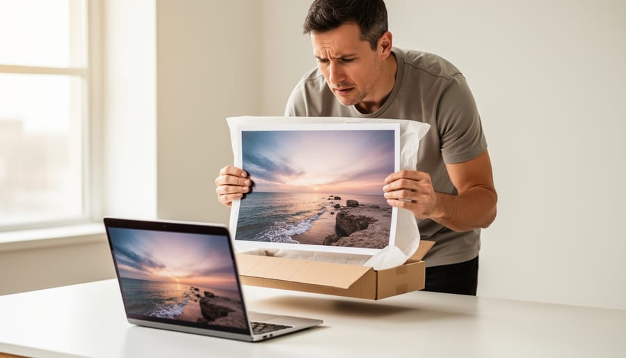
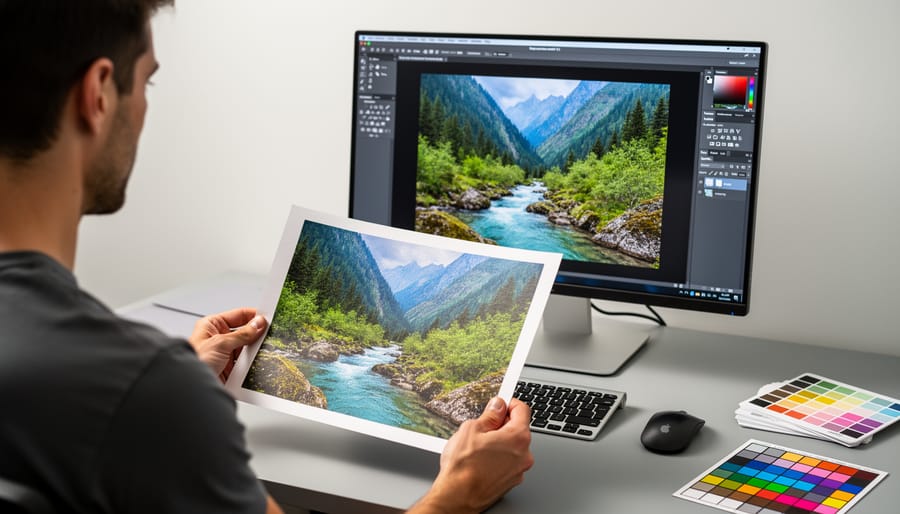
Most “bad prints” turn out to be one of two things: a mismatch between your screen and the paper, or normal variation that every lab and printer produces. A true defect is rarer, and it looks different. Start with a ten-second check. Hold the print under daylight-balanced light, not your desk lamp, and compare it side by side with the file on a screen set to moderate brightness. If the color shift or darkness disappears under good light, or the file looks too bright on your monitor to begin with, the problem is likely in your workflow, not the print.
If the issue survives that test, look at where it lives. Banding, streaks, scratches, specks, or a cast that shows up in the same spot on every sheet points toward the print itself. A general look that’s slightly warmer, darker, or flatter than you expected often points toward soft proofing, paper choice, or an uncalibrated display. Fine-grained differences between two prints of the same image can also fall inside normal tolerance, which is the acceptable range of variation a process can reasonably deliver.
Below, we’ll sort your symptom, explain how tolerance differs from a defect, and walk through documenting the problem so a reprint or refund request holds up. If you’re looking at physical damage like crushed corners or water marks, photograph the packaging first, before you touch anything else.
Symptom Triage: What Exactly Are You Seeing?
The Quick Checks Before You Call the Lab
Before you email anyone, spend five minutes ruling out the usual suspects. Most “bad print” complaints dissolve at this stage, and the ones that don’t leave you with a much stronger case.
Run these in order:
- Move the print under neutral, daylight-balanced light, near a window on an overcast day or under a bulb rated around 5000 to 6500K. Warm kitchen bulbs and cool office tubes both skew colors.
- Hold it at normal viewing distance, not nose-to-paper. Fine texture and slight banding that looks alarming up close often disappears at the distance the print is meant to be seen.
- Compare it against a soft proof or your original file on a calibrated screen set to moderate brightness. A soft proof is simply a simulation of how your file will look on a specific paper, built from the lab’s ICC profile (a small file describing how that printer and paper reproduce color). Cranking your screen to full brightness is the classic reason prints look “too dark.”
- Check your order confirmation for the paper type and finish you chose, then feel and look at the print. Gloss, luster, and matte behave very differently, and mixing them up is an easy mistake to spot.
- Measure the physical dimensions with a ruler, including any border you requested, and note whether anything important is cropped.
Photograph each check as you go. That habit also helps you avoid placeholders and stand-in images in your own records, since you’ll have real reference shots instead of guesses. If every step checks out and the problem remains, you can move on knowing it isn’t your lighting or your screen.
Likely Causes: Defect, Tolerance, or Something Upstream?
What Counts as Normal Variation: Understanding Print Tolerances
Every print has some wiggle room built in. Before you reach for the claim form, it helps to know what ordinary variation looks like, because ink on paper is a physical process, not a pixel-perfect copy of your screen.
The biggest source of confusion is the screen itself. A monitor emits light, while a print only reflects whatever light falls on it. That means saturated blues and greens, and the deepest blacks, will almost always look a touch different on paper.
Beyond that, a few differences are normal in practice:
– Color between runs and papers. A reprint of the same file, or the same image on a different paper, can shift slightly in warmth or contrast. Paper batches, ink lots, and surface texture all play a part.
– Trim size. Prints are cut mechanically, so a small difference in dimensions or border width is common, especially on larger formats.
– Surface character. Matte, lustre, and gloss each render shadows and highlights differently, so a swap in finish will change the look even with identical color data.
Contrast those with real problems like creases, scuffs, or handling damage which aren’t variation at all. They’re defects, and they deserve a different conversation.
There is no single universal standard that every lab follows, so don’t assume one exists. Many labs publish their own tolerance or acceptance policy, usually on a help page, in their terms, or alongside their color-profile downloads. Find it before you order, not after something goes wrong.
When you read it, look for plain-language statements about color matching, trim accuracy, and what the lab considers a reprint-worthy fault. Notice whether it mentions your file’s color space and profile, since that often decides who is responsible. If the wording is vague, ask the lab to clarify in writing, and save the reply.
Defects That Are Never Acceptable
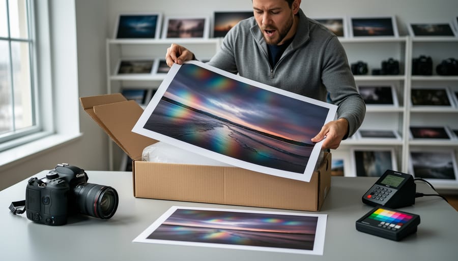
Some problems aren’t a matter of taste or tolerance. If you can see the flaw from arm’s length, in neutral light, without comparing it to anything, it’s almost certainly a defect. The difference is simple: a tolerance issue shifts how the print looks, while a defect damages the print itself.
Here’s what generally earns a reprint or refund:
- Banding or streaks: repeating lines or stripes, often visible in smooth areas like skies and skin tones.
- Ink smears or smudges: fuzzy, dragged ink that wasn’t dry or was touched during handling.
- Scuffs and scratches: abrasions, especially on glossy or dark areas, where the surface looks rubbed or scored.
- Creases and dents: folds, kinks, or pressure marks that break the surface of the paper.
- Water damage: ripples, stains, or warping, usually along the edges first.
- Wrong paper or finish: a matte print when you ordered lustre, or a different weight than your order confirmation.
- Bad cropping: a head, horizon, or key detail cut off, when your file clearly had room.
- File-handling errors: swapped images, rotated or stretched files, or a missing section the lab should have caught.
Now compare those with normal variation. A touch more warmth, a slightly different contrast curve, or a trim that’s a hair off won’t usually qualify. The rejection cases above are visible flaws, not subtle differences.
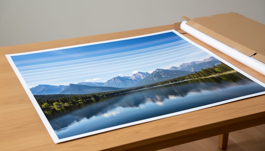
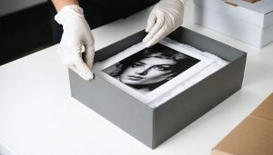
One more thing worth knowing: some damage happens in transit, not at the lab. A crushed corner or a crease from a bent tube can still be a valid claim, but the packaging matters. If you’re sending your own work to clients, make sure it can survive shipping too, so the same problem never lands on your end.
Step-by-Step Fix: Inspecting, Documenting, and Resolving a Problem Print
How to Write a Claim the Lab Can Act On
A good claim reads like a short case file, not a complaint. The lab’s support team handles a lot of messages, and the ones that get resolved fastest are the ones that let someone verify the problem without a back-and-forth. Include four things:
– Your order numberso they can pull up the job, paper, and file instantly.
– Photos of the print next to the file on screentaken in neutral light, plus a close-up of the flaw itself.
– A plain description of what’s wrongand where on the print it appears.
– The outcome you wantwhether that’s a reprint, a refund, or a partial credit.
If the print arrived creased or scuffed, photograph the box and packing too. Damage in transit often points to the need for better packaging, and those photos support your case.
Compare these two messages.
Vague: “My print looks bad and the colors are off. Please fix this.”
Specific: “Order 48213, 16×20 lustre. A horizontal band of cyan streaking crosses the sky, about four inches from the top edge. I’ve attached a photo of the print beside my original file under daylight-balanced light, plus a close-up of the band and the box it arrived in. I’d like a reprint, please.”
The second version tells the lab exactly what to check and what you expect. Keep the tone calm and factual, and you’ll usually get a faster, friendlier response.
Prevention: Setting Yourself Up for a Print You Can Accept on Delivery

Acceptance on Delivery: A Simple Routine for Every Order
Think of the delivery moment as a short checklist rather than a vibe check. Here’s the routine that works for most orders:
1. Open the box the day it arrives, while the packaging is still intact and the courier details are fresh.
2. Pull each print and look at it in neutral, daylight-balanced light, not under a warm lamp or a window with a colored curtain.
3. Hold it next to the file on a calibrated screen, remembering that ink on paper won’t glow the way a backlit display does.
4. Measure the dimensions, count the prints against your order, and note the paper and finish.
5. Decide right then: accept, or start a claim.
A small portrait studio I know made this a standing habit. Whoever unpacks the order checks every print against a printed order sheet and photographs the box before opening it. Twice that has turned a vague “something feels off” into a clean, documented claim, and the lab fixed both without any back and forth.
Keep your notes simple: order number, date received, and a one-line verdict per print.
Print Quality Control FAQs
Why do my prints look darker than my screen?
A screen emits light and a print only reflects it, so a print can never be as luminous as a backlit display. If your monitor runs bright or isn’t calibrated, the gap gets much wider, which is why a calibrated screen and a soft proof matter before you order.
Is a slight color difference grounds for a reprint?
Usually not, since small shifts between screen and paper, or between runs, are normal variation. A reprint is more realistic when the difference is obvious, such as a heavy color cast or something clearly out of line with a proof you approved, but check your lab’s own acceptance policy.
Who pays if the file was the problem?
Generally the lab prints what you send, so a low-resolution image, wrong color space, or unflattened edit tends to be the customer’s responsibility. Policies differ, so read the lab’s terms before assuming either way.
Should I order a test print first?
For a large or expensive run, yes. A small test on the same paper shows you how your tones and colors translate before you commit, and it costs far less than a reprint.
Paper choice changes how colors look more than most people expect. Glossy and luster surfaces tend to hold deeper blacks and punchier color, while matte and fine art papers soften contrast and can make a vibrant image feel quieter. If you switch papers, treat it like starting over and soft proof for the new stock rather than assuming your old settings will carry across.
Timing matters too. Inspect a delivery as soon as it arrives, ideally while the packaging is still intact, because many labs set a limited window for reporting problems. Since those windows vary, confirm the exact timeframe in your lab’s policy rather than guessing, and photograph any issue before you do anything else.
Most of the time, a disappointing print isn’t a printing failure at all. It’s the kitchen bulb, the over-bright editing monitor, the low-resolution file, or the ordinary give-and-take of ink on paper that can never quite match a backlit screen. Genuine defects like banding, smears, creases, and the wrong paper do happen, and when they do, you deserve a reprint. But you can only make that call with confidence if you’ve ruled out the everyday culprits first.
That’s what a short, repeatable inspection routine buys you. Look at the print in neutral light, compare it with your file, check the size and finish you ordered, and decide to accept or claim while the packaging is still intact. It takes a few minutes, and it turns a gut-sinking moment into a clear decision.
Before your next order, find your lab’s acceptance policy and read it. Then treat that first look at a delivered print as a real quality-control step, not an afterthought. Your future self, and your clients, will thank you.

 By