 By
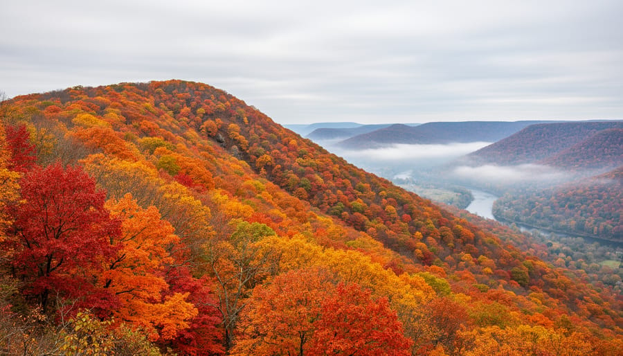
A peak autumn foliage map shows you, region by region, how far fall color has progressed, so you can aim your trip at the week when the leaves are at their brightest. The short version: check a current map for the area you want, compare it against typical timing for that region, and plan to arrive with a few days of flexibility on either side. Peak usually moves from north to south and from high elevation to low, but the exact dates shift every year with temperature, rainfall, and the first frosts, so no single calendar date is reliable.
That’s why the map matters more than any “best week” list. A foliage map turns a vague hope into a plan. It tells you whether the ridgeline is already bare while the valley is just turning, and whether it’s worth driving three hours for color or waiting a weekend.
For photographers, the stakes are a little higher. Peak color lasts days, not weeks, and an overcast morning at the right moment can beat a perfect sunrise a week too early. Below, we’ll cover how to read a foliage map, eight standout regions worth building a trip around, and the planning and shooting details that help you land on the right ridge at the right time.
What a Peak Foliage Map Really Tells You (and Why It Matters for Photographers)
A peak autumn foliage map looks simple: a color-coded gradient laid over a region, usually sweeping from north to south and from high ground to low. But each color is a quick summary of conditions on the ground, and knowing how to read it saves you a lot of guesswork.
Most maps use a few stages. Early or minimal means just a handful of trees are turning. Patchy or moderate means color is building but uneven, with green still dominating. Near peak means most trees show strong color, and peak means the landscape is at or close to its fullest, richest display. Past peak means leaves are dropping, and bare branches are starting to show.
Behind those colors is a blend of inputs. Many maps lean on observer reports from volunteers, park staff and local tourism offices who describe what they see. These get combined with seasonal forecasts and weather models that track temperature, rainfall and daylight. Cool nights and sunny days tend to speed up and intensify color, while a warm, wet stretch can delay it. Because the weather keeps changing, a map is a best estimate rather than a promise. Treat it as a compass, not a schedule.
For photographers, that distinction matters more than it does for a casual leaf-peeper. Someone out for a weekend drive is happy with “pretty good color.” We’re chasing a specific look: saturated reds, glowing golds, and enough leaves still on the branches to fill the frame.
Picture arriving a week too early. The hillside you scouted is still mostly green with a few orange streaks, and the photo reads as a summer scene with a hint of fall. Arrive a week too late and the story flips. The best leaves are carpeting the ground, branches look thin, and the sky does most of the work. In both cases the location is identical, yet the image feels flat.
That’s why the colors on the map are only a starting point. They tell you where to aim, and your timing, flexibility and eye for light do the rest.
How We Chose These 8 Foliage Regions
Eight regions can’t cover every beautiful forest on the map, so I used a few simple filters to narrow the list.
First, reliability. I favored places where strong color shows up year after year, rather than spots that only deliver in a perfect season. Second, variety of trees. Sugar maples, aspens, bigleaf maples and mixed hardwoods each produce a different palette, and a good list should show that range.
I also looked for photographic variety: lakes and coastlines for reflections, mountains for layered ridgelines, historic villages and farmland for human scale, and waterfalls for movement. Accessibility mattered too, since a hotspot is only useful if you can reach it by road or a manageable trail.
Finally, I spread the picks across different parts of the map, so most readers will find something within reach.
A note on sourcing: these choices come from widely documented regional foliage patterns and public park and tourism information. They are not claims of first-hand visits, and you should always confirm current conditions before you travel.
Top Autumn Foliage Hotspots to Pin on Your Map
1. Vermont’s Green Mountains and Stowe Area
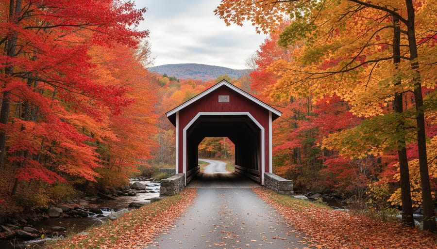
Vermont’s Green Mountains are the postcard version of New England fall. Sugar maples, which turn a fiery orange and red, line the back roads, and covered bridges and white-steepled churches give you ready-made foregrounds. Stowe is a handy base because the village sits right below the high ridgelines.
On a foliage map, Vermont’s higher elevations tend to show color first, often moving from patchy to near peak in late September or early October, while the valleys follow later. That staggered timing is your friend: if the village is still green, drive uphill and you may find the show already underway.
For composition, try pairing a village scene with the ridgeline behind it. Place a steeple in the lower third of the frame and let a color-streaked mountain fill the background. A short telephoto lens, somewhere around 70-200mm, compresses the layers so the hillside looks richer and more densely packed with color.
2. New Hampshire’s White Mountains and the Kancamagus Highway
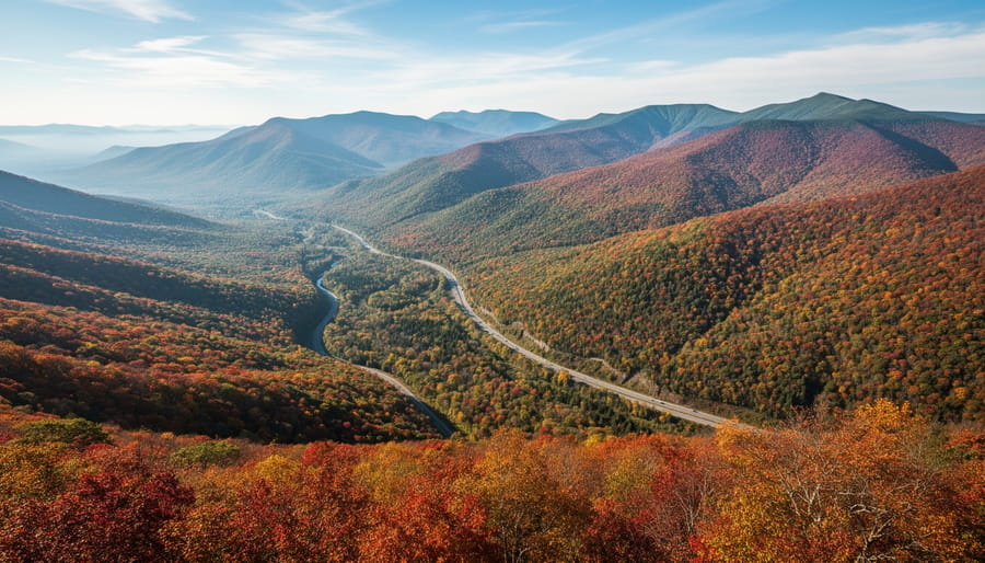
The Kancamagus Highway (Route 112) runs about 34 miles through the White Mountain National Forest, and it’s a gift for photographers because the road itself works like a built-in foliage map. The route climbs and dips with the terrain, so color doesn’t arrive all at once. Higher stretches near Kancamagus Pass tend to turn first, while the lower valley sections near Conway and Lincoln often catch up later. That staggering gives you more than one chance to find good color on a single drive.
Pull-offs like Sabbaday Falls, Lower Falls and the Swift River overlooks frame water, boulders and tree-covered ridges in one view. Autumn rain leaves leaves slick and shiny, which can wash out color in your photos. A circular polarizing filter, which cuts glare and boosts saturation, strips that sheen away. Rotate it slowly while watching the screen and you’ll see the reds and oranges deepen.
3. Acadia National Park, Maine
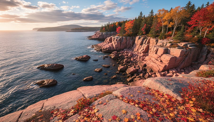
Acadia is where fall color meets the Atlantic. Red maples and golden birches frame pink granite shorelines, and the sea adds contrast you won’t find inland. Color here tends to arrive earlier than in many southern spots, and the coastal location keeps it moving along the map at a slightly different pace than the interior.
The real challenge is the sunrise. A bright sky over dark rock and foliage can overwhelm your sensor. Expose for the highlights, shoot RAW (the uncompressed file format that preserves more editing flexibility), and consider bracketing, which means taking several frames at different exposures to blend later. Use a graduated neutral density filter, a filter that darkens only the sky, to balance the scene.
Check the water, too. Learning tide pool timing helps you find wet, reflective rocks at low tide, and these coastal timing tips will keep you safe and well positioned.
4. The Adirondacks, New York
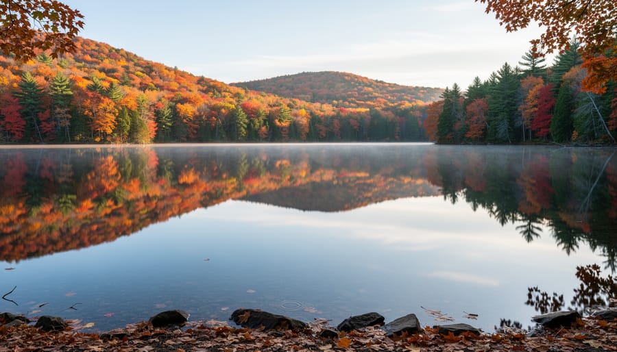
The Adirondacks reward patience more than almost any other region on the map. With thousands of lakes and ponds scattered across vast forest tracts, you can often find a sheltered cove where the water goes glassy, doubling the hillside color in a perfect mirror. Color typically arrives earlier at higher elevations and in the northern reaches, then drifts downhill and south, so a map helps you choose which lake to visit and when.
Calm is the key ingredient. Wind ripples ruin reflections, and the stillest conditions usually come at dawn, before the breeze picks up. Arrive early, scout a shoreline with a clear view of the color, and wait.
A tripod matters here. In dim morning light, you’ll want a slow shutter speed (the length of time the sensor is exposed), and a sturdy support keeps everything sharp. Stop down to around f/11 so both the far shore and its reflection stay crisp.
5. Great Smoky Mountains National Park, Tennessee and North Carolina
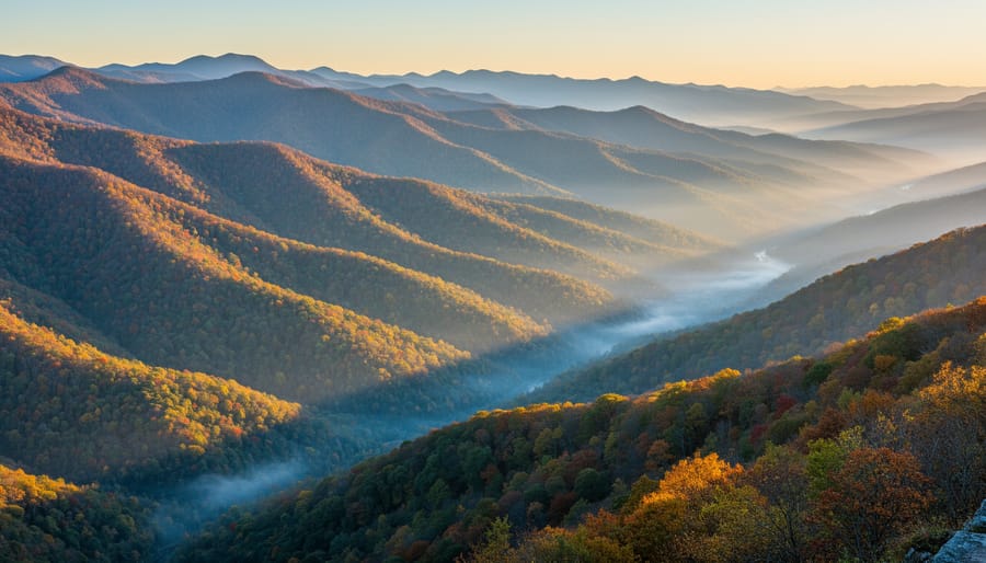
The Smokies are a gift to anyone who struggles with timing. The park spans thousands of feet of elevation, and its forests hold a huge mix of hardwoods, from maples and hickories to yellow poplars and oaks. The result is a color season that unfolds slowly instead of arriving all at once.
On a peak foliage map, you’ll see color start at the highest ridges and creep downhill and southward. That means a single trip can include several “peaks.” If the high elevations are already past their best, drop to a lower road and the color is often just arriving. Tracking the map’s high-to-low progression lets you chase color across several weeks rather than gambling on one weekend.
Mornings add the mood. Valleys often fill with mist at sunrise, softening layered ridgelines into hazy blue steps. Try a modest telephoto lens, which compresses distance and stacks those ridges, to make the mist and color work together.
6. Aspen Groves of Colorado’s Rocky Mountains
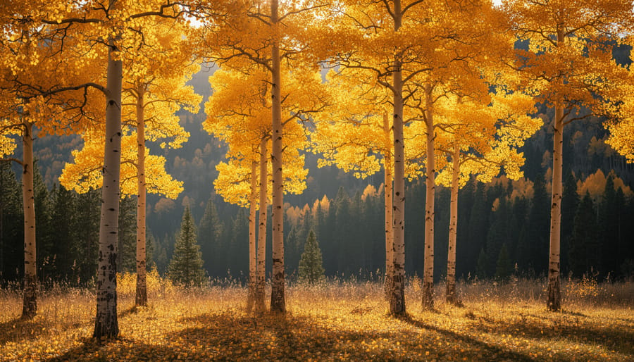
Colorado’s aspens do fall color differently from the maples of the East. Instead of fiery reds, you get a clean, glowing yellow that pops against dark evergreens and rocky alpine skylines. On a foliage map, these high-elevation stands tend to light up early, often well before lower valleys catch up, so they’re worth watching closely.
Backlighting is your best friend here. Aspen leaves are thin and translucent, so when the sun sits low behind them, they glow almost like stained glass. Position yourself so the light comes through the canopy, then expose for the highlights so the yellows don’t blow out.
A telephoto lens (roughly 70-200mm or longer) helps you use compression, the visual flattening that stacks distant hillsides on top of one another. Aim it across a valley and you’ll get bands of gold, green and blue-gray ridgelines layered like a painting.
7. Columbia River Gorge and the Pacific Northwest
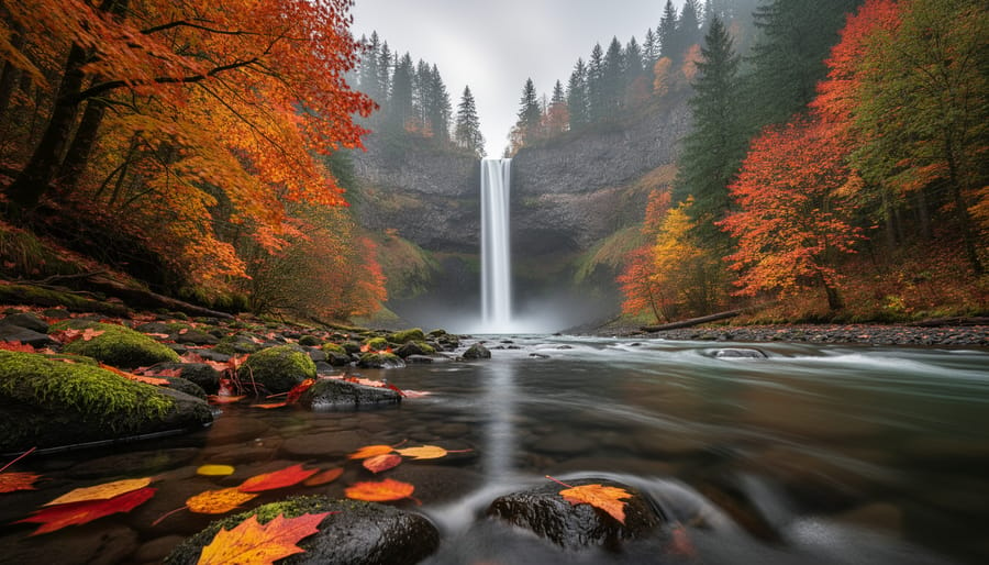
The Columbia River Gorge pairs fall color with some of the most photogenic water in the country. Bigleaf maples turn a warm yellow against moss-draped trunks and evergreen firs, while waterfalls like Multnomah Falls and the smaller cascades along the Historic Columbia River Highway add motion and contrast. Color here typically arrives later than in the northern Rockies or New England, often well into the season, and tends to hold at lower elevations longer than you’d expect.
Overcast days are your friend. Soft, diffused light removes harsh shadows and deepens saturation, so reds and golds look rich instead of washed out. It also lets you use slow shutter speeds (around half a second to two seconds) to turn falling water into silky ribbons without blowing out the whitest highlights.
Expect damp conditions. Mist and drizzle are common, so carry a microfiber cloth, a rain cover, and a lens hood to keep droplets off your glass.
8. Japan’s Kyoto and Nikko Regions
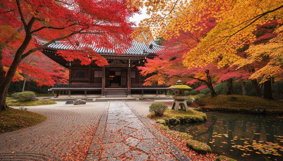
Kyoto and Nikko offer the red-and-orange side of fall color. Japanese maples (momiji) turn deep crimson and bright orange, and they frame temples, stone lanterns and moss gardens in a way few other places can. Kyoto’s color usually arrives later than Nikko’s, since Nikko sits higher in the mountains, so the two regions can be paired across a longer window.
Japan treats foliage almost like a national event, with its own forecasts and color-progress maps that follow the same north-to-south, high-to-low logic you’ve seen elsewhere in this guide. Check them as your dates approach, and treat them as a guide rather than a promise.
Crowds are the real challenge at famous temples. Arrive at opening time, when light is soft and paths are quiet. Many temples restrict tripods, drones or interior photography, so look for posted signs and ask if you’re unsure. Respecting those rules keeps these places welcoming for everyone.
Reading the Map and Planning Your Trip: Practical Information
A single foliage map is a snapshot, not a verdict. Compare two or three of them, ideally a mix of a state tourism map, a regional forecast and an observer-report site, and look for where they agree. If one says “near peak” and another says “patchy,” trust the overlap and check recent photos from the area to settle it. Start looking about three to four weeks out, then check again every few days as your trip gets closer, since the picture can shift fast.
Timing depends on a handful of factors, and knowing them helps you read any map more sensibly. Latitude and elevation set the baseline: color moves from north to south and from high ground to low. Beyond that, weather influences fall foliage through rainfall, temperature swings and the timing of the first frost. Cool nights with sunny days tend to deepen color, while an early hard frost or a strong windstorm can strip branches in a day or two. That’s why building a flexible itinerary matters more than picking one perfect date.
Here’s a quick pre-trip checklist to keep handy:
- Check multiple foliage maps and compare them against recent photos.
- Build flexibility into your itinerary, with a few days of buffer on either side.
- Confirm road and park access, since seasonal closures and weather can change things.
- Book lodging early in popular regions, where rooms fill up well ahead of the season.
- Pack weather layers and gear protection for cold, damp mornings.
A few logistics are worth planning around. Popular overlooks and trailheads often have limited parking, and lots can fill by mid-morning, so arriving before sunrise gives you both a spot and the best light. Keep a backup location within an hour’s drive in case your first choice is past peak or fogged in. Finally, check road and park status the morning you head out, because scenic byways and mountain roads can close for maintenance or weather with little notice.
Shooting Tips for Color That Actually Looks Like Fall
A foliage map tells you where color is happening, but your camera settings decide whether it looks like fall or like a flat green-brown blur. Start with elevation. Because color moves from high ground to low, you can chase it: if the valley looks patchy on the map, drive up toward the ridgelines where the leaves turned first.
Light matters just as much. Soft, overcast skies are your friend here, since they cut harsh shadows and let reds and oranges look rich instead of washed out. Picture a late-morning shot of a maple hillside under bright sun: the leaves reflect glare, the shadows go muddy, and the color looks thin. Return at golden hour, or on a cloudy morning, and the same trees glow.
A circular polarizer (a filter that cuts glare and boosts saturation) is especially useful on wet leaves and near water. Expose for the highlights so bright foliage doesn’t blow out, and shoot in RAW, the uncompressed file format that keeps far more editing flexibility than a JPEG. That extra data lets you recover subtle gradients in a red maple.
Finally, protect your gear. Mist and cold are common in fall, so carry a microfiber cloth and a rain cover, and keep spare batteries in an inside pocket, since cold drains them quickly.
Peak Foliage Map FAQs
Foliage maps raise the same handful of questions every year, so here are straight answers to the ones photographers ask most.
How accurate are peak foliage maps?
They’re a solid guide for the general state of color across a region, but they can’t predict what a specific hillside or overlook looks like on a given morning. Treat them as a compass and check several sources before you commit to dates.
How far ahead can I trust a foliage forecast?
Forecasts get more reliable the closer you are to your trip, because weather in the weeks before peak does most of the shaping. Use long-range predictions for rough planning, then rely on the current map and recent observer reports once you’re a week or two out.
Why does color change from year to year?
Temperature swings, rainfall, and early frost all influence how vividly and how quickly leaves turn. A warm, wet stretch can delay color, while crisp, sunny days with cool nights often produce richer reds and oranges.
Which region is best for beginners?
Great Smoky Mountains National Park is a forgiving starting point. Its huge elevation range spreads color across several weeks, so even if your timing is a little off, there’s usually good color somewhere nearby.
If you do arrive after peak, don’t write the trip off. Past-peak scenes can still make striking photographs, with fallen leaves carpeting trails and streams, so shift your focus to ground-level compositions and moody, muted palettes rather than sweeping canopy views.
So, which region is calling your name? Whether it’s a Vermont ridgeline, a misty Smoky Mountains morning, or a maple-lined temple in Kyoto, the next step is simple: pull up a foliage map, pick a window, and book something you can still change.
Pack patience along with your lenses. Scout a few vantage points before sunrise, and remember to protect your gear from damp and cold.
That’s the heart of our Autumn Foliage Hotspots: Travel Location Guides series: great fall color rewards the photographer who plans loosely and shows up ready. Where do you love shooting fall color? Share your favorite spot with us.





 By