 By
By 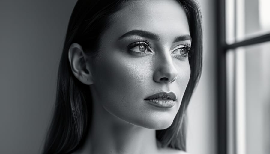
Black and white portrait photography strips away the distraction of color to reveal the essential elements that make an image powerful: light, shadow, texture, and emotion. By eliminating the chromatic layer, you force the viewer to focus on form, contrast, and the subtle interplay of tones that define a face, making every wrinkle, glance, and highlight count toward the story you’re telling.
This technique isn’t just a nostalgic throwback. It remains one of the most effective ways to create timeless, emotionally resonant portraits because it simplifies your visual language while amplifying mood. When you shoot in monochrome, a single shaft of window light becomes dramatic, skin texture transforms into a tactile element, and even ordinary backgrounds recede into elegant simplicity.
The current surge of interest in black and white portraiture reflects this enduring appeal. A competition running from September 27 through November 15, 2026, is inviting photographers to demonstrate their mastery of light, shadow, contrast, and composition through monochrome imagery, with CAPA Medals awarded for aggregate scoring and Merit Award e-certificates for top-scoring images in each theme. This kind of structured challenge highlights how the genre continues to push photographers toward technical precision and creative depth.
Whether you’re shooting your first monochrome portrait or refining years of practice, the fundamentals remain consistent: understand how light sculpts a face without color to guide the eye, recognize which subjects and settings benefit most from monochrome conversion, and develop a processing workflow that enhances tonal separation without crushing detail. The barrier to entry is low since any camera can capture the raw information you need, but the ceiling for mastery is high because success depends entirely on your ability to see and shape light.
Why Black and White Still Matters for Portrait Photographers
Color can distract. When you strip it away, what’s left? Emotion, form, the interplay of light across skin. Black and white portrait photography forces both photographer and viewer to confront the essentials: Is the lighting sculpting the face or flattening it? Does the composition guide the eye or scatter attention? Without the crutch of vibrant hues to mask weak fundamentals, monochrome reveals whether you truly understand how to shape light.
That’s precisely why black and white remains vital for portrait photographers in 2026, even as camera sensors capture color with unprecedented fidelity. The current CAPA competition, which opened September 27 and closes November 15, 2026, celebrates exactly this mastery of light, shadow, contrast, and composition through black and white imagery. It’s a reminder that stripping away color isn’t a limitation, it’s a deliberate creative choice that demands technical rigor.
Monochrome portraits also age better. A well-executed black and white portrait from 1950 feels just as powerful today, while color images often betray their era through clothing trends, film stock characteristics, or faded prints. This timelessness matters whether you’re building a professional portfolio or documenting your own family. The absence of color removes temporal markers, letting the subject’s expression and the quality of light carry the entire image.
There’s a practical advantage too: black and white forgives lighting inconsistencies that would ruin a color portrait. Mixed white balance from window light and tungsten bulbs? Not an issue in monochrome. Slight color cast from shooting through glass? Irrelevant. This isn’t permission for sloppy technique, but it shifts your focus to what genuinely matters: the direction and quality of light, the texture it reveals, and the emotion it conveys.
The Essential Elements of Strong Black and White Portraits
Mastering Light and Shadow
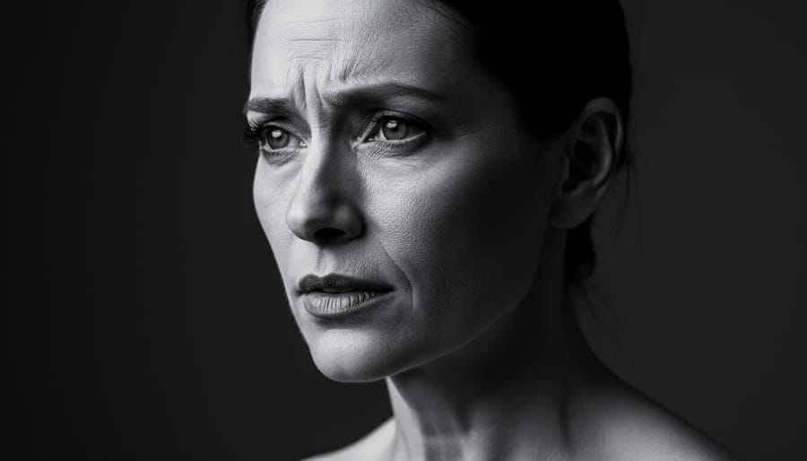
Light determines everything in black and white portraiture. Without color to separate elements, the interplay between illumination and darkness becomes the primary tool for revealing form, texture, and emotion.
Side lighting positions your light source at roughly 90 degrees to your subject, creating pronounced shadows that emphasize facial contours and bone structure. This technique works exceptionally well for defining cheekbones, jawlines, and the bridge of the nose. The shadow side reveals depth that would disappear under flat, frontal illumination.
Rembrandt lighting creates a distinctive inverted triangle of light on the shadow side of the face, just beneath the eye. Position your light source 45 degrees to the side and slightly above eye level. This classic portrait lighting setup delivers dimensional, moody results that showcase why mastery of light and shadow matters in monochrome work.
Split lighting takes drama further by illuminating exactly half the face while leaving the other half in complete shadow. Your light source sits at 90 degrees, creating a sharp division down the center. This approach suits subjects with strong facial features and works particularly well for conveying intensity or mystery.
Natural light offers the same directional control as studio setups. Window light functions like a large softbox when your subject faces it at an angle. Moving closer to the window increases contrast; stepping back softens it. Overcast days provide even illumination, while direct sun through a window mimics hard studio light. The advantage is cost and portability, though you sacrifice precise control over intensity and direction that studio strobes or continuous lights provide.
Understanding Contrast and Tonal Range
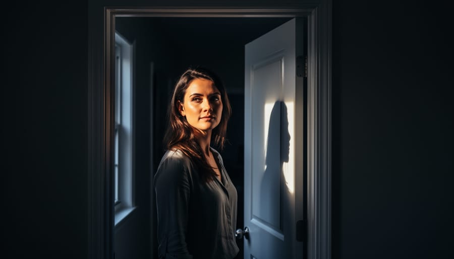
Contrast is the engine that drives a black and white portrait. The spectrum from pure black to pure white creates depth, dimension, and visual impact, but only when you control it deliberately. Muddy midtones, where everything sits in a narrow gray band, rob your portraits of life. The fix starts with exposure: meter for your subject’s skin and decide whether you want that tone to sit in the midtones or pushed toward brighter or darker zones.
High-key portraits use predominantly light tones with minimal shadows, creating an airy, optimistic feel. They work well for beauty and fashion, where soft lighting wraps the subject and bright backgrounds push everything toward white. Low-key portraits do the opposite: deep shadows dominate, with selective highlights picking out facial features. This creates drama and mystery, perfect for character studies. Neither approach is better, they serve different emotional intentions.
Preserving detail in highlights and shadows requires exposing so that your brightest areas (often forehead or cheekbones) don’t clip to pure white, while your darkest shadows (hair, clothing) retain enough information to distinguish texture. Check your histogram while shooting and use your camera’s highlight/shadow warnings. In post-processing, you’ll recover detail from these extremes, but you can’t retrieve information that was never captured.
When to use dramatic contrast versus subtle gradations depends on your subject and intent. Strong contrast emphasizes structure and emotion, sharp cheekbones, deep-set eyes, pronounced expressions. Subtle tonal transitions suit softer moods and highlight delicate details like skin texture or gentle expressions. The current celebration of black and white mastery demonstrates both approaches: competition entries showcase everything from high-contrast character studies to nuanced, low-contrast intimacy.
Composition Without Color Cues
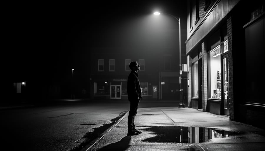
Without color to separate your subject from the background or guide the viewer’s eye through the frame, composition becomes entirely about tonal values, lines, and spatial relationships. Start by using leading lines, a window frame, a doorway edge, or even the angle of a shoulder, to direct attention toward the subject’s face. These lines create movement and structure that feel more deliberate in monochrome.
Negative space works harder in black and white because tonal separation defines it. Position your subject against a background that contrasts with their skin tone: a dark jacket against a white wall creates instant separation, while matching tones make the subject blend and disappear. Pay attention to where shadows fall behind the head and shoulders; these darker areas can either frame the face or compete with it.
Tonal layering builds depth when color can’t. Place your subject between a lighter foreground element and a darker background, or reverse it, to create distinct planes that pull the viewer into the image. A portrait shot through a doorway, for instance, gains dimension from the dark frame, the subject’s midtones, and the receding background, all separated by light rather than hue. This stacking of tones from front to back gives monochrome portraits their three-dimensional quality.
Camera Settings and Shooting Techniques
When you’re ready to shoot black and white portraits, your camera settings need to work with, not against, the light you’re capturing. Unlike color work where saturation and hue can compensate for mediocre exposure, monochrome reveals every tonal decision you make in-camera.
Shoot RAW, Always
RAW files give you far more latitude when converting to black and white because they preserve the full color information from your sensor. Even if you’re shooting with your camera’s monochrome preview mode active, that RAW file still contains separate red, green, and blue channel data. This matters enormously during conversion, you can use those channels to control how skin tones, fabrics, and backgrounds translate to grayscale. A JPEG bakes in a single interpretation. RAW lets you revisit that decision with nuance.
Exposure for the Shadows
In high-contrast portrait scenarios, expose to protect your shadow detail rather than your highlights. You can often recover blown highlights in post, but crushed blacks lose facial structure permanently. Use your histogram as a guide: you want information across the tonal range, but if you’re choosing where to clip, bias toward preserving the dark end. Underexposing by a third to half a stop frequently yields better results than the meter suggests, especially with dramatic aperture control directing attention through selective focus.
Metering Strategies
Spot metering works well when you can meter off your subject’s skin in the area you want as a midtone, then adjust from there. Center-weighted metering handles most one-light setup portraits where your subject dominates the frame. Evaluative metering can be fooled by dark clothing or bright backgrounds, it averages the scene, which often isn’t what you want in a portrait emphasizing facial tones over environment.
Using Color Filters for Tonal Control
If you’re working with physical color filters on your lens, a yellow filter darkens blue skies and lightens skin slightly. Orange goes further, creating more drama. Red filters produce the most contrast, turning blue eyes nearly white and skies almost black. These are particularly useful outdoors where you can’t control ambient light color temperature.
Most photographers skip physical filters and apply the same logic digitally during conversion, adjusting individual color channels to control how different hues translate to gray values. The principle remains identical: you’re manipulating the relationship between colors and their monochrome equivalents to create the tonal separation and mood you want.
Post-Processing Black and White Portraits
Converting from Color to Black and White
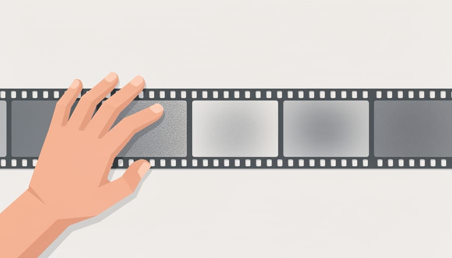
The way you convert a color portrait to black and white matters far more than most photographers realize. A simple grayscale conversion treats all colors equally, often producing flat, lifeless results where vibrant blue eyes look identical to brown ones, and red clothing blends into the background.
The channel mixer gives you manual control over how each color channel (red, green, blue) contributes to the final grayscale image. By adjusting these sliders, you can make reds darker or lighter, blues more prominent, and greens brighter or more subdued. This method works well when you need surgical precision, but requires understanding how colors translate to tones.
Black and white adjustment layers in software like Photoshop or Lightroom offer the most intuitive approach. These tools show individual sliders for each color family, letting you lighten skin tones by increasing reds and oranges while darkening blue eyes or greenery in the background. You can see changes in real time, making it easier to achieve the tonal separation that gives monochrome portraits their depth.
HSL (Hue, Saturation, Lightness) desaturation works differently. It preserves the original color channel structure while removing saturation, giving you control over specific color ranges even after conversion. This method excels for portraits where clothing, eye color, or background elements need independent tonal control.
The key insight: your original color photograph contains information about six to eight distinct color ranges. By manipulating how each translates to gray, you control the emphasis, separation, and mood of the final portrait in ways that straight desaturation never can.
Refining Contrast and Local Adjustments
Once you’ve completed your initial conversion, refining contrast and local adjustments separates workmanlike black and white portraits from images that genuinely hold attention. This stage is where you shape light selectively, guiding the viewer’s eye and sculpting dimension into your subject’s face. The key is restraint, subtle adjustments compound into powerful effects, while heavy-handed edits flatten depth and betray themselves as over-processed.
Start with a systematic approach that builds from broad to specific:
- Apply global tonal adjustments using curves to establish your overall contrast and set midtone placement across the entire portrait.
- Use selective dodging (lightening) and burning (darkening) on large areas, the side of the face in shadow, clothing, or background, to create separation and depth.
- Refine eyes, cheekbones, and jawline with targeted local adjustments, lifting brightness in the iris and catchlights while subtly darkening the eyelid crease to add definition.
- Apply edge vignetting if appropriate to your subject and lighting style, darkening corners to concentrate attention without creating an obvious tunnel effect.
- Finish with selective sharpening on facial features and consider subtle grain to unify the tonal range and add texture.
Curves remain your most powerful tool for precise tonal control. Rather than sliding a single contrast slider, place anchor points on the curve to lift specific tonal ranges, say, brightening the upper midtones where skin sits while leaving deep shadows alone. This preserves facial detail without blowing highlights or blocking up blacks. A proper pro editing workflow relies on these targeted adjustments rather than global moves that affect every pixel equally.
When dodging and burning facial features, work with low-opacity brushes and build the effect gradually. A common mistake is making a single pass at high opacity, which creates visible boundaries and artificial-looking highlights. Instead, make three or four gentle passes over the same area, allowing the adjustment to accumulate naturally.
Adding Grain and Texture
Grain serves a purpose beyond nostalgia, it adds dimension and tactile quality to portraits, breaking up smooth digital gradients that can look sterile. Apply grain when you want to evoke a film aesthetic, add grit to moody portraits, or introduce visual interest to large areas of smooth tone like backgrounds or clothing. Skip it when you need clinical sharpness or when the subject already has plenty of natural texture.
Digital grain differs from film grain in two key ways: uniformity and behavior across tones. Film grain varies in size and intensity depending on the emulsion layer, creating organic irregularity that changes with exposure. Digital grain, by default, applies the same pattern across all tones unless you adjust controls for size, roughness, and tonal distribution. Quality editing tools let you mimic film characteristics by varying grain size in highlights versus shadows and controlling how it interacts with color channels, even in monochrome conversions.
Add grain after your tonal adjustments and dodging work, since it affects perceived sharpness and detail. Start subtle, around 10-15% intensity, and increase only if it serves the image. Target grain primarily to midtones and shadows where it reads most naturally, pulling back in bright highlights to avoid a digital look. For portraits, use finer grain (smaller particle size) to preserve facial detail, reserving coarser grain for environmental or character-driven work where texture reinforces mood rather than competes with expression.
Common Mistakes and How to Avoid Them
Black and white portraits can fail for reasons that color photography often forgives. Without hue to create separation or interest, technical flaws become immediately visible. Understanding these common mistakes helps you avoid them before they undermine your images.
Poor lighting is the most damaging error. In color portraits, vibrant tones can distract from mediocre light, but monochrome relies entirely on how light sculpts the subject. Flat, even illumination, like direct on-camera flash, produces lifeless portraits with no dimension. The solution is directional lighting: position your light source 30-45 degrees to the side of your subject to create shadows that define facial structure. Even window light works beautifully if you turn your subject toward it and let one side fall into shadow.
Excessive contrast that crushes blacks and blows highlights destroys the subtle tonal transitions that make skin look three-dimensional. Many beginners crank contrast sliders too far, thinking drama equals quality. Instead, aim for a full tonal range with preserved detail in both shadows and highlights. Use your histogram as a guide, if it’s slammed against either edge, you’ve gone too far.
Flat conversions plague photographers who simply desaturate their images. This approach ignores the color information that can create tonal separation in monochrome. A red shirt and green background might have identical brightness when desaturated, creating a muddy, formless blob. Use channel-based conversion methods that let you control how individual colors translate to gray tones. Many traditional black-and-white film tricks apply here, think about how a yellow filter would darken a blue sky even in digital conversion.
- Muddy midtones
- Increase contrast selectively using curves rather than a global contrast slider. Target the midtone region specifically to create separation without destroying highlight or shadow detail.
- Blown highlights
- Expose for the highlights first, then lift shadows in post-processing. Your camera sensor can recover shadow detail far better than it can restore blown highlights, particularly in skin tones.
- Flat lighting
- Add a directional light source positioned off-axis from your subject. Even a simple window or reflector creates the shadows necessary for dimensional portraits.
- Busy backgrounds
- Use shallow depth of field to blur distractions, or ensure tonal separation between subject and background. A dark-clothed subject needs a lighter background and vice versa.
- Over-sharpening
- Apply sharpening selectively to eyes and key facial features only, not globally. Excessive sharpening emphasizes pores and texture in unflattering ways while creating visible halos.
Background separation deserves special attention because it’s invisible to many shooters until they convert to black and white. That person wearing a medium-gray jacket against a medium-gray wall? They’ll blend together in monochrome even if the colors were different. Scout your background before shooting and ensure tonal contrast between subject and surroundings. If you can’t change the background, adjust your lighting to create a rim light that separates your subject’s edge from what’s behind them.
Over-processing shows up as unnatural skin texture, excessive grain, or obvious dodging and burning. The goal is a polished image that doesn’t advertise its editing. If viewers notice your technique before they connect with your subject, you’ve gone too far. Apply adjustments with a light touch, step away from the image for a few minutes, then review with fresh eyes before finalizing.
Building Your Black and White Portrait Skills
Improving your black and white portrait work requires deliberate practice and continuous learning. Start by studying the masters, photographers like Irving Penn, Richard Avedon, and Yousuf Karsh built careers on their ability to sculpt faces with light and shadow. Analyze their work not just to admire it, but to understand the technical decisions behind each image. Notice where they placed their key lights, how they managed falloff, and which tonal relationships they emphasized. This kind of active study builds your visual vocabulary faster than shooting alone.
Set up intentional practice sessions focused on specific techniques rather than just hoping for good results. Dedicate one session to mastering Rembrandt lighting, another to high-key portraits with minimal shadow, another to dramatic low-key work. Work with the same subject and the same basic setup, changing only one variable at a time. This methodical approach reveals cause and effect in ways that random shooting never will.
Competitions provide valuable external benchmarks for your progress. The CAPA competition, which opened September 27, 2026 and accepts submissions through November 15, 2026 at midnight Pacific Time, specifically celebrates mastery of light, shadow, contrast, and composition in black and white imagery. CAPA Medals go to entrants with the highest aggregate scores, while Merit Award e-certificates recognize the top three images in each theme. Even if you don’t win, the process of selecting and submitting work forces you to evaluate your portfolio critically.
Seek feedback from photographers whose monochrome work you respect, and be specific about what you want to improve. Generic praise won’t sharpen your skills, constructive critique on your lighting ratios, tonal management, or composition will.
Black and white portrait photography strips away the superficial and reveals what truly matters: the relationship between light and shadow, the architecture of a face, the weight of an expression. By removing color, you’re not limiting yourself, you’re sharpening your eye for the fundamentals that underpin all great photography. Every technique covered here, from managing tonal range to sculpting light across skin, builds skills that transfer directly to your color work while creating portraits with a timeless quality that transcends trends.
The path to mastery isn’t mysterious. It’s found in deliberate practice, in studying how light falls, in pushing contrast further than feels comfortable and then pulling back. Experiment with the lighting setups and post-processing approaches we’ve explored. Shoot the same subject in different lighting conditions and compare the results. Enter your work in exhibitions and competitions, the CAPA competition celebrating mastery of light, shadow, and composition accepts submissions through November 15, 2026, offering a concrete deadline and benchmark for your progress.
Should I shoot in black and white mode or convert later?
Shoot RAW in color for maximum flexibility. This preserves all tonal information and lets you control how colors translate to monochrome tones during conversion, giving you far more creative control than in-camera black and white.
What lenses work best for black and white portraits?
Any good portrait lens works, typically in the 50mm to 135mm range. Focus on sharpness and pleasing bokeh rather than specialty glass, the fundamentals matter more than the gear.
Can I use the same lighting for black and white as color portraits?
Yes, but you can be more dramatic with shadows. Black and white forgives and even rewards higher contrast and harder light that might look harsh in color.
How do I know if a portrait will work in black and white before shooting?
Look for strong directional light, interesting textures, and compelling expressions rather than colorful elements. If the scene relies on color for its impact, it probably won’t translate well to monochrome.
Start today. Choose one lighting technique from this guide and practice it until it becomes intuitive. Your portraits will become more powerful, more focused, and more yours.




 By
By